> ## Documentation Index
> Fetch the complete documentation index at: https://help.voxdash.com/llms.txt
> Use this file to discover all available pages before exploring further.
# Question Guide
The **Question Guide** explains how to configure questions in **VoxDash**. It covers common question settings, question-specific options, conditional logic, data settings, Dynamic Matrix columns, and question tags.
Use this guide to understand how each setting affects the respondent experience, data collection, validation, logic, and questionnaire exports.
> **Tip:** To configure a question, open the **Designer** tab and select the desired question. The **Question Settings** panel appears on the right side of the screen.
## Understanding Question Configuration
Each question in VoxDash has two main levels of configuration:
1. **General settings** — settings shared by most or all question types.
2. **Question-specific settings** — settings that depend on the selected question type.
Some features also depend on the question's **input type** and configuration.
For example, a **Single-line Input** question can use different HTML5 input types such as Text, Number, Date, or Color. These input types may behave differently and may not support the same tags or features.
> **Important:** When configuring a question, consider the **question type + input type + configuration**, rather than the question type alone.
## General Question Settings
Most question types share a set of common settings that control their basic properties, appearance, behavior, and data handling.
### Basic Information
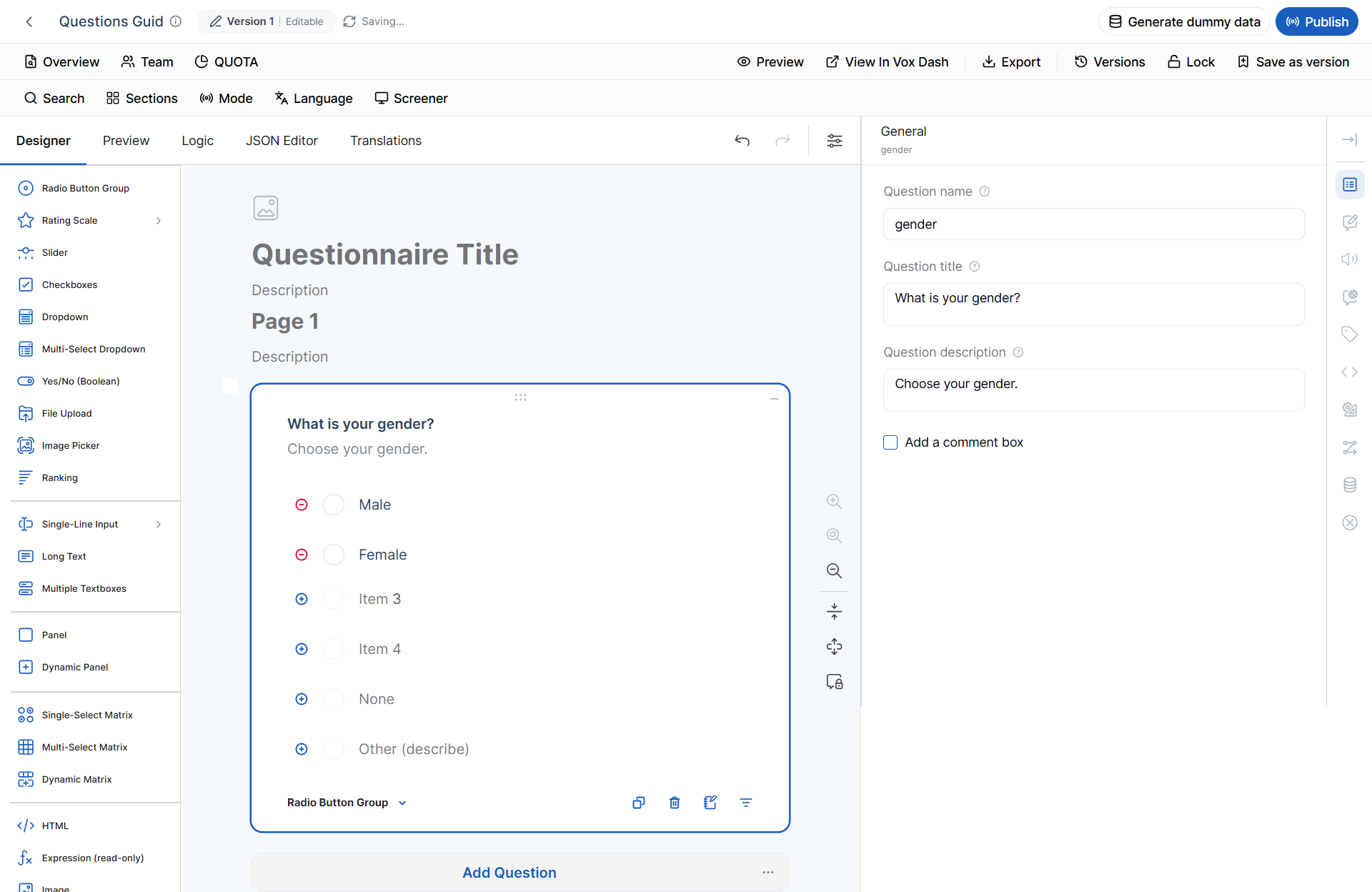
Use the **Basic Information** section to define the question's identity and respondent-facing content.
**Question Name**
The **Question Name** is the internal identifier used throughout the questionnaire.
It can be referenced in:
* Logic expressions
* Conditions
* Validation rules
* Dynamic text
* JSON
* Data exports
* Other questionnaire configurations
Use a unique and descriptive name for each question.
**Example:**
```text theme={null}
employment_status
```
**Question Title**
The **Question Title** is the text displayed to respondents.
**Example:**
> What is your preferred payment method?
The title should clearly describe what the respondent needs to answer.
**Question Description**
The **Question Description** provides additional instructions or context below the question title.
Use it when respondents need more information about how to answer the question.
**Example:**
> Please select the payment method you use most often.
 ### Text-to-Speech (TTS)
The **Text-to-Speech (TTS)** feature allows respondents to listen to question content instead of reading it.
TTS can help:
* Improve accessibility.
* Support audio-assisted interviews.
* Make questionnaires easier to use for respondents with reading difficulties.
* Support interviewer-assisted research.
To configure TTS, select the question and open its TTS settings.
For detailed configuration options, see the [**Text-to-Speech (TTS)**](https://help.voxdash.com/Questionnaire-Builder/tts) documentation.
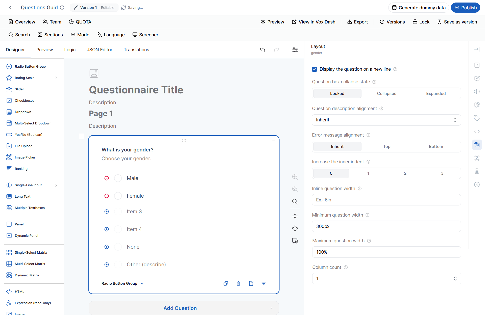
### Layout Settings
Layout settings control how the question appears in the questionnaire and in the Designer.
**Display the Question on a New Line**
Displays the question on its own row instead of placing it alongside other questions.
Use this option when:
* The question contains long text.
* The question requires more horizontal space.
* You want to visually separate the question from surrounding content.
**Question Box State**
Controls the default state of the question in the Designer.
Available options:
* **Locked** — Prevents accidental editing.
* **Collapsed** — Shows only the question title.
* **Expanded** — Displays the complete question configuration.
This setting is useful when working with questionnaires containing many questions.
**Question Description Alignment**
Controls where the question description is displayed.
Available option:
* **Inherit questionnaire setting** — Uses the alignment configured at the questionnaire level.
**Error Message Alignment**
Controls where validation messages appear.
Available options:
* **Inherit** — Uses the questionnaire-level setting.
* **Top** — Displays the error message above the question.
* **Bottom** — Displays the error message below the question.
**Increase Inner Indent**
Adds additional indentation inside the question.
Use it to create visual hierarchy or group related content.
**Inline Question Width**
Defines the width of the question when it is displayed alongside other questions.
**Minimum Question Width**
Defines the minimum width of the question before it wraps to a new line.
**Maximum Question Width**
Limits the maximum width of the question.
**Column Count**
Controls how many columns are used to display answer choices.
For example, four choices can be displayed vertically or across multiple columns to reduce the amount of vertical space used.
### Text-to-Speech (TTS)
The **Text-to-Speech (TTS)** feature allows respondents to listen to question content instead of reading it.
TTS can help:
* Improve accessibility.
* Support audio-assisted interviews.
* Make questionnaires easier to use for respondents with reading difficulties.
* Support interviewer-assisted research.
To configure TTS, select the question and open its TTS settings.
For detailed configuration options, see the [**Text-to-Speech (TTS)**](https://help.voxdash.com/Questionnaire-Builder/tts) documentation.
### Layout Settings
Layout settings control how the question appears in the questionnaire and in the Designer.
**Display the Question on a New Line**
Displays the question on its own row instead of placing it alongside other questions.
Use this option when:
* The question contains long text.
* The question requires more horizontal space.
* You want to visually separate the question from surrounding content.
**Question Box State**
Controls the default state of the question in the Designer.
Available options:
* **Locked** — Prevents accidental editing.
* **Collapsed** — Shows only the question title.
* **Expanded** — Displays the complete question configuration.
This setting is useful when working with questionnaires containing many questions.
**Question Description Alignment**
Controls where the question description is displayed.
Available option:
* **Inherit questionnaire setting** — Uses the alignment configured at the questionnaire level.
**Error Message Alignment**
Controls where validation messages appear.
Available options:
* **Inherit** — Uses the questionnaire-level setting.
* **Top** — Displays the error message above the question.
* **Bottom** — Displays the error message below the question.
**Increase Inner Indent**
Adds additional indentation inside the question.
Use it to create visual hierarchy or group related content.
**Inline Question Width**
Defines the width of the question when it is displayed alongside other questions.
**Minimum Question Width**
Defines the minimum width of the question before it wraps to a new line.
**Maximum Question Width**
Limits the maximum width of the question.
**Column Count**
Controls how many columns are used to display answer choices.
For example, four choices can be displayed vertically or across multiple columns to reduce the amount of vertical space used.
 ### Conditional Logic
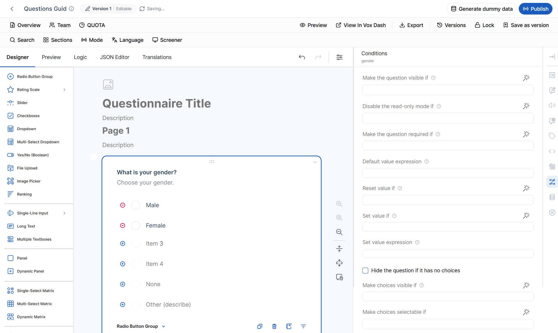
Conditional logic allows you to dynamically control questions and answer choices based on previous responses.
You can use conditions to:
* Show or hide questions.
* Make questions required.
* Enable editing.
* Automatically calculate values.
* Reset values.
* Display or disable answer choices.
Click the **Magic Wand** icon to create or edit a condition.
#### Make the Question Visible If
Displays the question only when the specified condition evaluates to **True**.
**Example:**
Question 1:
> Do you own a vehicle?
Question 2:
> What is your vehicle model?
Configure Question 2 to be visible if:
```text theme={null}
{do_you_own_a_vehicle} = "Yes"
```
Question 2 will only appear when the respondent answers **Yes**.
#### Disable Read-only Mode If
Controls when a read-only question becomes editable.
The question remains read-only until the specified condition becomes **True**.
This is useful when a value is normally calculated automatically but should become editable in specific situations.
#### Make the Question Required If
Makes a question mandatory only when a condition is true.
**Example:**
> Employment Status = Employed
If the respondent is employed, the **Employer Name** question becomes required.
#### Default Value Expression
Automatically assigns an initial value using an expression.
Expressions can include:
* Mathematical calculations
* Boolean comparisons
* References to other questions
* Built-in functions
**Examples:**
```text theme={null}
{price} * {quantity}
```
```text theme={null}
today()
```
```text theme={null}
iif({age} >= 18, "Adult", "Minor")
```
The respondent can normally change the default value unless the question is configured as **Read-only**.
#### Reset Value If
Automatically resets a question's value when the specified condition becomes true.
The question returns to its configured **Default Answer** or **Default Value Expression**.
This is particularly useful when a previous response changes and makes an existing answer invalid.
#### Set Value If
Defines when VoxDash should automatically assign a value to the question.
#### Set Value Expression
Defines the value assigned when the **Set Value If** condition evaluates to **True**.
The expression can contain calculations, functions, and references to other questions.
#### Hide the Question If It Has No Choices
Automatically hides a question when no answer choices are available.
This is useful for questions whose choices are generated dynamically.
#### Make Choices Visible If
Controls whether individual choices are displayed.
**Example:**
Display **Electric Vehicle** only if the respondent selected **Owns a Car**.
#### Make Choices Selectable If
Controls whether an answer choice can be selected.
Unlike **Make Choices Visible If**, the choice remains visible but is disabled until the condition becomes true.
> **Important:**
> **Visible** controls whether an option is displayed.
> **Selectable** controls whether a displayed option can be selected.
### Conditional Logic
Conditional logic allows you to dynamically control questions and answer choices based on previous responses.
You can use conditions to:
* Show or hide questions.
* Make questions required.
* Enable editing.
* Automatically calculate values.
* Reset values.
* Display or disable answer choices.
Click the **Magic Wand** icon to create or edit a condition.
#### Make the Question Visible If
Displays the question only when the specified condition evaluates to **True**.
**Example:**
Question 1:
> Do you own a vehicle?
Question 2:
> What is your vehicle model?
Configure Question 2 to be visible if:
```text theme={null}
{do_you_own_a_vehicle} = "Yes"
```
Question 2 will only appear when the respondent answers **Yes**.
#### Disable Read-only Mode If
Controls when a read-only question becomes editable.
The question remains read-only until the specified condition becomes **True**.
This is useful when a value is normally calculated automatically but should become editable in specific situations.
#### Make the Question Required If
Makes a question mandatory only when a condition is true.
**Example:**
> Employment Status = Employed
If the respondent is employed, the **Employer Name** question becomes required.
#### Default Value Expression
Automatically assigns an initial value using an expression.
Expressions can include:
* Mathematical calculations
* Boolean comparisons
* References to other questions
* Built-in functions
**Examples:**
```text theme={null}
{price} * {quantity}
```
```text theme={null}
today()
```
```text theme={null}
iif({age} >= 18, "Adult", "Minor")
```
The respondent can normally change the default value unless the question is configured as **Read-only**.
#### Reset Value If
Automatically resets a question's value when the specified condition becomes true.
The question returns to its configured **Default Answer** or **Default Value Expression**.
This is particularly useful when a previous response changes and makes an existing answer invalid.
#### Set Value If
Defines when VoxDash should automatically assign a value to the question.
#### Set Value Expression
Defines the value assigned when the **Set Value If** condition evaluates to **True**.
The expression can contain calculations, functions, and references to other questions.
#### Hide the Question If It Has No Choices
Automatically hides a question when no answer choices are available.
This is useful for questions whose choices are generated dynamically.
#### Make Choices Visible If
Controls whether individual choices are displayed.
**Example:**
Display **Electric Vehicle** only if the respondent selected **Owns a Car**.
#### Make Choices Selectable If
Controls whether an answer choice can be selected.
Unlike **Make Choices Visible If**, the choice remains visible but is disabled until the condition becomes true.
> **Important:**
> **Visible** controls whether an option is displayed.
> **Selectable** controls whether a displayed option can be selected.
 ### Data Settings
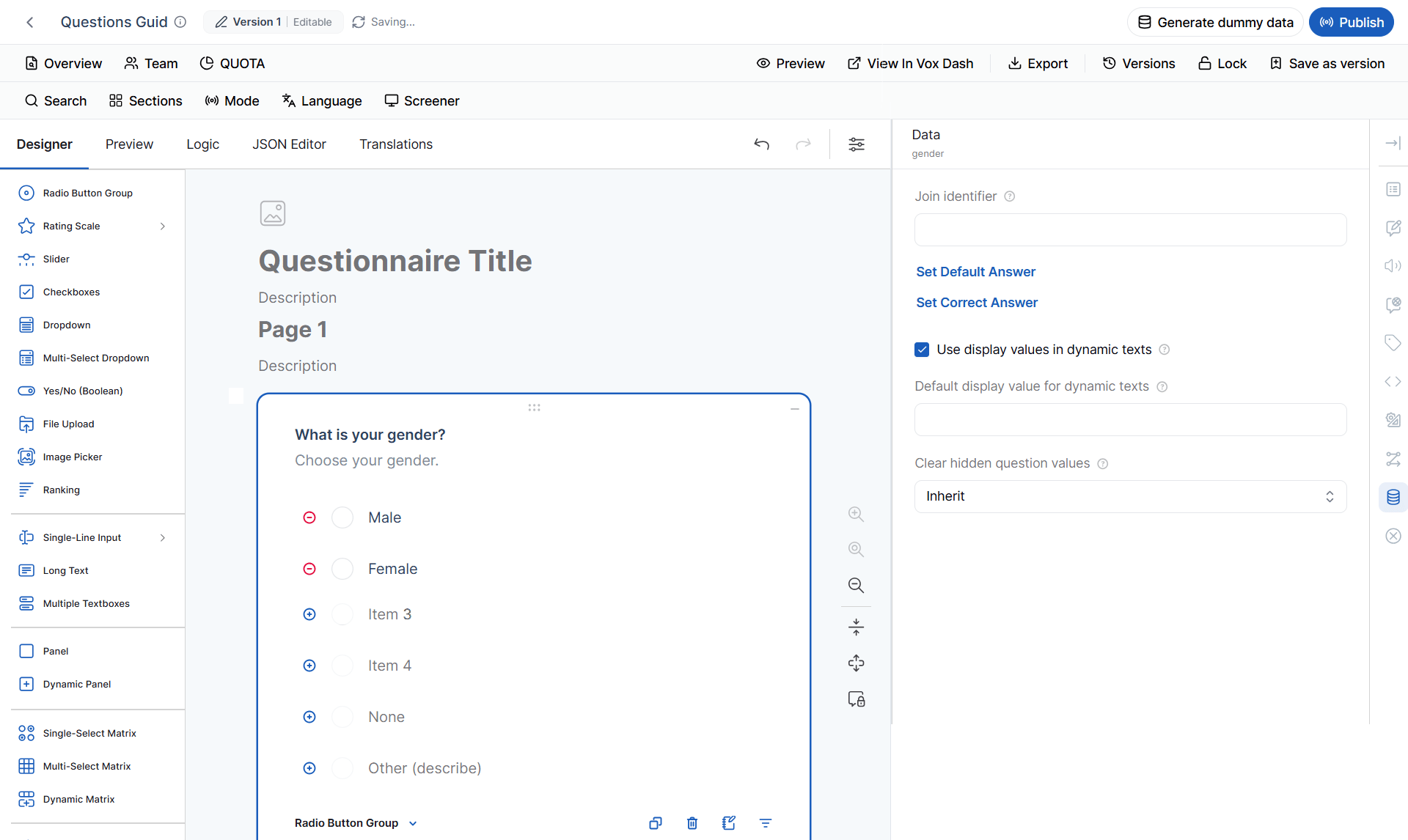
Data settings control how responses are initialized, stored, displayed, and exported.
**Join Identifier**
A **Join Identifier** groups related questions under a shared identifier.
For example, the following questions can belong to the same `address` object:
* Street
* City
* Postal Code
Configure:
```text theme={null}
address
```
The exported structure can then be represented as:
```json theme={null}
{
"address": {
"street": "12 Main Street",
"city": "London",
"postalCode": "SW1A 1AA"
}
}
```
Use Join Identifiers when several questions represent different properties of the same logical object.
**Default Answer**
Defines the answer automatically assigned when the questionnaire is initialized.
**Correct Answer**
Defines the correct response for quizzes, assessments, or scored questionnaires.
**Use Display Values in Dynamic Texts**
Controls whether dynamic text uses the respondent-facing display value instead of the internal choice value.
For example, a choice may have:
```text theme={null}
Value: 01
Text: Credit Card
```
When this setting is enabled, dynamic text displays **Credit Card** instead of `01`.
**Default Display Value for Dynamic Texts**
Defines the placeholder text shown when a question has not yet been answered.
**Clear Hidden Question Values**
Controls what happens to a question's existing response when conditional logic hides the question.
Available options:
* **Inherit questionnaire setting**
* **Never**
* **Upon questionnaire completion**
* **When the question becomes hidden**
### Data Settings
Data settings control how responses are initialized, stored, displayed, and exported.
**Join Identifier**
A **Join Identifier** groups related questions under a shared identifier.
For example, the following questions can belong to the same `address` object:
* Street
* City
* Postal Code
Configure:
```text theme={null}
address
```
The exported structure can then be represented as:
```json theme={null}
{
"address": {
"street": "12 Main Street",
"city": "London",
"postalCode": "SW1A 1AA"
}
}
```
Use Join Identifiers when several questions represent different properties of the same logical object.
**Default Answer**
Defines the answer automatically assigned when the questionnaire is initialized.
**Correct Answer**
Defines the correct response for quizzes, assessments, or scored questionnaires.
**Use Display Values in Dynamic Texts**
Controls whether dynamic text uses the respondent-facing display value instead of the internal choice value.
For example, a choice may have:
```text theme={null}
Value: 01
Text: Credit Card
```
When this setting is enabled, dynamic text displays **Credit Card** instead of `01`.
**Default Display Value for Dynamic Texts**
Defines the placeholder text shown when a question has not yet been answered.
**Clear Hidden Question Values**
Controls what happens to a question's existing response when conditional logic hides the question.
Available options:
* **Inherit questionnaire setting**
* **Never**
* **Upon questionnaire completion**
* **When the question becomes hidden**
 This setting is important when hidden responses could affect calculations, logic, quotas, or exported data.
## Question-Specific Settings
Each question type has additional settings based on its purpose and behavior.
### 1 Radio Button
A **Radio Button** question allows respondents to select **one** option from a list.
#### Available Settings
You can:
* Add, edit, and delete choices.
* Copy choices from another question.
* Change choice order.
* Enable the **Clear** button.
* Enable **Other**.
* Enable **None**.
* Separate special choices.
* Apply conditions to individual choices.
**Example:**
> What is your preferred payment method?
* Credit Card
* PayPal
* Bank Transfer
* Other
This setting is important when hidden responses could affect calculations, logic, quotas, or exported data.
## Question-Specific Settings
Each question type has additional settings based on its purpose and behavior.
### 1 Radio Button
A **Radio Button** question allows respondents to select **one** option from a list.
#### Available Settings
You can:
* Add, edit, and delete choices.
* Copy choices from another question.
* Change choice order.
* Enable the **Clear** button.
* Enable **Other**.
* Enable **None**.
* Separate special choices.
* Apply conditions to individual choices.
**Example:**
> What is your preferred payment method?
* Credit Card
* PayPal
* Bank Transfer
* Other
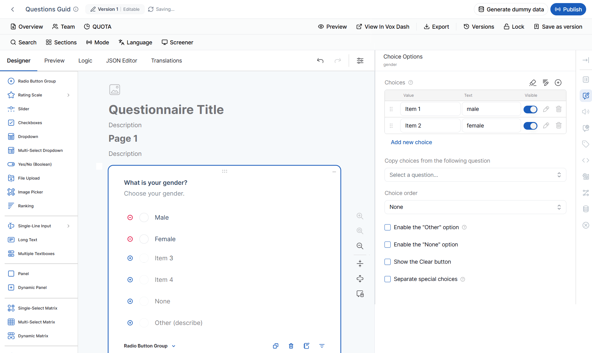 When **Other** is selected, the respondent can provide a custom answer.
#### SPSS Metadata
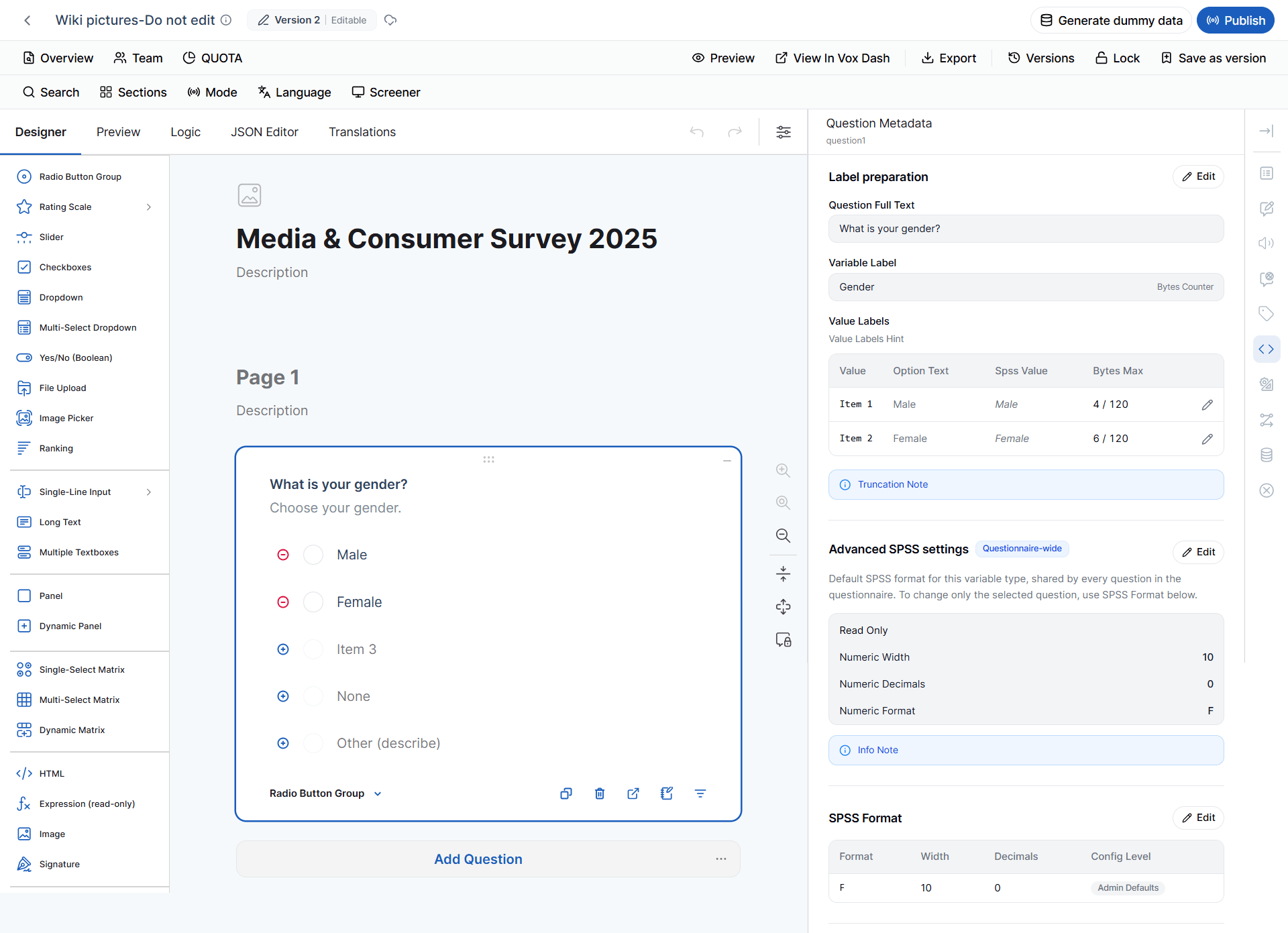
Radio Button questions are represented as **numeric variables** in SPSS.
| SPSS Property | Default |
| ----------------- | ------- |
| SPSS Format | `F10.0` |
| Data Type | Numeric |
| Measurement Level | Nominal |
The numeric value represents the selected choice. The **Nominal** measurement level indicates that the response categories do not inherently have an order.
> **Example:** A response such as `1 = Credit Card` and `2 = PayPal` does not mean that PayPal is greater than Credit Card. The numbers identify categories.
The SPSS metadata source defines Radio Button Group as **Numeric / NOMINAL / F10.0**.
When **Other** is selected, the respondent can provide a custom answer.
#### SPSS Metadata
Radio Button questions are represented as **numeric variables** in SPSS.
| SPSS Property | Default |
| ----------------- | ------- |
| SPSS Format | `F10.0` |
| Data Type | Numeric |
| Measurement Level | Nominal |
The numeric value represents the selected choice. The **Nominal** measurement level indicates that the response categories do not inherently have an order.
> **Example:** A response such as `1 = Credit Card` and `2 = PayPal` does not mean that PayPal is greater than Credit Card. The numbers identify categories.
The SPSS metadata source defines Radio Button Group as **Numeric / NOMINAL / F10.0**.
 ### 2 Rating Scale
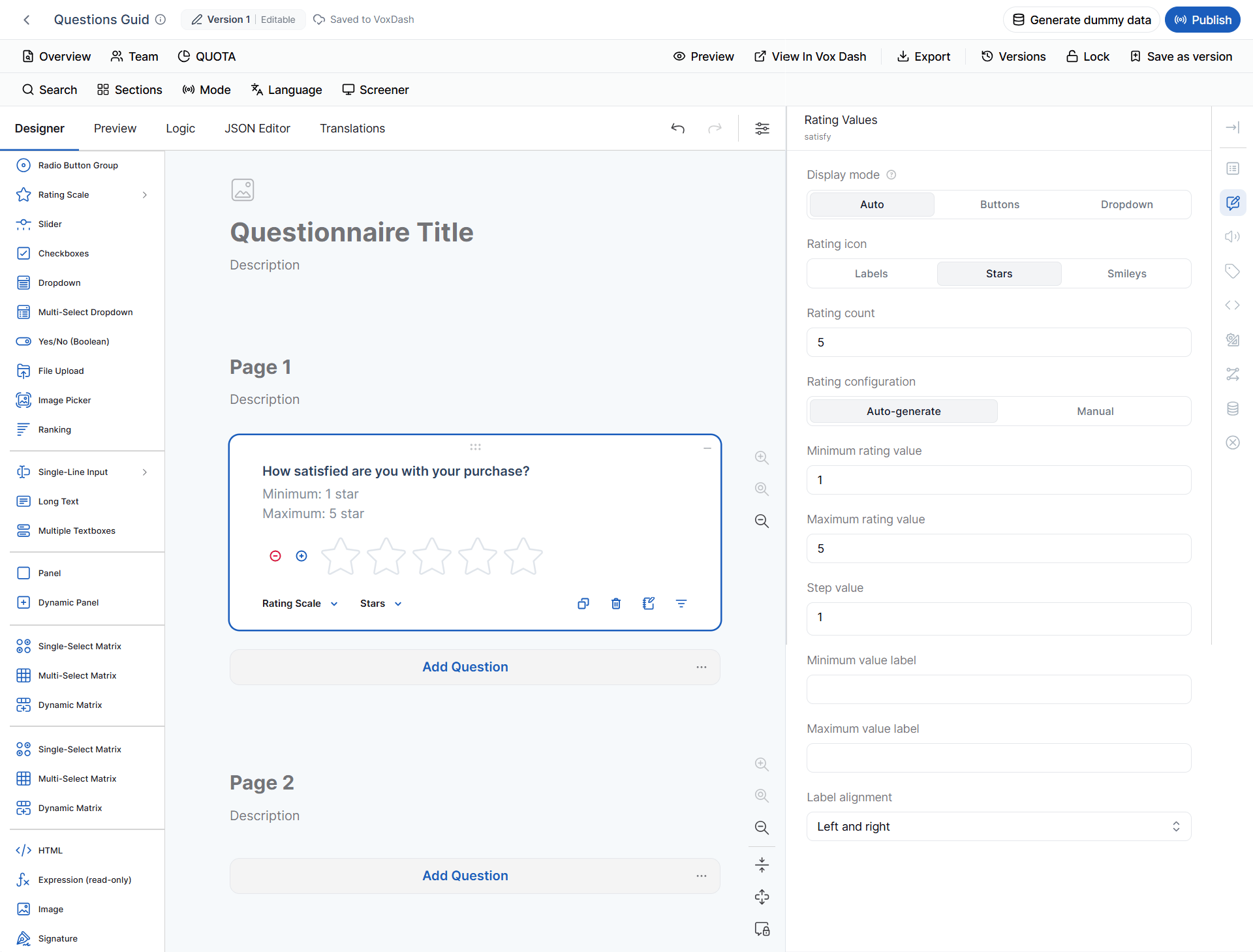
Use a **Rating Scale** to measure satisfaction, agreement, quality, or opinion.
#### Display Mode
Available options:
* **Auto**
* **Buttons**
* **Dropdown**
**Auto** automatically selects the display format based on available space.
#### Rating Icons
Available styles:
* **Labels**
* **Stars**
* **Smileys**
#### Rating Configuration
You can:
* Automatically generate rating values.
* Create values manually.
* Define the minimum value.
* Define the maximum value.
* Define the step value.
**Example:**
> How satisfied are you with your purchase?
* Display: Stars
* Minimum: 1
* Maximum: 5
### 2 Rating Scale
Use a **Rating Scale** to measure satisfaction, agreement, quality, or opinion.
#### Display Mode
Available options:
* **Auto**
* **Buttons**
* **Dropdown**
**Auto** automatically selects the display format based on available space.
#### Rating Icons
Available styles:
* **Labels**
* **Stars**
* **Smileys**
#### Rating Configuration
You can:
* Automatically generate rating values.
* Create values manually.
* Define the minimum value.
* Define the maximum value.
* Define the step value.
**Example:**
> How satisfied are you with your purchase?
* Display: Stars
* Minimum: 1
* Maximum: 5
 #### SPSS Metadata
Rating Scale questions are represented as **numeric ordinal variables**.
| SPSS Property | Default |
| ----------------- | ------- |
| SPSS Format | `F10.0` |
| Data Type | Numeric |
| Measurement Level | Ordinal |
The same default SPSS representation applies to Rating Scale questions displayed as **Labels**, **Stars**, or **Smileys**.
The **Ordinal** measurement level is used because the response values have an ordered relationship.
#### SPSS Metadata
Rating Scale questions are represented as **numeric ordinal variables**.
| SPSS Property | Default |
| ----------------- | ------- |
| SPSS Format | `F10.0` |
| Data Type | Numeric |
| Measurement Level | Ordinal |
The same default SPSS representation applies to Rating Scale questions displayed as **Labels**, **Stars**, or **Smileys**.
The **Ordinal** measurement level is used because the response values have an ordered relationship.
 ### 3 Slider
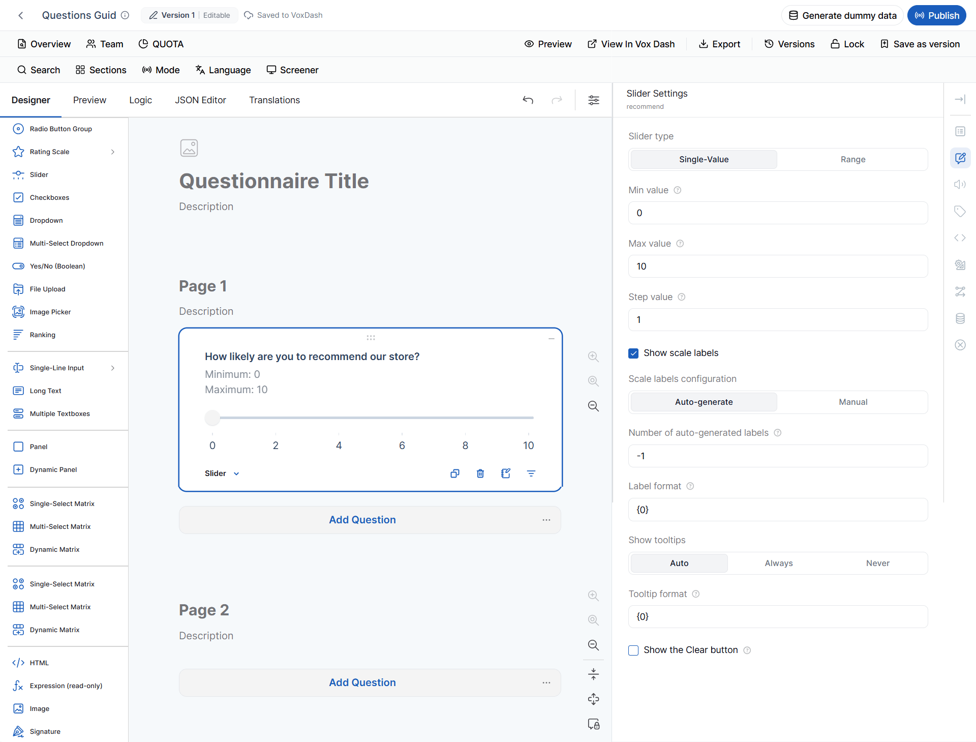
The **Slider** question allows respondents to select a value from a defined range.
#### Slider Type
* **Single Value** — One value is selected.
* **Range** — A minimum and maximum value are selected.
#### Available Settings
You can configure:
* Minimum value
* Maximum value
* Step value
* Scale labels
* Label generation
* Label format
* Tooltip behavior
* Tooltip format
* Clear button
Tooltip options include:
* **Auto**
* **Always**
* **Never**
**Example:**
> How likely are you to recommend our store?
* Minimum: 0
* Maximum: 10
* Step: 1
### 3 Slider
The **Slider** question allows respondents to select a value from a defined range.
#### Slider Type
* **Single Value** — One value is selected.
* **Range** — A minimum and maximum value are selected.
#### Available Settings
You can configure:
* Minimum value
* Maximum value
* Step value
* Scale labels
* Label generation
* Label format
* Tooltip behavior
* Tooltip format
* Clear button
Tooltip options include:
* **Auto**
* **Always**
* **Never**
**Example:**
> How likely are you to recommend our store?
* Minimum: 0
* Maximum: 10
* Step: 1
 #### SPSS Metadata
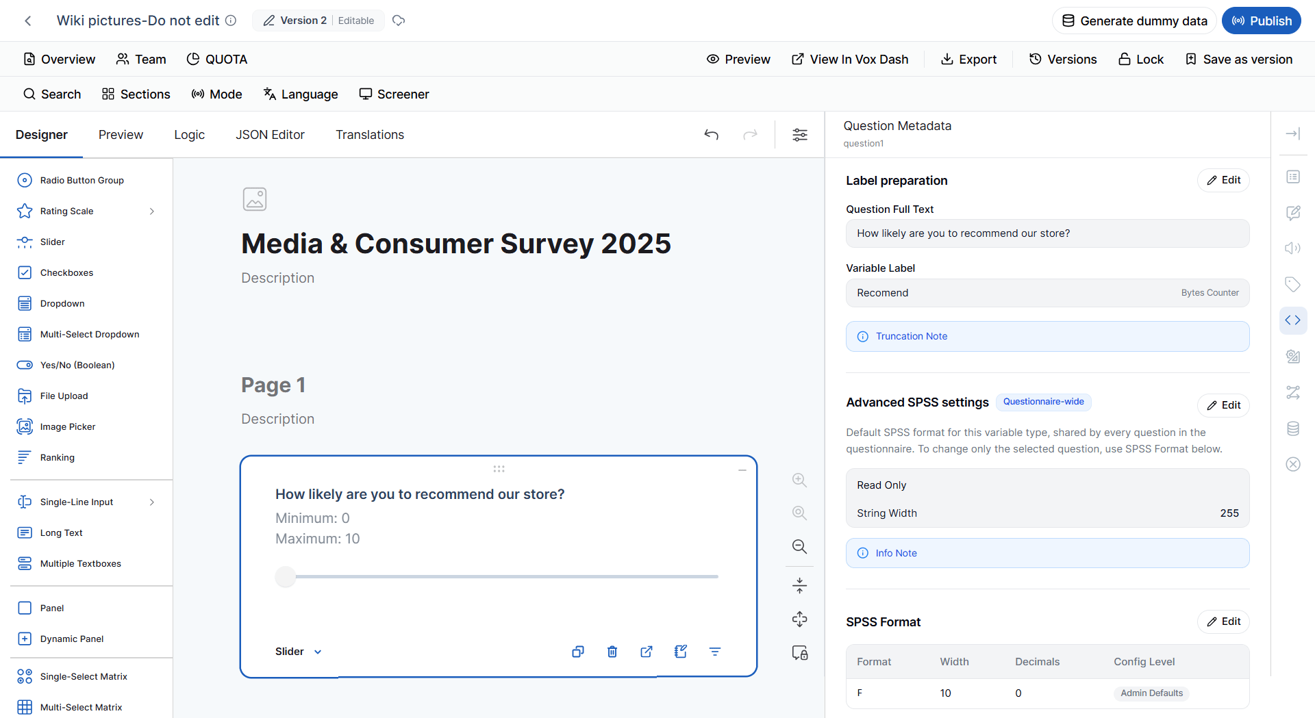
Slider questions are represented as **numeric Scale variables**.
| SPSS Property | Default |
| ----------------- | ------- |
| SPSS Format | `F10.0` |
| Data Type | Numeric |
| Measurement Level | Scale |
#### SPSS Metadata
Slider questions are represented as **numeric Scale variables**.
| SPSS Property | Default |
| ----------------- | ------- |
| SPSS Format | `F10.0` |
| Data Type | Numeric |
| Measurement Level | Scale |
 ### 4 Checkbox
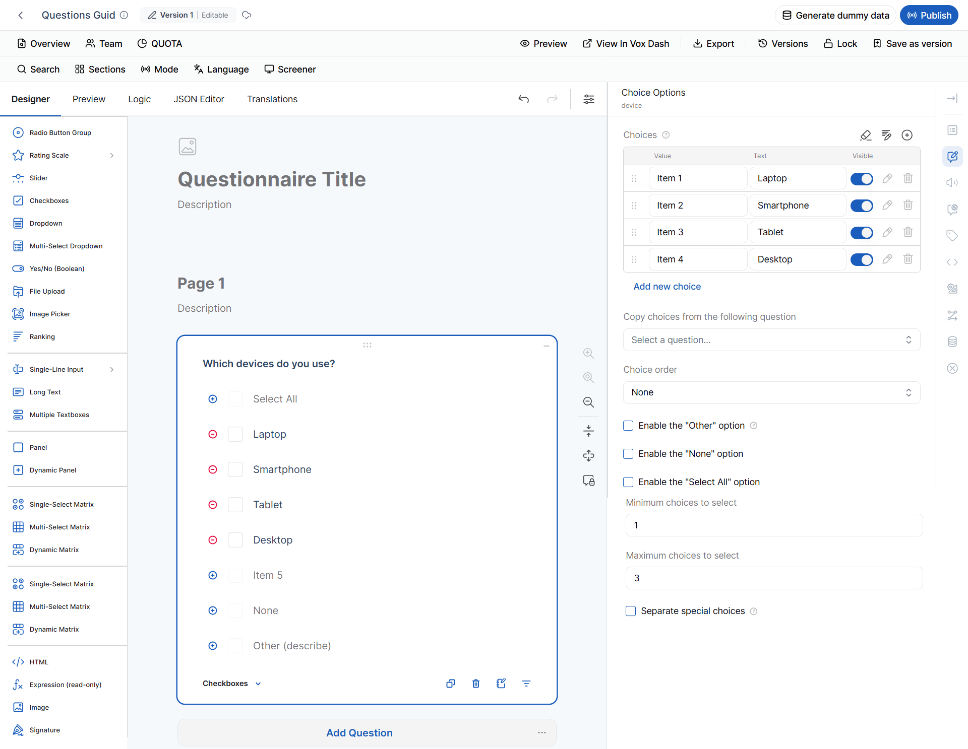
A **Checkbox** question allows respondents to select **multiple** answers.
It supports standard choice settings plus:
* **Select All**
* Minimum selections
* Maximum selections
**Example:**
> Which devices do you use?
* Laptop
* Smartphone
* Tablet
* Desktop
Configure:
* Minimum selections: 1
* Maximum selections: 3
The respondent must select at least one and no more than three options.
### 4 Checkbox
A **Checkbox** question allows respondents to select **multiple** answers.
It supports standard choice settings plus:
* **Select All**
* Minimum selections
* Maximum selections
**Example:**
> Which devices do you use?
* Laptop
* Smartphone
* Tablet
* Desktop
Configure:
* Minimum selections: 1
* Maximum selections: 3
The respondent must select at least one and no more than three options.
 #### SPSS Metadata
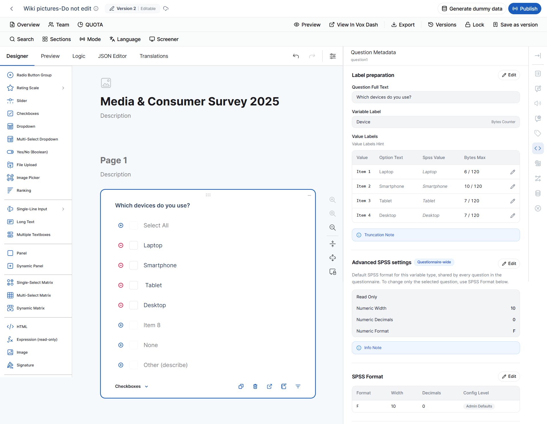
Checkbox questions are represented as **numeric variables** with a **Nominal** measurement level.
| SPSS Property | Default |
| ----------------- | ------- |
| SPSS Format | `F10.0` |
| Data Type | Numeric |
| Measurement Level | Nominal |
The provided SPSS metadata source identifies **Checkboxes** as `F10.0 / Numeric / NOMINAL`.
> **Note:** Because Checkbox questions allow multiple selections, review the exported variable structure when preparing the dataset for statistical analysis.
#### SPSS Metadata
Checkbox questions are represented as **numeric variables** with a **Nominal** measurement level.
| SPSS Property | Default |
| ----------------- | ------- |
| SPSS Format | `F10.0` |
| Data Type | Numeric |
| Measurement Level | Nominal |
The provided SPSS metadata source identifies **Checkboxes** as `F10.0 / Numeric / NOMINAL`.
> **Note:** Because Checkbox questions allow multiple selections, review the exported variable structure when preparing the dataset for statistical analysis.
 ### 5 Dropdown and Multi-select Dropdown
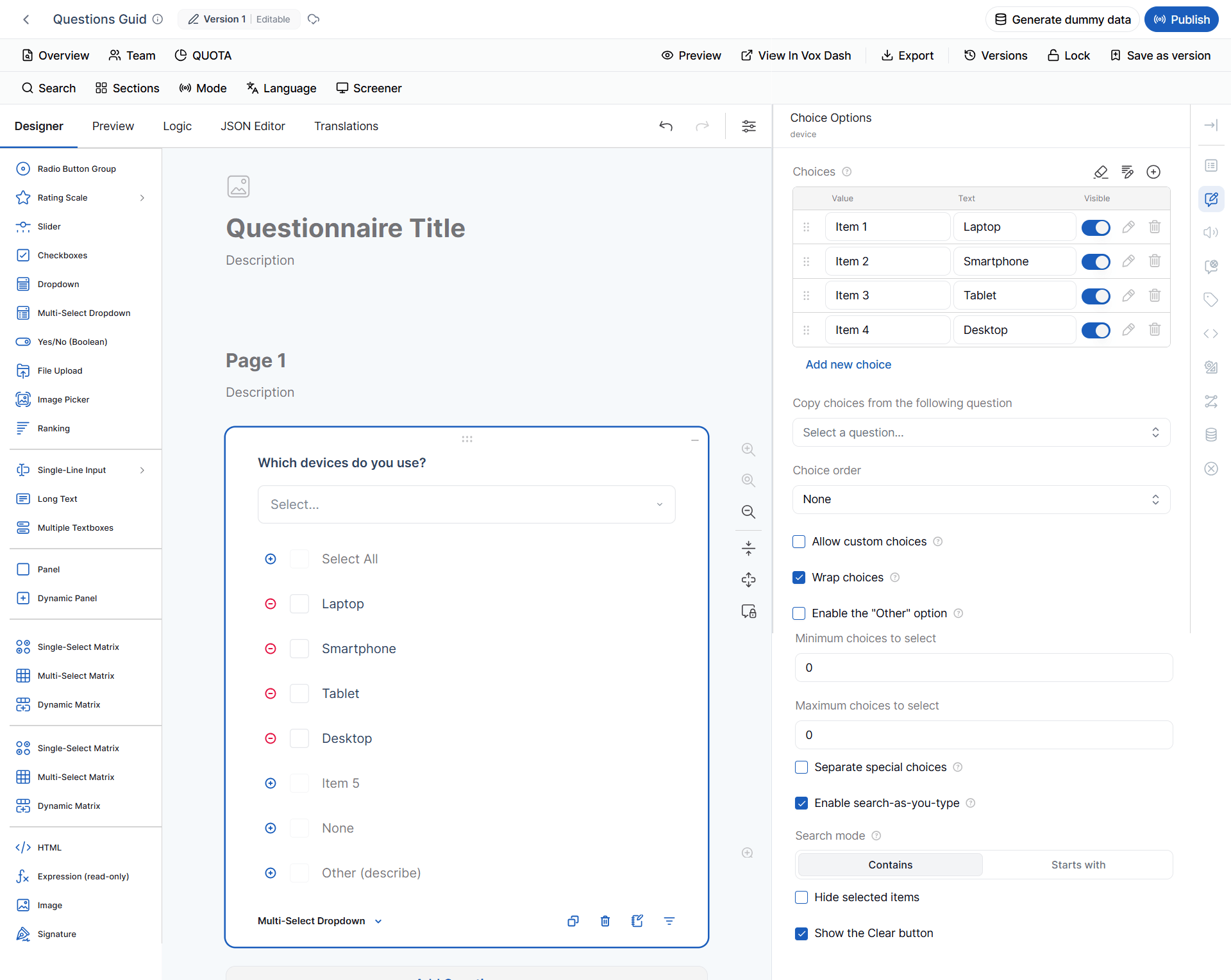
A **Dropdown** displays choices in a compact list.
A **Multi-select Dropdown** allows respondents to select multiple choices.
#### Additional Settings
Depending on the question configuration, you can:
* Allow custom choices.
* Wrap long choice text.
* Automatically generate numeric choices.
* Define minimum and maximum values.
* Define the step value.
* Configure search behavior.
### 5 Dropdown and Multi-select Dropdown
A **Dropdown** displays choices in a compact list.
A **Multi-select Dropdown** allows respondents to select multiple choices.
#### Additional Settings
Depending on the question configuration, you can:
* Allow custom choices.
* Wrap long choice text.
* Automatically generate numeric choices.
* Define minimum and maximum values.
* Define the step value.
* Configure search behavior.
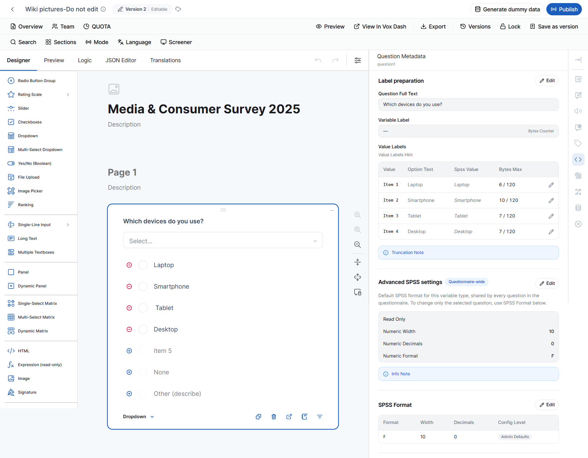
 #### SPSS Metadata — Dropdown
A standard **Dropdown** is represented as a numeric nominal variable.
| SPSS Property | Default |
| ----------------- | ------- |
| SPSS Format | `F10.0` |
| Data Type | Numeric |
| Measurement Level | Nominal |
#### SPSS Metadata — Dropdown
A standard **Dropdown** is represented as a numeric nominal variable.
| SPSS Property | Default |
| ----------------- | ------- |
| SPSS Format | `F10.0` |
| Data Type | Numeric |
| Measurement Level | Nominal |
 #### SPSS Metadata — Multi-select Dropdown
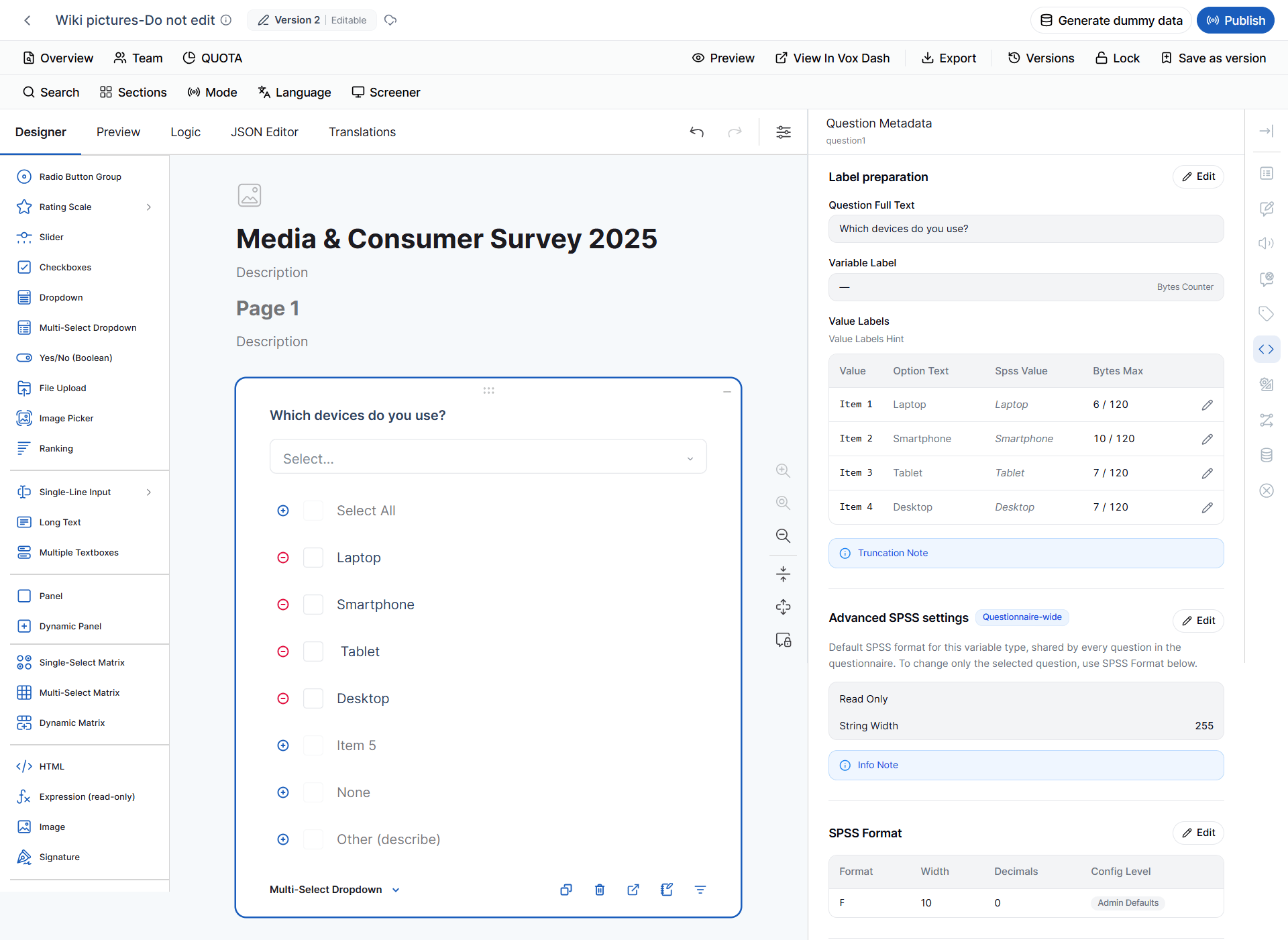
A **Multi-select Dropdown** is also defined as:
| SPSS Property | Default |
| ----------------- | ------- |
| SPSS Format | `F10.0` |
| Data Type | Numeric |
| Measurement Level | Nominal |
The metadata source classifies both Dropdown and Multi-Select Dropdown as **Numeric / NOMINAL / F10.0**.
#### SPSS Metadata — Multi-select Dropdown
A **Multi-select Dropdown** is also defined as:
| SPSS Property | Default |
| ----------------- | ------- |
| SPSS Format | `F10.0` |
| Data Type | Numeric |
| Measurement Level | Nominal |
The metadata source classifies both Dropdown and Multi-Select Dropdown as **Numeric / NOMINAL / F10.0**.
 ### 6 Image Picker
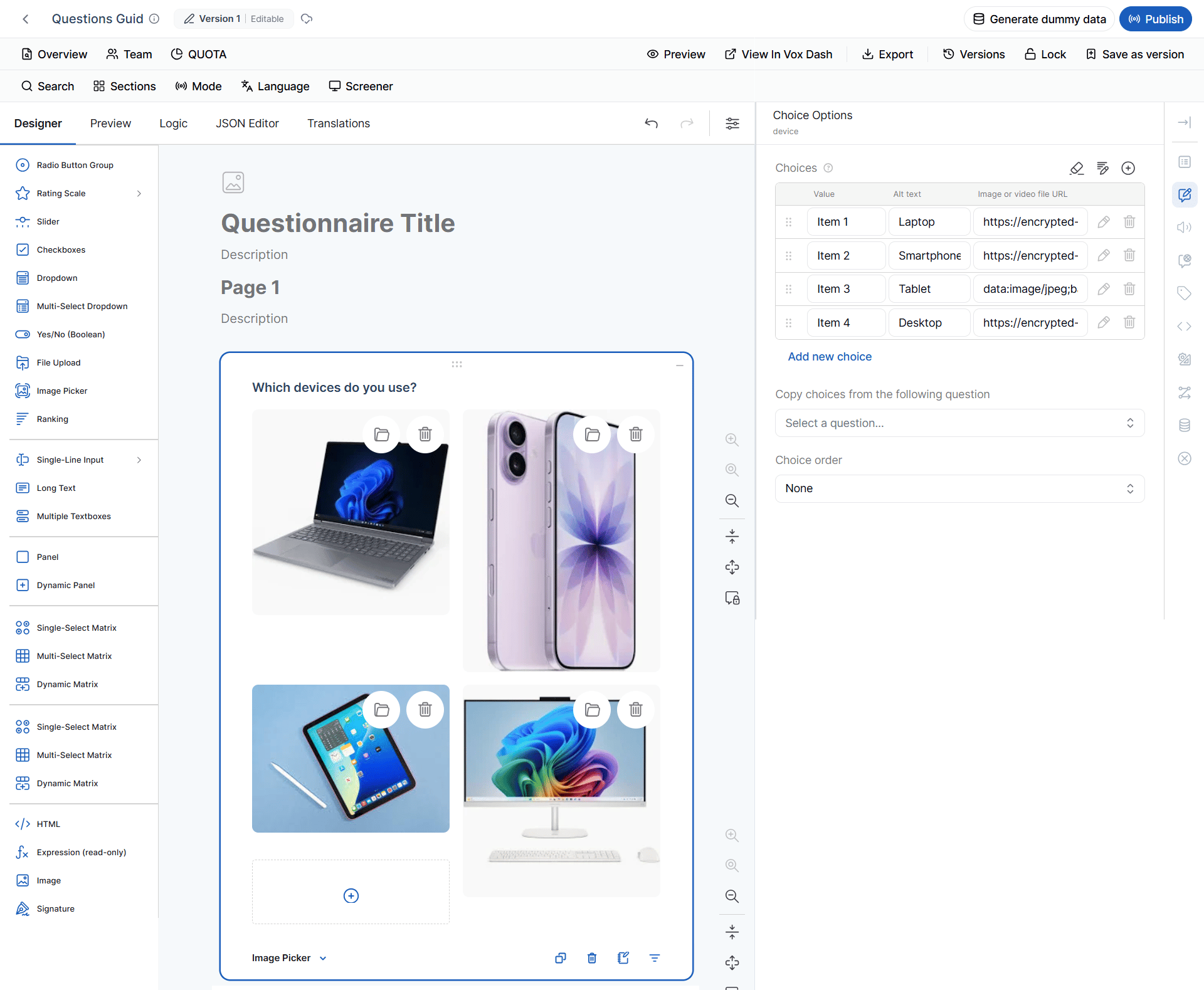
The **Image Picker** allows respondents to answer a question by selecting an image.
#### Available Settings
You can:
* Add or remove images.
* Edit image labels.
* Copy image choices from another question.
* Change image order.
> **Important:** The **Value** is used internally for logic, conditions, quotas, and data processing. The **Text** is displayed to respondents.
### 6 Image Picker
The **Image Picker** allows respondents to answer a question by selecting an image.
#### Available Settings
You can:
* Add or remove images.
* Edit image labels.
* Copy image choices from another question.
* Change image order.
> **Important:** The **Value** is used internally for logic, conditions, quotas, and data processing. The **Text** is displayed to respondents.
 #### Image Picker and Quotas
Image Picker questions can be used with the **Quota** tag.
Uploaded images appear as selectable quota options, allowing a quota to be configured for each image.
For example:
> Which product design do you prefer?
* Product A
* Product B
* Product C
Each image can have its own quota.
This applies to:
* **Image Picker (Single)**
* **Image Picker (Multi)**
#### SPSS Metadata
Image Picker responses are represented as numeric nominal variables.
| SPSS Property | Default |
| ----------------- | ------- |
| SPSS Format | `F10.0` |
| Data Type | Numeric |
| Measurement Level | Nominal |
#### Image Picker and Quotas
Image Picker questions can be used with the **Quota** tag.
Uploaded images appear as selectable quota options, allowing a quota to be configured for each image.
For example:
> Which product design do you prefer?
* Product A
* Product B
* Product C
Each image can have its own quota.
This applies to:
* **Image Picker (Single)**
* **Image Picker (Multi)**
#### SPSS Metadata
Image Picker responses are represented as numeric nominal variables.
| SPSS Property | Default |
| ----------------- | ------- |
| SPSS Format | `F10.0` |
| Data Type | Numeric |
| Measurement Level | Nominal |
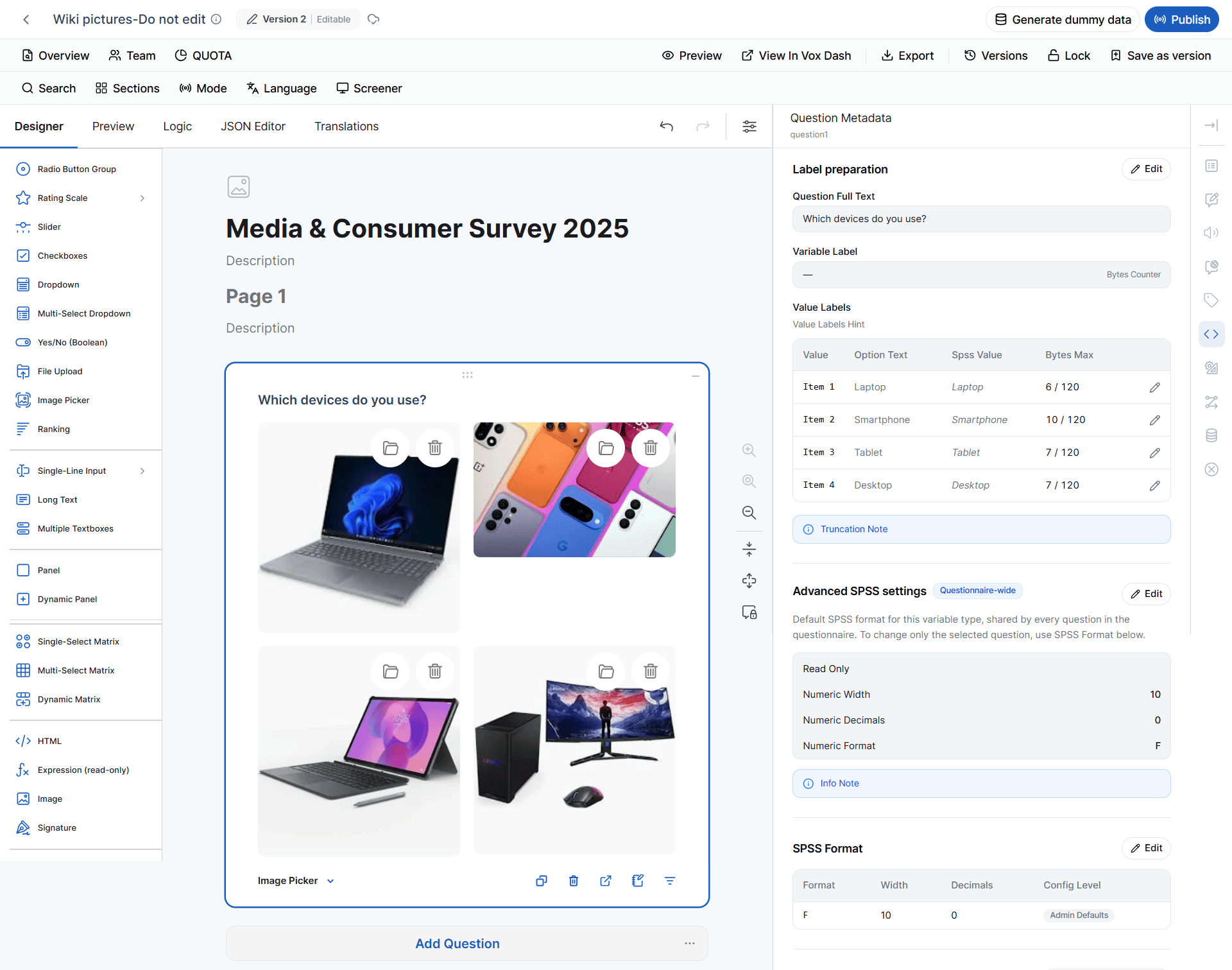 The internal numeric values represent the selected image choices. The metadata source classifies Image Picker as **Numeric / NOMINAL / F10.0**.
### 7 Ranking
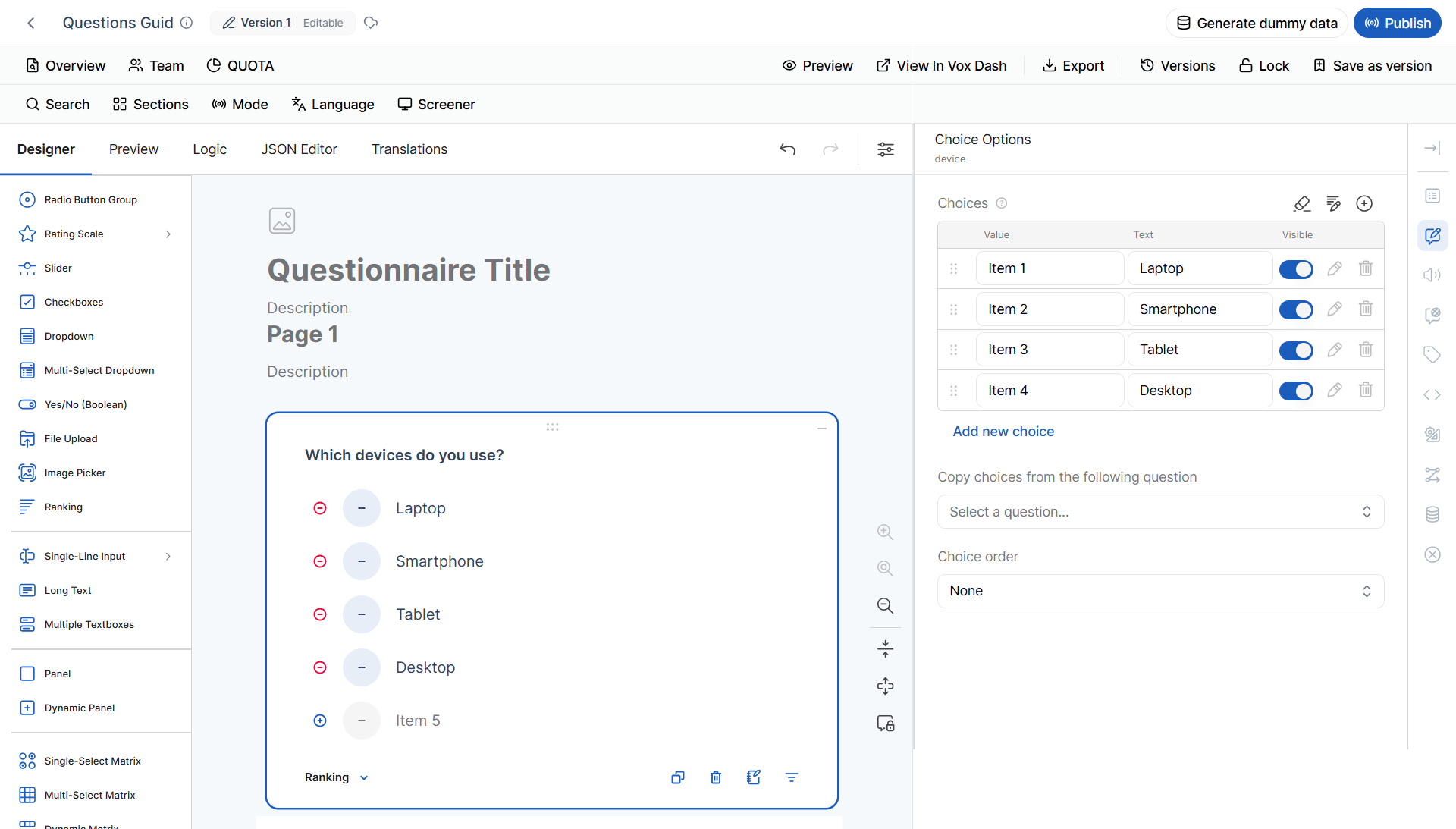
The **Ranking** question allows respondents to arrange items according to preference or priority.
**Example:**
> Rank the following payment methods from most preferred to least preferred.
Ranking questions support standard choice settings, including:
* Choice order
* Other
* None
* Choice conditions
The internal numeric values represent the selected image choices. The metadata source classifies Image Picker as **Numeric / NOMINAL / F10.0**.
### 7 Ranking
The **Ranking** question allows respondents to arrange items according to preference or priority.
**Example:**
> Rank the following payment methods from most preferred to least preferred.
Ranking questions support standard choice settings, including:
* Choice order
* Other
* None
* Choice conditions
 #### SPSS Metadata
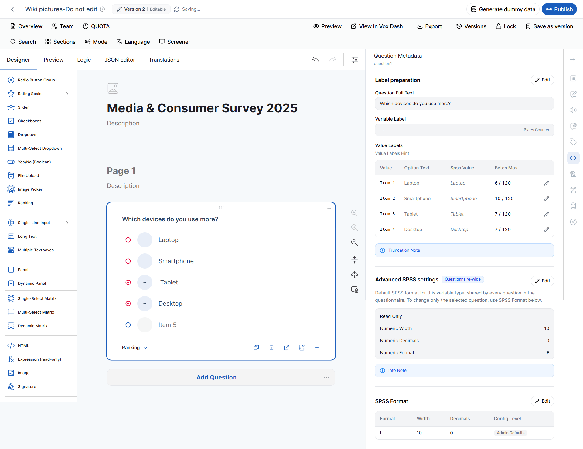
Ranking is represented as a numeric ordinal variable.
| SPSS Property | Default |
| ----------------- | ------- |
| SPSS Format | `F10.0` |
| Data Type | Numeric |
| Measurement Level | Ordinal |
The **Ordinal** measurement level reflects the meaningful order represented by ranking positions.
#### SPSS Metadata
Ranking is represented as a numeric ordinal variable.
| SPSS Property | Default |
| ----------------- | ------- |
| SPSS Format | `F10.0` |
| Data Type | Numeric |
| Measurement Level | Ordinal |
The **Ordinal** measurement level reflects the meaningful order represented by ranking positions.
 ### 8 Single-line Input
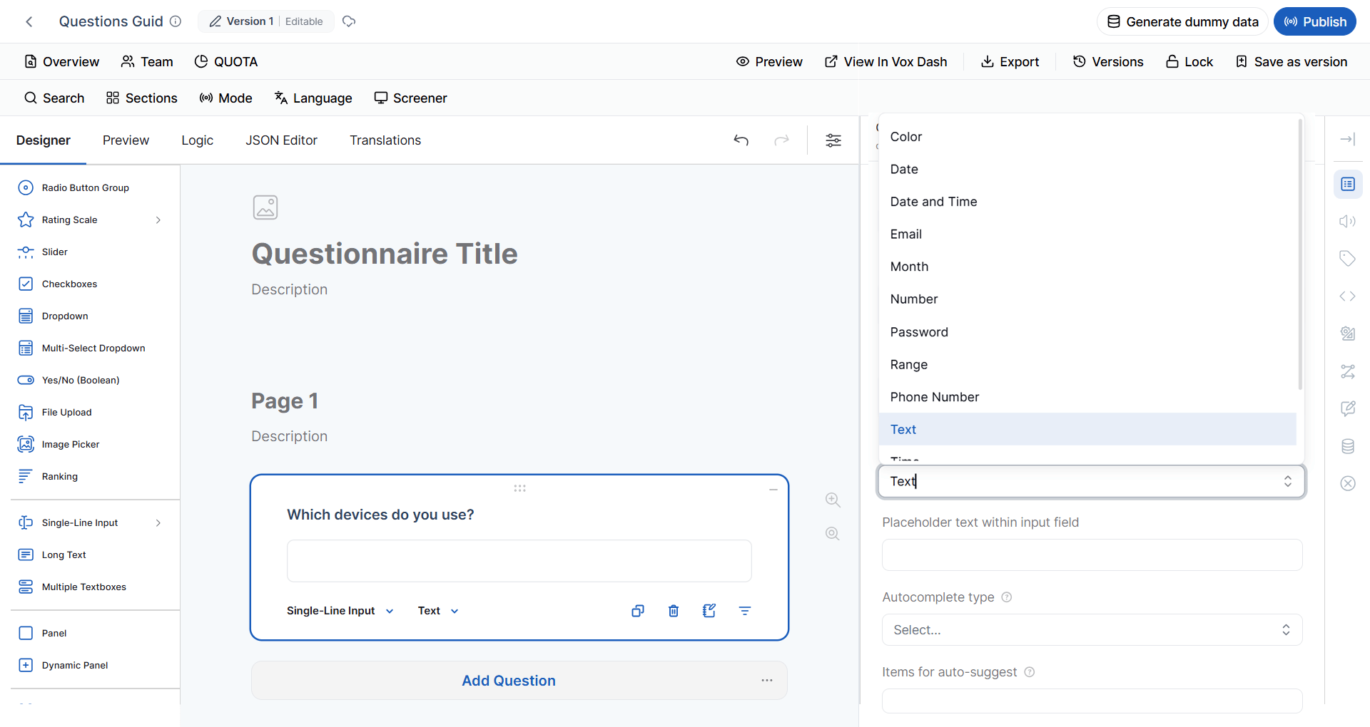
The **Single-line Input** question collects short text or structured input.
#### Supported Input Types
Supported input types may include:
* Text
* Number
* Email
* Phone Number
* URL
* Password
* Date
* Date & Time
* Time
* Week
* Month
* Color
* Range
For numeric inputs, you can define minimum and maximum allowed values.
### 8 Single-line Input
The **Single-line Input** question collects short text or structured input.
#### Supported Input Types
Supported input types may include:
* Text
* Number
* Email
* Phone Number
* URL
* Password
* Date
* Date & Time
* Time
* Week
* Month
* Color
* Range
For numeric inputs, you can define minimum and maximum allowed values.
 > **Important:** A Single-line Input question can behave differently depending on its selected **inputType**. Tag availability and validation behavior may therefore vary between input types.
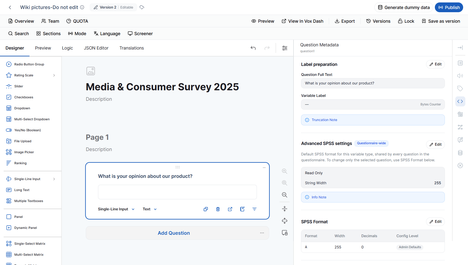
#### SPSS Metadata by Input Type
The SPSS representation of a Single-line Input is determined by its selected **input type**.
| Input Type | SPSS Format | Data Type | Measurement Level |
| ------------- | ------------ | --------- | ----------------- |
| No input type | `A255` | String | Nominal |
| Text | `A255` | String | Nominal |
| Color | `A255` | String | Nominal |
| Email | `A255` | String | Nominal |
| Password | `A255` | String | Nominal |
| Phone Number | `A255` | String | Nominal |
| URL | `A255` | String | Nominal |
| Number | `F10.0` | Numeric | Scale |
| Range | `F10.0` | Numeric | Scale |
| Date | `DATE11` | Date | Scale |
| Date and Time | `DATETIME20` | DateTime | Scale |
| Time | `TIME8` | Time | Scale |
| Month | `A255` | String | Scale |
| Week | `A255` | String | Scale |
These mappings are defined by the current SPSS metadata rules.
> **Important:** A Single-line Input question can behave differently depending on its selected **inputType**. Tag availability and validation behavior may therefore vary between input types.
#### SPSS Metadata by Input Type
The SPSS representation of a Single-line Input is determined by its selected **input type**.
| Input Type | SPSS Format | Data Type | Measurement Level |
| ------------- | ------------ | --------- | ----------------- |
| No input type | `A255` | String | Nominal |
| Text | `A255` | String | Nominal |
| Color | `A255` | String | Nominal |
| Email | `A255` | String | Nominal |
| Password | `A255` | String | Nominal |
| Phone Number | `A255` | String | Nominal |
| URL | `A255` | String | Nominal |
| Number | `F10.0` | Numeric | Scale |
| Range | `F10.0` | Numeric | Scale |
| Date | `DATE11` | Date | Scale |
| Date and Time | `DATETIME20` | DateTime | Scale |
| Time | `TIME8` | Time | Scale |
| Month | `A255` | String | Scale |
| Week | `A255` | String | Scale |
These mappings are defined by the current SPSS metadata rules.
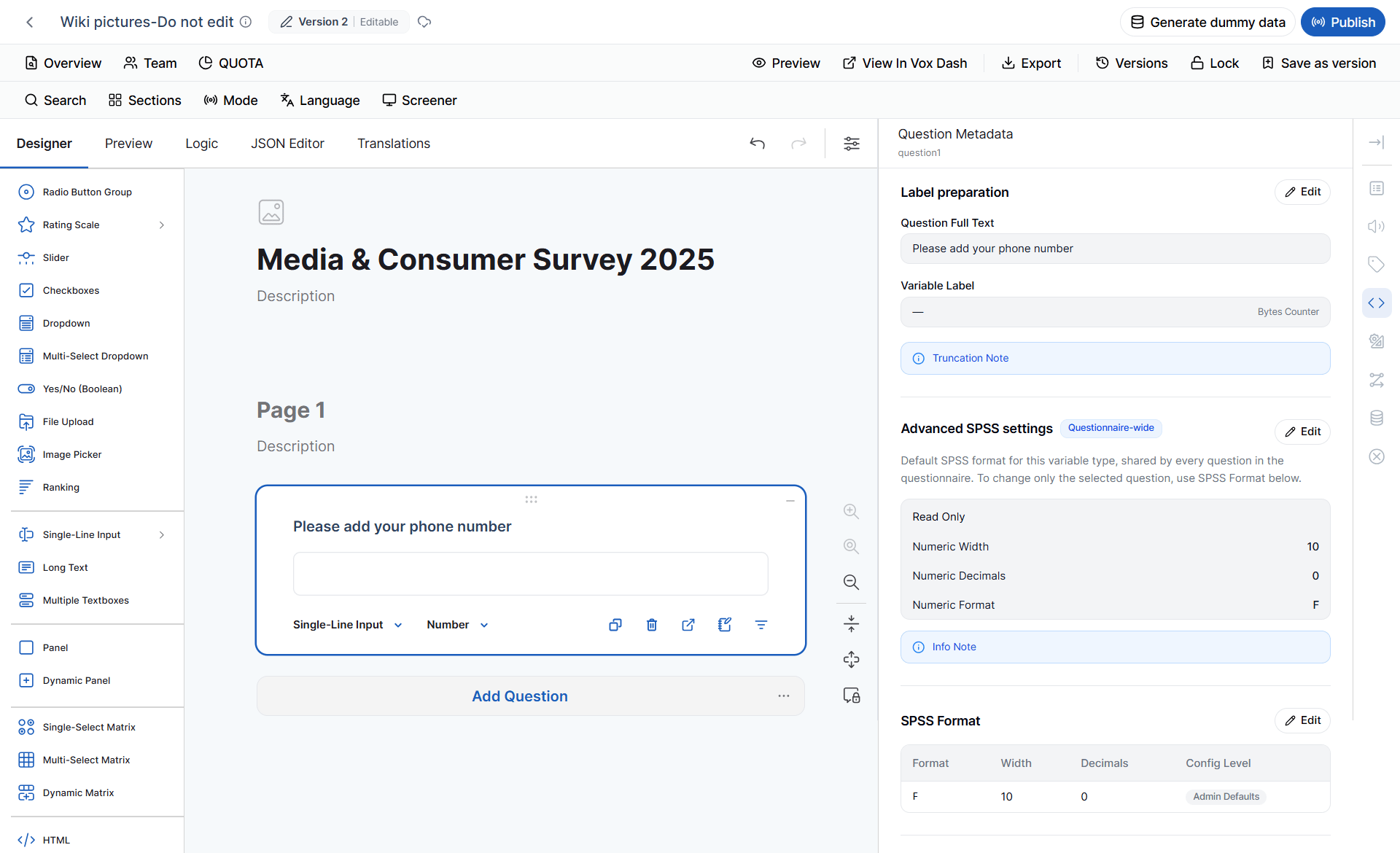 ### Why Input Type Matters
A Single-line Input is not a single SPSS data type.
For example:
```text theme={null}
Text → A255 → String
Number → F10.0 → Numeric
Date → DATE11 → Date
DateTime → DATETIME20 → DateTime
```
Therefore, always review the selected **inputType** when configuring or reviewing SPSS metadata.
> **Note:** The current metadata rules represent **Month** and **Week** as strings while retaining a **Scale** measurement level.
### 9 Long Text
The **Long Text** question collects open-ended responses.
**Example:**
> Please describe your experience with our product.
Use Long Text when respondents need to provide detailed or unrestricted answers.
Because Long Text collects free-form content, it does not normally provide predefined response categories for quota management.
Therefore:
> **Quota is not available for Long Text.**
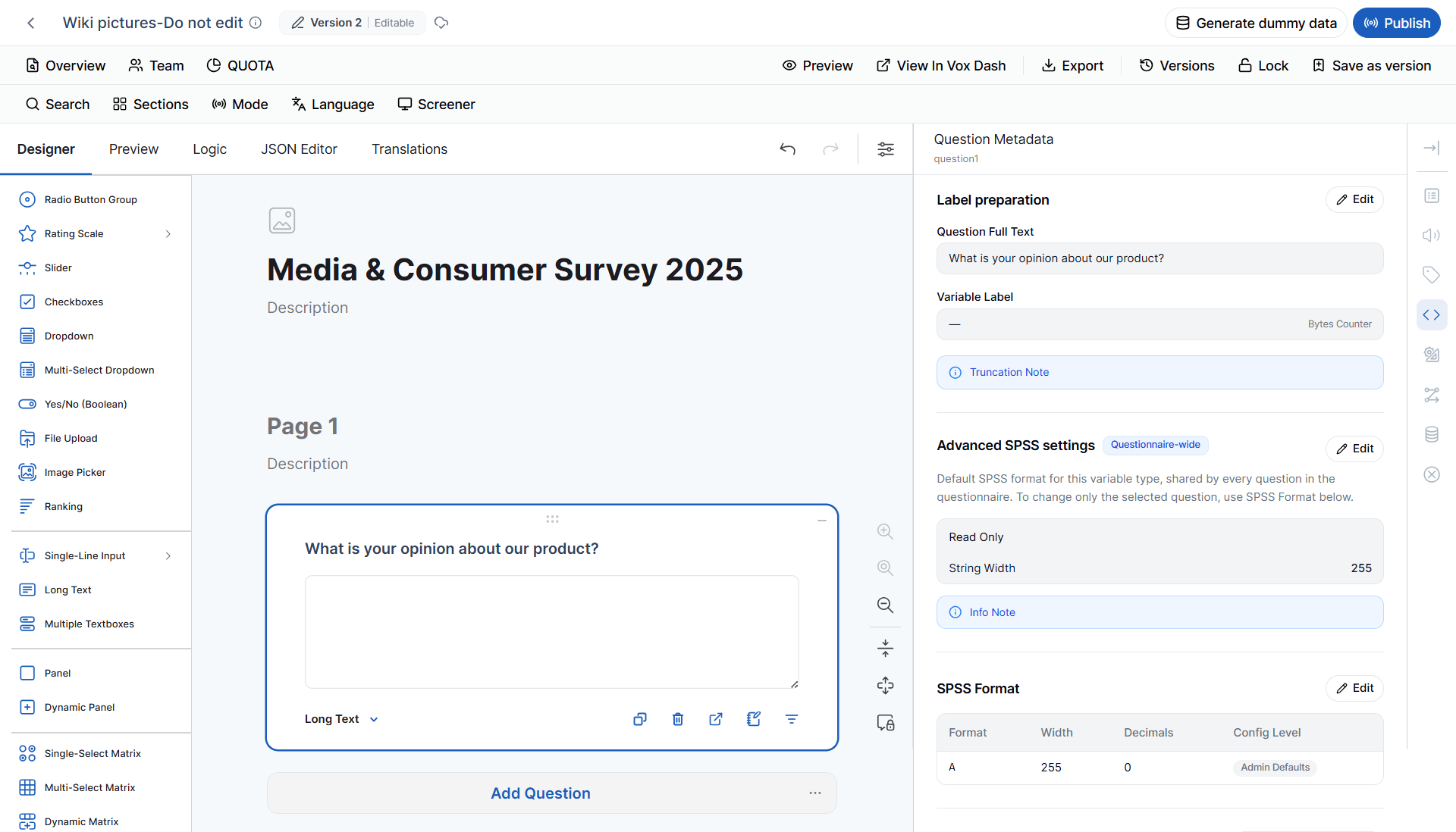
#### SPSS Metadata
Long Text responses are represented as string variables.
| SPSS Property | Default |
| ----------------- | ------- |
| SPSS Format | `A255` |
| Data Type | String |
| Measurement Level | Nominal |
This representation reflects the free-form nature of Long Text responses.
### Why Input Type Matters
A Single-line Input is not a single SPSS data type.
For example:
```text theme={null}
Text → A255 → String
Number → F10.0 → Numeric
Date → DATE11 → Date
DateTime → DATETIME20 → DateTime
```
Therefore, always review the selected **inputType** when configuring or reviewing SPSS metadata.
> **Note:** The current metadata rules represent **Month** and **Week** as strings while retaining a **Scale** measurement level.
### 9 Long Text
The **Long Text** question collects open-ended responses.
**Example:**
> Please describe your experience with our product.
Use Long Text when respondents need to provide detailed or unrestricted answers.
Because Long Text collects free-form content, it does not normally provide predefined response categories for quota management.
Therefore:
> **Quota is not available for Long Text.**
#### SPSS Metadata
Long Text responses are represented as string variables.
| SPSS Property | Default |
| ----------------- | ------- |
| SPSS Format | `A255` |
| Data Type | String |
| Measurement Level | Nominal |
This representation reflects the free-form nature of Long Text responses.
 ### 10 Single-select Matrix
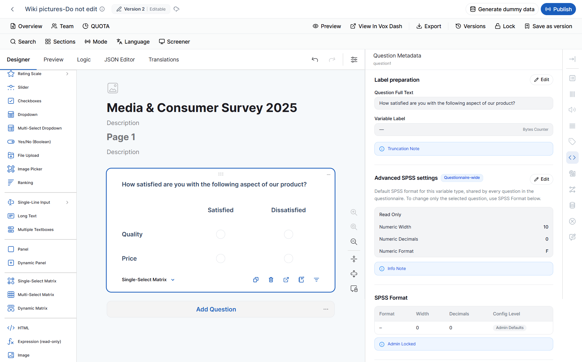
A **Single-select Matrix** displays multiple rows in a table and allows respondents to select **one answer per row**.
It supports Radio Button settings.
### 10 Single-select Matrix
A **Single-select Matrix** displays multiple rows in a table and allows respondents to select **one answer per row**.
It supports Radio Button settings.
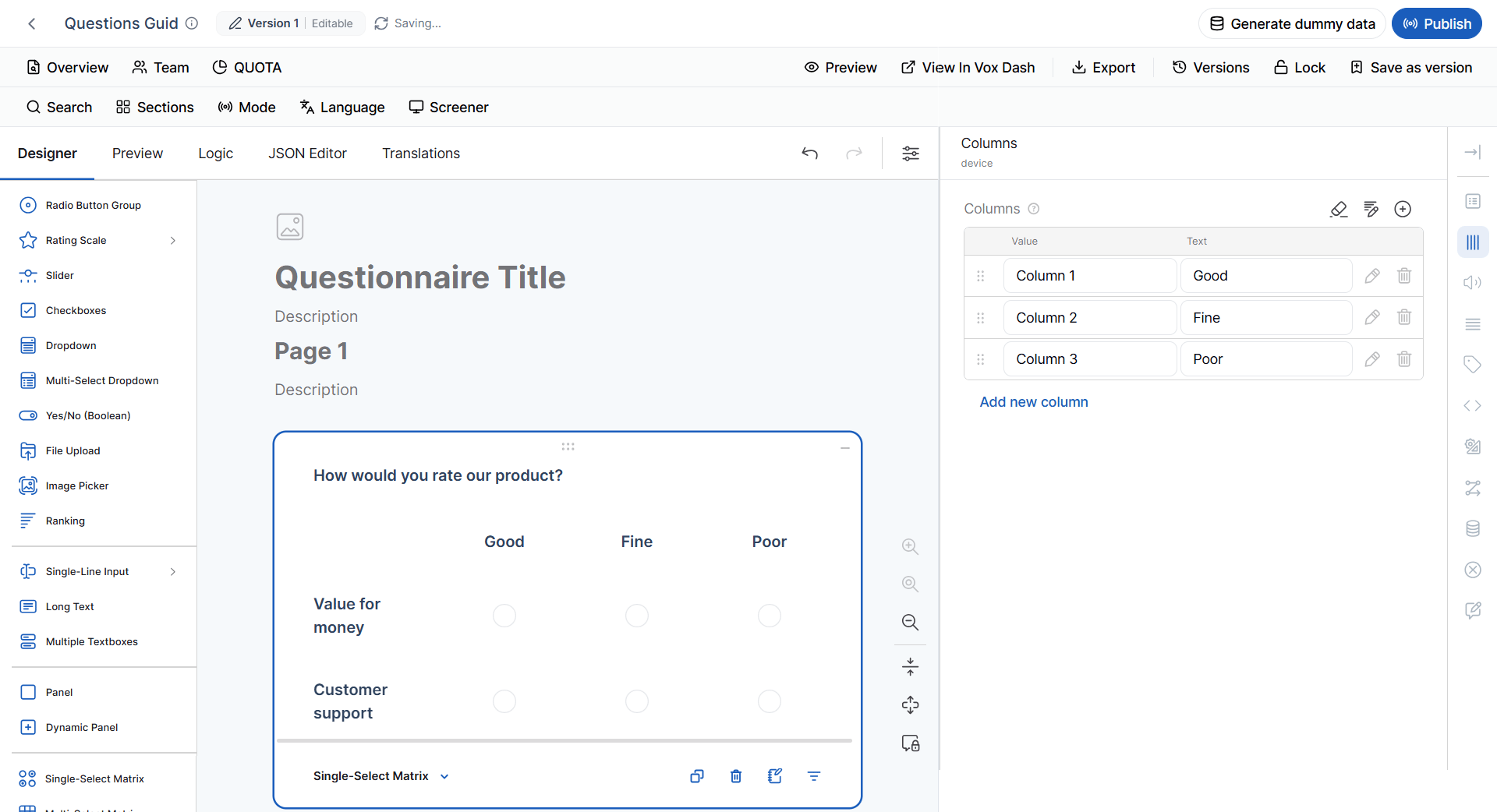
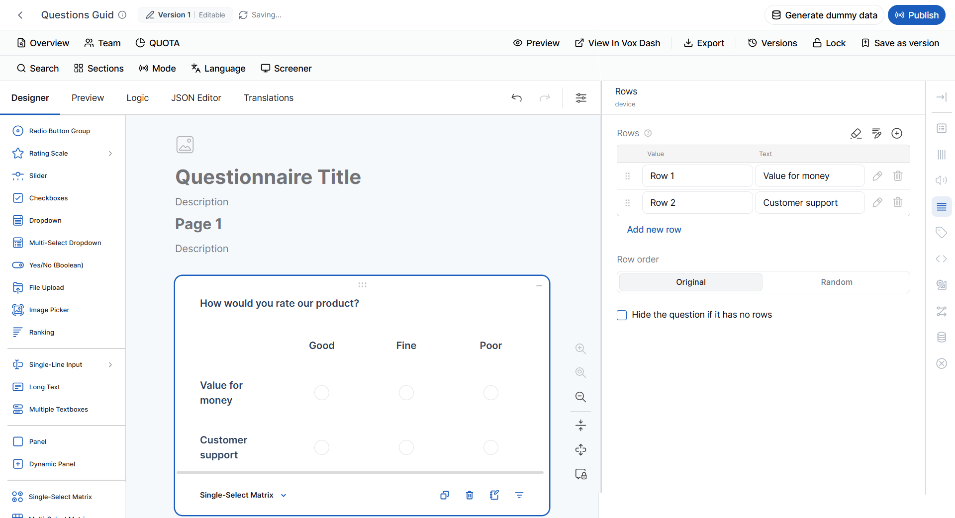 #### Additional Settings
You can configure:
* Row labels
* Column labels
* Horizontal layout
* Vertical layout
**Example:**
| Product | Very dissatisfied | Dissatisfied | Satisfied | Very satisfied |
| --------- | ----------------- | ------------ | --------- | -------------- |
| Product A | ○ | ○ | ○ | ○ |
| Product B | ○ | ○ | ○ | ○ |
#### SPSS Metadata
The Single-select Matrix does not create one standalone SPSS variable for the entire matrix.
Instead, metadata is handled **per cell**.
> **Important:** When reviewing the SPSS export of a Single-select Matrix, consider each response cell separately rather than treating the matrix as one variable.
The provided metadata source specifies **per-cell metadata** but does not provide a single `F10.0`/Numeric/measurement-level mapping for the entire matrix.
#### Additional Settings
You can configure:
* Row labels
* Column labels
* Horizontal layout
* Vertical layout
**Example:**
| Product | Very dissatisfied | Dissatisfied | Satisfied | Very satisfied |
| --------- | ----------------- | ------------ | --------- | -------------- |
| Product A | ○ | ○ | ○ | ○ |
| Product B | ○ | ○ | ○ | ○ |
#### SPSS Metadata
The Single-select Matrix does not create one standalone SPSS variable for the entire matrix.
Instead, metadata is handled **per cell**.
> **Important:** When reviewing the SPSS export of a Single-select Matrix, consider each response cell separately rather than treating the matrix as one variable.
The provided metadata source specifies **per-cell metadata** but does not provide a single `F10.0`/Numeric/measurement-level mapping for the entire matrix.
 ### 11 Multi-select Matrix
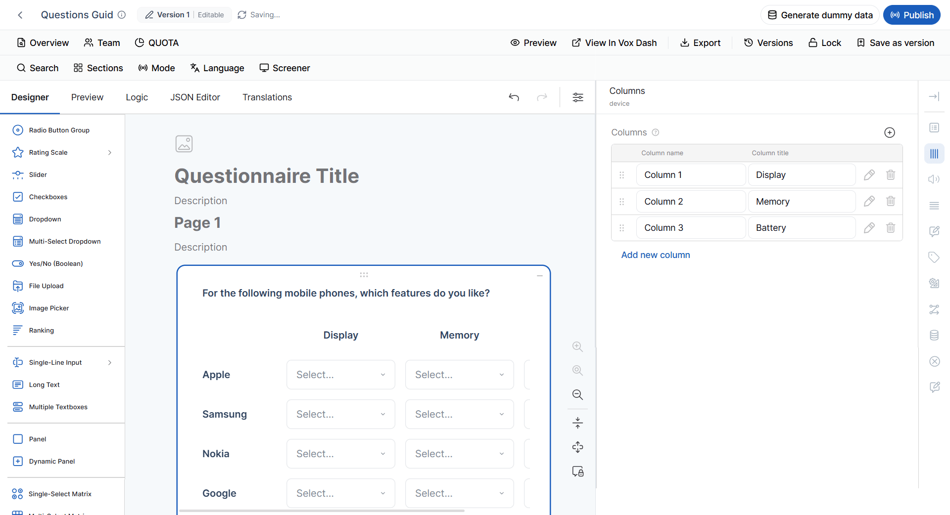
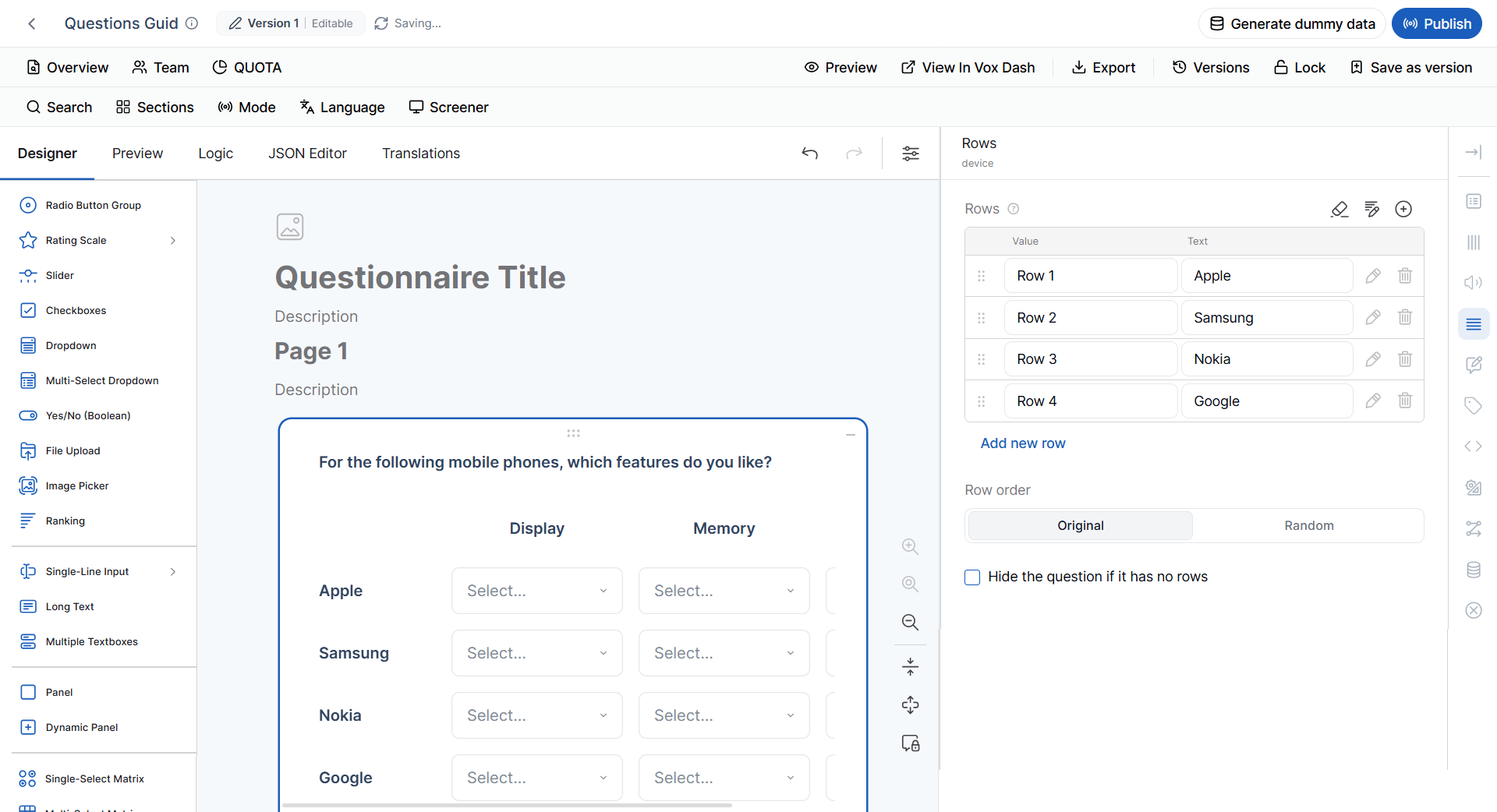
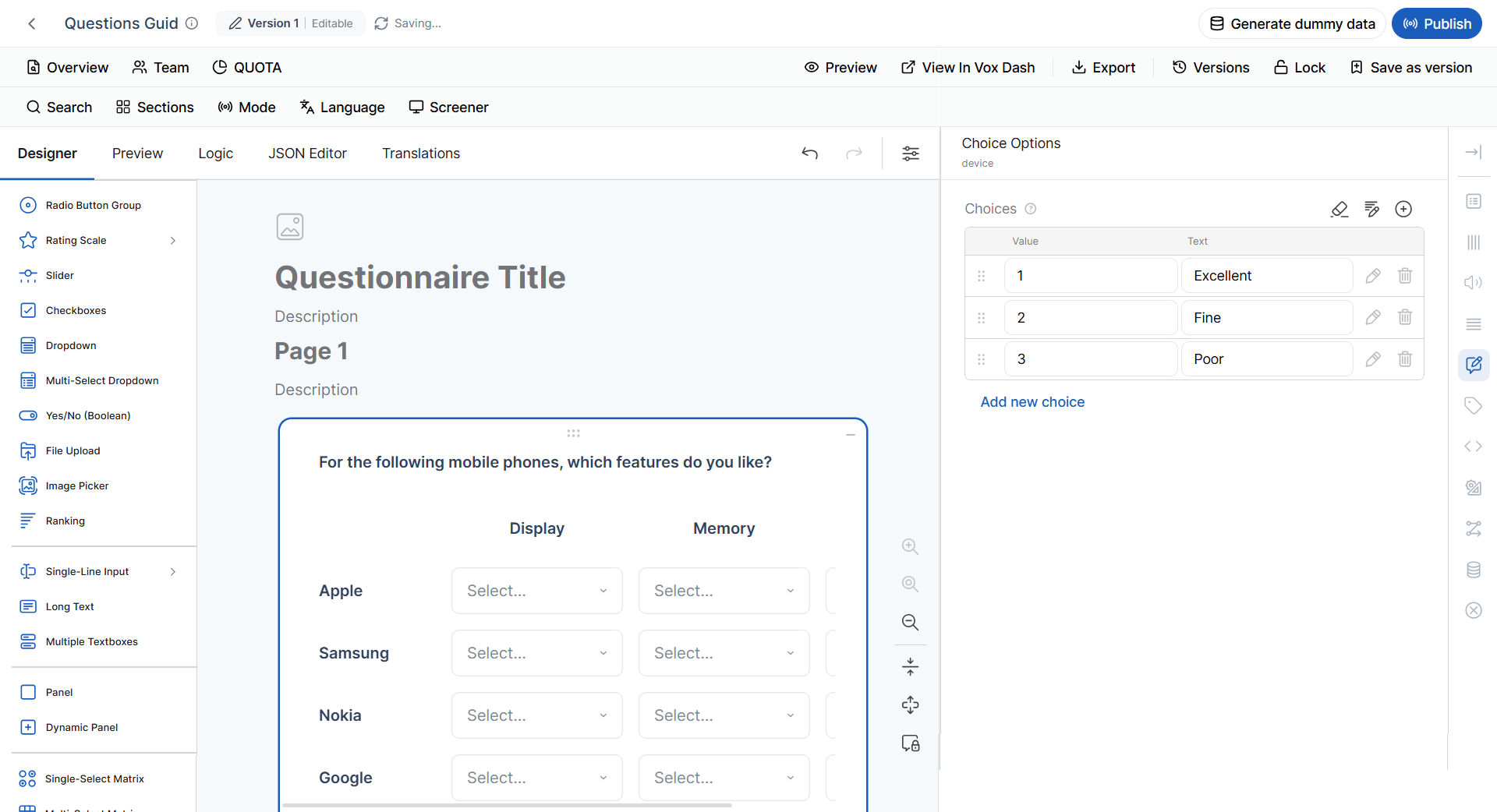
A **Multi-select Matrix** allows respondents to select **multiple answers per row**.
It supports Checkbox settings.
You can configure:
* Rows
* Columns
* Choice items
* Layout
Use this question type when respondents may need to select multiple attributes for each row.
### 11 Multi-select Matrix
A **Multi-select Matrix** allows respondents to select **multiple answers per row**.
It supports Checkbox settings.
You can configure:
* Rows
* Columns
* Choice items
* Layout
Use this question type when respondents may need to select multiple attributes for each row.
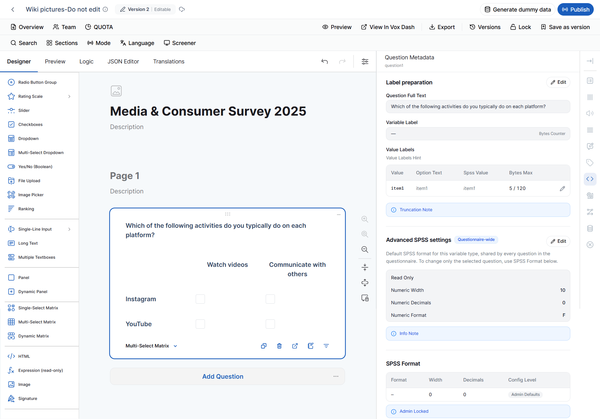
 #### SPSS Metadata
The Multi-select Matrix is handled at the **column level**.
It does not create one standalone SPSS variable for the entire matrix.
> **Important:** Review metadata for each matrix column when preparing or validating the SPSS export.
The current metadata rules specify **per-column metadata** for Multi-select Matrix questions but do not provide one standalone metadata mapping for the matrix itself.
#### SPSS Metadata
The Multi-select Matrix is handled at the **column level**.
It does not create one standalone SPSS variable for the entire matrix.
> **Important:** Review metadata for each matrix column when preparing or validating the SPSS export.
The current metadata rules specify **per-column metadata** for Multi-select Matrix questions but do not provide one standalone metadata mapping for the matrix itself.
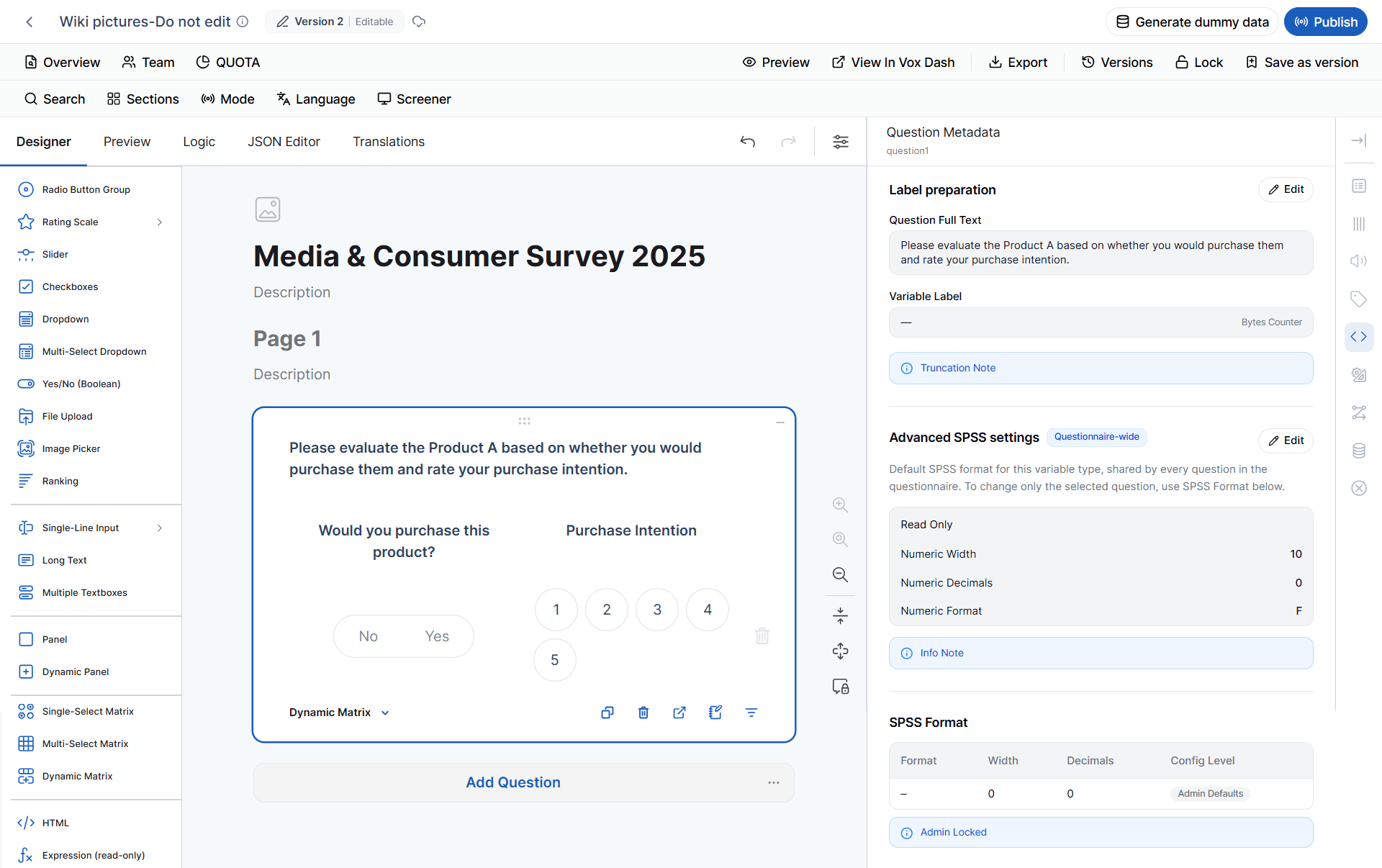
 ### 12 Dynamic Matrix
A **Dynamic Matrix** creates a table where each column can have its own input type, validation, visibility, and conditional logic.
For example:
| Product | Quantity | Purchase Date | Available |
| --------- | -------: | ------------- | --------- |
| Product A | 2 | 2026-08-01 | ✓ |
| Product B | 5 | 2026-08-03 | ✓ |
Each column can behave differently.
To configure a column:
1. Select the **Dynamic Matrix**.
2. Select the column.
3. The **Column Settings** panel appears.
4. Configure the column settings.
#### SPSS Metadata
A Dynamic Matrix does not create one standalone SPSS variable for the entire matrix.
SPSS metadata is handled **per column**.
This is important because each column may use a different **Cell Input Type**, which can affect its data representation.
> **Important:** Review each Dynamic Matrix column individually when validating SPSS metadata.
The provided metadata source specifies **per-column metadata** for Dynamic Matrix questions but does not define one default SPSS format for the matrix as a whole.
### 12 Dynamic Matrix
A **Dynamic Matrix** creates a table where each column can have its own input type, validation, visibility, and conditional logic.
For example:
| Product | Quantity | Purchase Date | Available |
| --------- | -------: | ------------- | --------- |
| Product A | 2 | 2026-08-01 | ✓ |
| Product B | 5 | 2026-08-03 | ✓ |
Each column can behave differently.
To configure a column:
1. Select the **Dynamic Matrix**.
2. Select the column.
3. The **Column Settings** panel appears.
4. Configure the column settings.
#### SPSS Metadata
A Dynamic Matrix does not create one standalone SPSS variable for the entire matrix.
SPSS metadata is handled **per column**.
This is important because each column may use a different **Cell Input Type**, which can affect its data representation.
> **Important:** Review each Dynamic Matrix column individually when validating SPSS metadata.
The provided metadata source specifies **per-column metadata** for Dynamic Matrix questions but does not define one default SPSS format for the matrix as a whole.
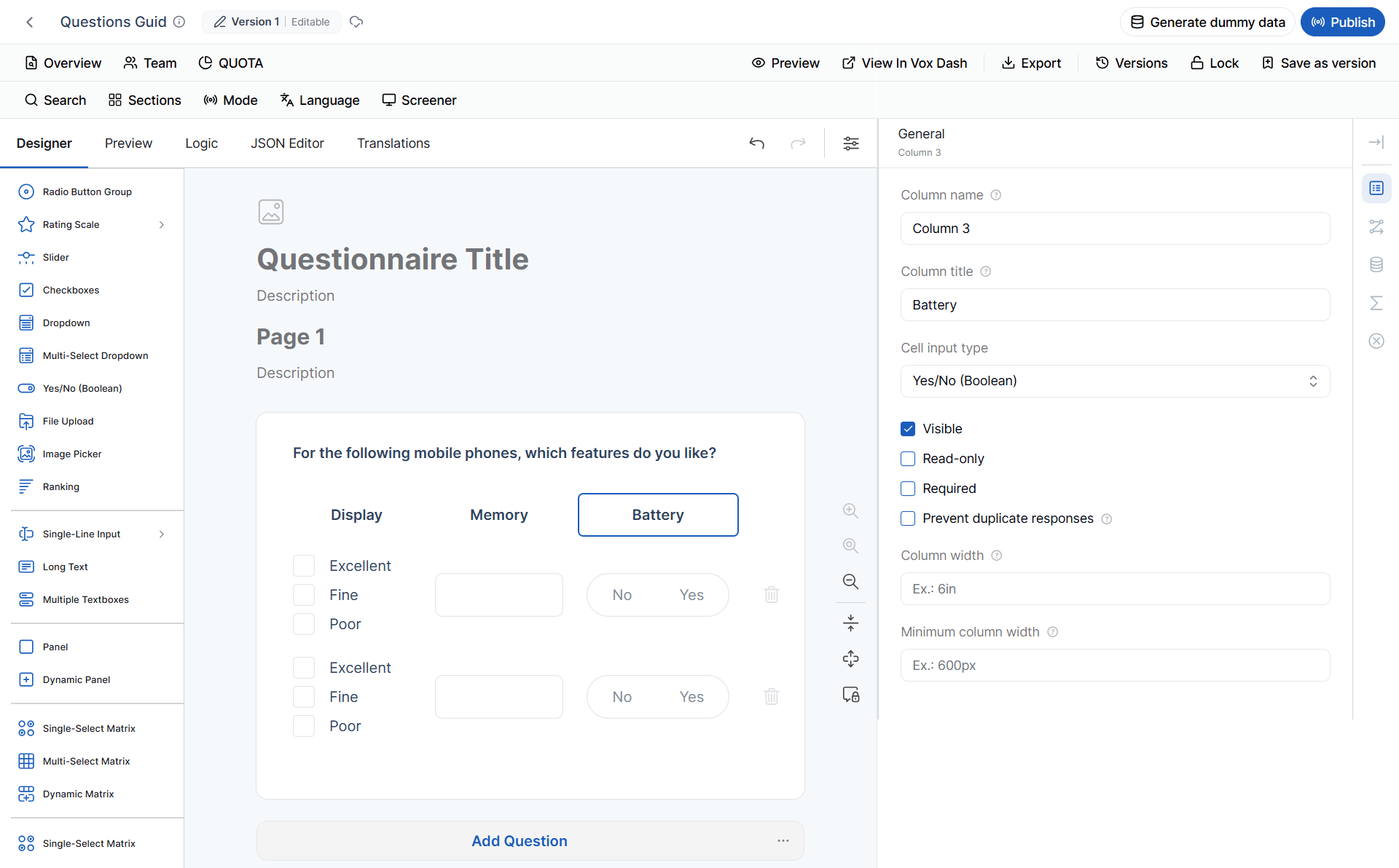
 #### 12.1 General Column Settings
**Column Name**
The internal identifier for the column.
Used in:
* Logic
* Conditions
* JSON
* Data exports
**Column Title**
The text displayed as the column header.
**Cell Input Type**
Defines the type of input displayed in each cell.
Depending on the configuration, available types may include:
* Text
* Number
* Dropdown
* Checkbox
* Date
* Rating
* Email
* Phone Number
* URL
* Other supported input types
**Visible**
Determines whether the column is displayed to respondents.
A column can be hidden while still being used internally.
**Read-only**
Prevents respondents from editing values.
Use this for calculated or automatically populated columns.
**Required**
Makes the column mandatory.
**Prevent Duplicate Responses**
Prevents duplicate values from being entered within the same column.
**Column Width**
Defines the width of the column.
**Minimum Column Width**
Defines the minimum width before the column automatically resizes or wraps.
#### 12.1 General Column Settings
**Column Name**
The internal identifier for the column.
Used in:
* Logic
* Conditions
* JSON
* Data exports
**Column Title**
The text displayed as the column header.
**Cell Input Type**
Defines the type of input displayed in each cell.
Depending on the configuration, available types may include:
* Text
* Number
* Dropdown
* Checkbox
* Date
* Rating
* Email
* Phone Number
* URL
* Other supported input types
**Visible**
Determines whether the column is displayed to respondents.
A column can be hidden while still being used internally.
**Read-only**
Prevents respondents from editing values.
Use this for calculated or automatically populated columns.
**Required**
Makes the column mandatory.
**Prevent Duplicate Responses**
Prevents duplicate values from being entered within the same column.
**Column Width**
Defines the width of the column.
**Minimum Column Width**
Defines the minimum width before the column automatically resizes or wraps.
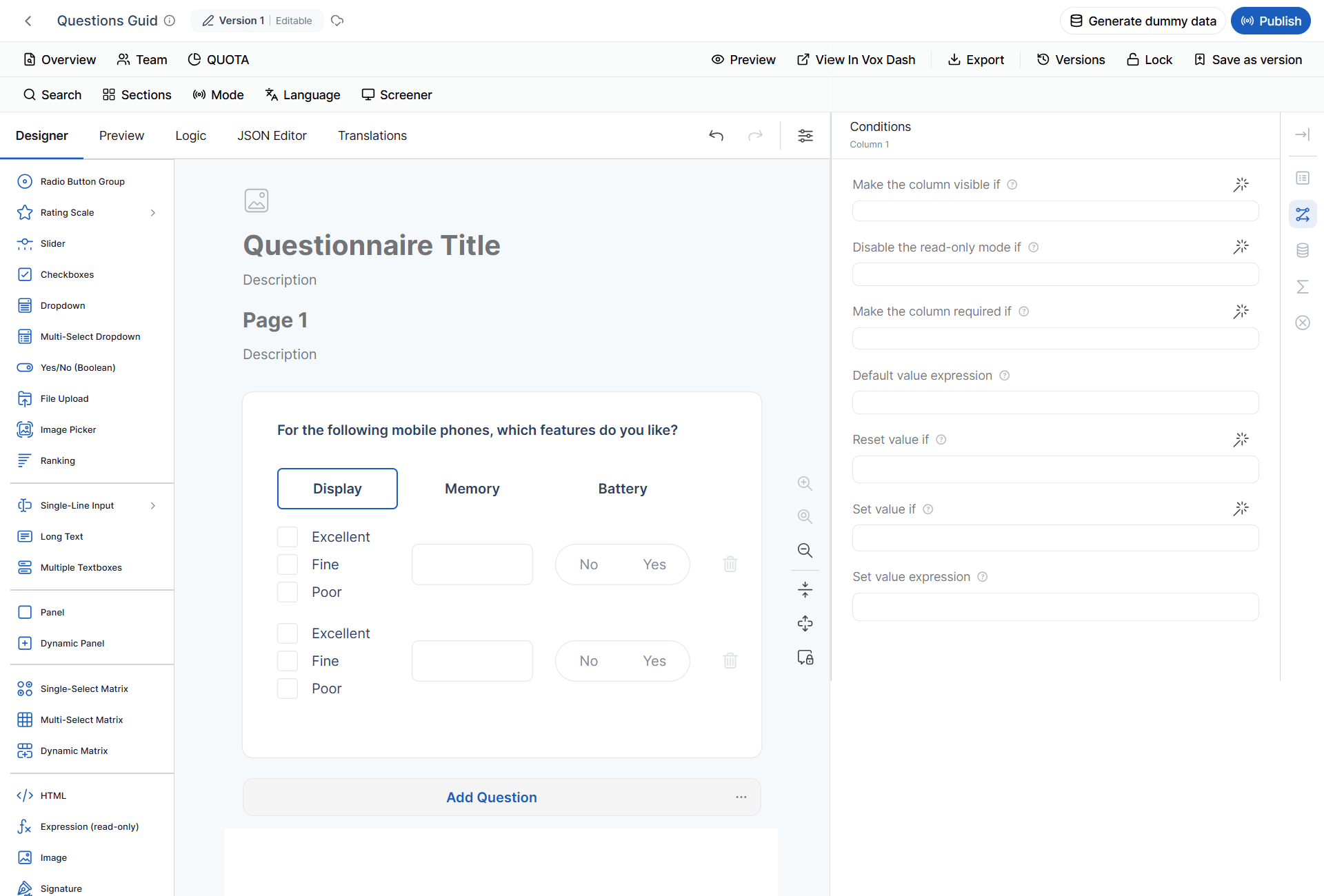
 #### 12.2 Column Conditions
Dynamic Matrix columns support conditional logic.
Click the **Magic Wand** icon to configure expressions.
**Make the Column Visible If**
Displays the column only when the specified condition is true.
**Disable Read-only Mode If**
Makes a read-only column editable when the condition becomes true.
**Make the Column Required If**
Makes the column required only when the condition is satisfied.
**Default Value Expression**
Automatically assigns an initial value.
Examples:
```text theme={null}
today()
```
```text theme={null}
iif({age} >= 18, "Adult", "Minor")
```
**Reset Value If**
Clears or resets the cell value when a specified condition is met.
**Set Value If**
Defines when VoxDash should automatically assign a value.
**Set Value Expression**
Defines the value assigned when **Set Value If** evaluates to true.
The calculated value remains editable unless **Read-only** is enabled.
#### 12.2 Column Conditions
Dynamic Matrix columns support conditional logic.
Click the **Magic Wand** icon to configure expressions.
**Make the Column Visible If**
Displays the column only when the specified condition is true.
**Disable Read-only Mode If**
Makes a read-only column editable when the condition becomes true.
**Make the Column Required If**
Makes the column required only when the condition is satisfied.
**Default Value Expression**
Automatically assigns an initial value.
Examples:
```text theme={null}
today()
```
```text theme={null}
iif({age} >= 18, "Adult", "Minor")
```
**Reset Value If**
Clears or resets the cell value when a specified condition is met.
**Set Value If**
Defines when VoxDash should automatically assign a value.
**Set Value Expression**
Defines the value assigned when **Set Value If** evaluates to true.
The calculated value remains editable unless **Read-only** is enabled.
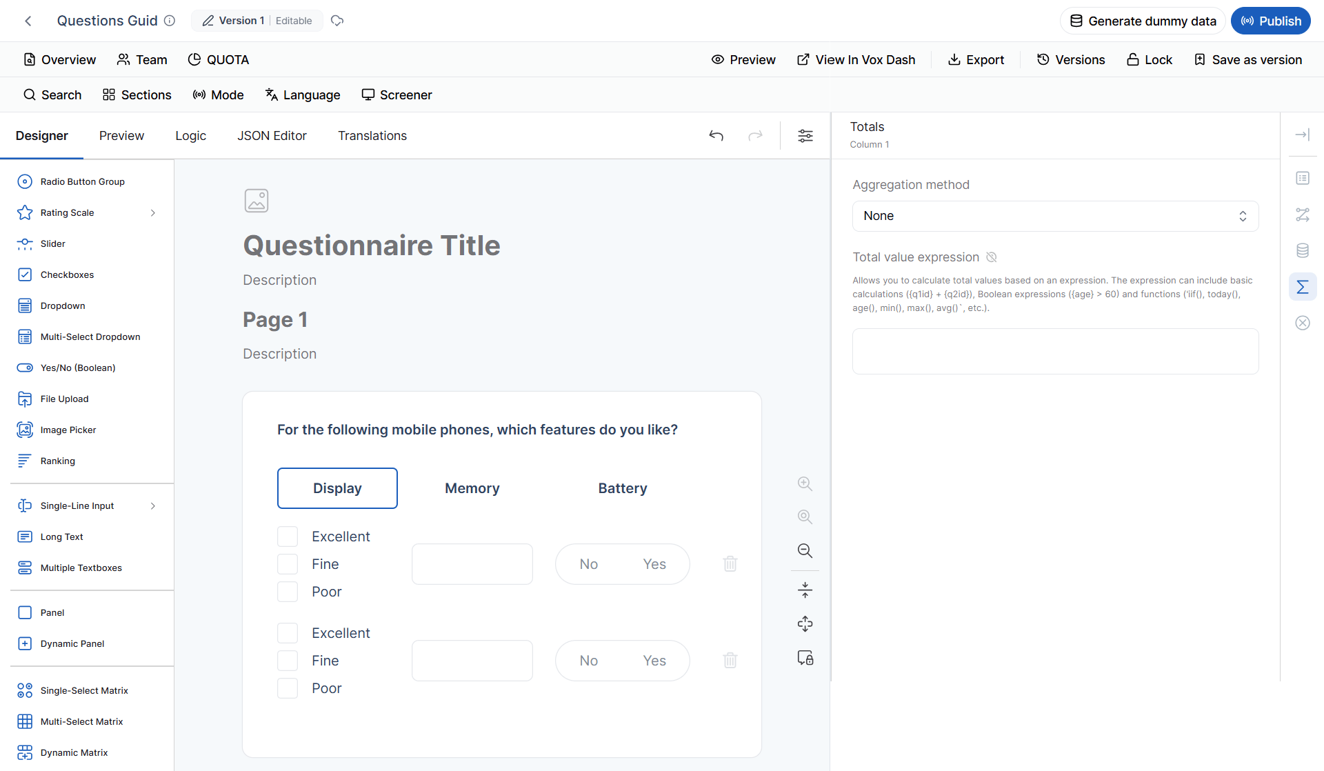
 #### 12.3 Column Totals
The **Totals** section allows you to summarize values in numeric columns.
**Aggregation Method**
Available options may include:
* None
* Sum
* Average
* Minimum
* Maximum
* Count
Available methods depend on the column type.
**Total Value Expression**
Allows you to define a custom calculation instead of using a standard aggregation.
This can be useful for:
* Total cost
* Weighted scores
* Custom metrics
* Calculated performance values
#### 12.3 Column Totals
The **Totals** section allows you to summarize values in numeric columns.
**Aggregation Method**
Available options may include:
* None
* Sum
* Average
* Minimum
* Maximum
* Count
Available methods depend on the column type.
**Total Value Expression**
Allows you to define a custom calculation instead of using a standard aggregation.
This can be useful for:
* Total cost
* Weighted scores
* Custom metrics
* Calculated performance values
 #### 12.4 Column Validation
Validation rules ensure that respondents enter valid and consistent data.
Depending on the selected Cell Input Type, you may be able to configure:
* Required values
* Minimum and maximum values
* Minimum and maximum text length
* Email validation
* URL validation
* Regular expression validation
* Custom validation rules
* Custom validation messages
Dynamic Matrix is particularly useful for repeating structured information such as:
* Purchased products
* Household members
* Previous employers
* Expenses
* Project items
### Question Tags
Question tags classify questions and can enable or control specific questionnaire functionality.
Tag availability depends on:
* Question type
* Input type
* Data structure
* Supported functionality
* System limitations
When you select a question in the **Editor Panel**, VoxDash displays the tags supported by that question.
You do not need to manually determine compatibility.
> **Important:** A tag being unavailable does not necessarily mean that the question is incorrectly configured. It may simply mean that the selected question type or input type does not support the tag.
#### Administrative Tag
The **Administrative** tag is available for all question types.
Use it for internal or operational information rather than standard respondent-facing survey content.
Examples include:
* Interview information
* Project information
* Internal identifiers
* Processing information
* Fieldwork information
Because administrative information can be associated with almost any questionnaire element, the tag is intentionally available across question types.
#### Screener Tag
The **Screener** tag can be applied to any question type.
A screener question determines whether a respondent is eligible for a survey or a specific part of it.
**Example:**
> Which of the following best describes your employment status?
The answer could determine whether the respondent proceeds to the next section.
**Screener Without Logic**
Adding the **Screener** tag does **not** automatically create screening logic.
For example:
> Have you purchased a laptop in the last 12 months?
The question can be tagged as Screener, but if no skip, termination, or other logic has been configured, it does not actually screen respondents.
In this situation, VoxDash does not block:
* Export
* Dummy-data generation
Instead, it displays a warning indicating that a screener question does not have corresponding logic.
This allows users to continue while highlighting a potential configuration issue.
> **Best Practice:** Whenever you use the Screener tag, verify that the question has the appropriate skip, termination, or conditional logic.
#### Demographic Tag
The **Demographic** tag identifies questions related to demographic information.
Examples include:
* Age
* Gender
* Education
* Occupation
* Income
* Household size
* Location
The tag is broadly available because demographic information can be collected using different question formats.
For example, age can be collected using:
* Number
* Dropdown
* Radio Button
* Text
#### Quota Tag
The **Quota** tag is more restricted because the question must provide response data that can be meaningfully used for quota management.
A quota defines a target or limit for specific response categories.
**Example:**
> What is your age group?
* 18–24
* 25–34
* 35–44
* 45+
A quota can be configured for each age-group option.
**Quota and Image Picker**
Image Picker questions can also be used for quotas.
When images are uploaded as selectable options, they appear as options when creating a quota.
A separate quota can then be configured for each image.
This applies to:
* Image Picker (Single)
* Image Picker (Multi)
**Quota and Text Input Types**
Quota availability for Text questions requires additional consideration.
A Text question can use multiple HTML5 input types, including:
* Text
* Number
* Date
* Email
* URL
* Color
* Other supported input types
These input types do not necessarily behave in the same way.
For example:
> **Color input does not support Quota in the current MVP.**
The reason is that a color picker does not provide the same predefined categorical response structure as a standard choice question.
Therefore:
> **For Text questions, question type alone is not enough to determine tag compatibility. The specific `inputType` must also be considered.**
#### Auto Code Tag
The **Auto Code** tag identifies questions whose values are populated automatically by VoxDash or an interviewer rather than directly by the respondent.
Auto Code is not available for every question type.
Currently, Auto Code is disabled for:
* HTML
* Image
* File Upload
* Dynamic Panel
For supported question types, Auto Code can be used for:
* Response IDs
* Interview outcomes
* Timestamps
* Internal processing values
* Interviewer-entered metadata
These restrictions exist because the unsupported elements do not support Auto Code behavior in the same way as supported question types.
#### Geo Map Tag
The **Geo Map** tag identifies questions associated with geographic information.
A specific map does **not** need to be selected before applying the tag.
This means a question can be tagged as Geo Map while the actual map configuration is added later.
**Open-ended Questions and Geo Map**
Open-ended questions can also use the Geo Map tag.
**Example:**
> Which city do you currently live in?
The respondent can enter the city as text while the question is still classified as geographic data.
> **Important:** The Geo Map tag indicates that a question is associated with geographic data. It does not necessarily mean that a specific map has already been configured.
#### In-House Randomization Tag
The **In-House Randomization** tag identifies questions that participate in VoxDash's internal randomization functionality.
Depending on the question type and configuration, randomization can be used to:
* Randomize answer choices
* Rotate questions
* Reduce order bias
* Reduce position effects
* Support experimental designs
Not every question type supports the same randomization behavior.
The tag is therefore available only where the relevant randomization functionality can be supported.
#### Multi-Language Tag
The **Multi-Language** tag identifies questions associated with a specific questionnaire language.
It is useful when one questionnaire contains multiple language versions.
For example:
* English
* Persian
* German
A question can be assigned a language tag indicating the language version in which it should be included.
**Multi-Language and Exports**
The Multi-Language tag affects language-specific questionnaire exports.
When exporting a questionnaire for a selected language, VoxDash includes:
1. Questions tagged with the selected language.
2. Questions with **no Multi-Language tag**.
Questions tagged with another language are excluded.
**Example**
| Question | Language Tag | English Export |
| -------- | ------------ | -------------- |
| Q1 | None | Included |
| Q2 | English | Included |
| Q3 | French | Excluded |
| Q4 | German | Excluded |
This allows multiple language versions to be maintained in one questionnaire.
> **Important:** The Multi-Language tag is not only a classification label. It actively affects which questions are included in language-specific exports.
#### Tags on Panels and Dynamic Panels
**Panel** and **Dynamic Panel** elements can contain other questions.
For example:
**Customer Information Panel**
* Name
* Age
* Gender
* Email
When a tag is applied to a Panel, the tag can cascade to its child questions.
This is called **tag cascading**.
Cascading is reflected across:
* Survey JSON
* Data Map exports
* Question card UI
* Tag filters
**Example**
Instead of applying the **Administrative** tag individually to ten questions, apply it to the parent Panel.
The child questions are then treated as having the Administrative tag as well.
This makes it easier to manage groups of related questions consistently.
### Tag Availability by Question Type
Not every tag is available for every question.
The general rule is:
> **A tag is available when the selected question type and its configuration support the functionality provided by that tag.**
For example:
| Tag | General Availability |
| ---------------------- | ----------------------------------------- |
| Administrative | All question types |
| Screener | All question types |
| Demographic | Broadly available |
| Quota | Requires compatible response data |
| Auto Code | Restricted by question type |
| Geo Map | Geographic data |
| In-House Randomization | Requires supported randomization behavior |
| Multi-Language | Language-specific questionnaire behavior |
These rules may also depend on the selected **input type**.
### Why Are Some Tags Unavailable?
There are two main reasons:
**Functional limitations**
The question type does not provide the data or behavior required by the tag.
**Technical limitations**
The feature may theoretically make sense for a question, but the underlying system does not currently support it.
VoxDash disables unsupported tags to prevent users from creating configurations that appear valid but would not work correctly during questionnaire execution, export, or data processing.
### Troubleshooting Tag Availability
#### A tag is not available
Check the following:
1. The selected question type.
2. The selected input type.
3. Whether the question has the required choice structure.
4. Whether the feature is supported by that question type.
5. Whether the question is inside a Panel or Dynamic Panel.
6. Whether another configuration is required.
#### Quota is unavailable
If **Quota** is unavailable:
1. Check the question type.
2. If it is a Text question, check the **inputType**.
3. Check whether the response structure can provide meaningful quota categories.
For example, **Color** input does not support Quota in the current MVP.
#### Screener warning appears
If VoxDash warns that a Screener question has no logic:
1. Locate the question.
2. Open its conditional logic.
3. Check whether skip, termination, visibility, or other screening logic has been configured.
4. Test the questionnaire with both qualifying and non-qualifying responses.
#### A question is missing from a language export
Check the question's Multi-Language tag.
A question is included when:
* It has the selected language tag, or
* It has no language tag.
A question tagged only with another language is excluded.
## Best Practices
Follow these practices when configuring questions:
* **Use clear question names**
Use descriptive internal names such as:
**employment\_status** instead of: **q12**
* **Keep question titles respondent-friendly**
Write titles that clearly explain what respondents should provide.
* **Use descriptions when necessary**
Avoid putting long instructions into the question title. Use the description for additional guidance.
* **Test conditional logic**
Test both sides of a condition to make sure questions appear, disappear, become required, or become editable correctly.
* **Check the input type**
For Single-line Input and Text questions, always verify the selected **inputType** before configuring tags or validation.
* **Use Panel-level tags**
When multiple questions share the same classification, use a Panel-level tag where appropriate instead of tagging each question individually.
* **Validate Dynamic Matrix data**
Use column validation to prevent invalid or inconsistent data from entering the dataset.
* **Test language exports**
Preview or export each required language before publishing the questionnaire.
* **Test quota behavior**
Verify that the response categories used for quotas are correctly configured and available.
* **Preview before publishing**
Always preview the questionnaire after making significant changes.
Check:
* Question visibility
* Required behavior
* Read-only behavior
* Choice availability
* Validation messages
* Calculated values
* Hidden values
* Tags
* Language-specific exports
* Quota configuration
## Summary
VoxDash provides a flexible question configuration system that combines **question types, input types, general settings, conditional logic, validation, data settings, and tags**.
These features allow you to control both:
* **How respondents interact with the questionnaire**
* **How the resulting data is structured and processed**
The most important concept to remember is:
> **The question type determines the basic behavior, but the selected input type and configuration determine which additional features and tags are available.**
When a feature or tag is unavailable, first check the **question type, input type, and current configuration** before changing the question itself.
Finally, always **preview and test the questionnaire** before publishing to ensure that the respondent experience, logic, validation, data collection, tags, quotas, and exports work as expected.
#### 12.4 Column Validation
Validation rules ensure that respondents enter valid and consistent data.
Depending on the selected Cell Input Type, you may be able to configure:
* Required values
* Minimum and maximum values
* Minimum and maximum text length
* Email validation
* URL validation
* Regular expression validation
* Custom validation rules
* Custom validation messages
Dynamic Matrix is particularly useful for repeating structured information such as:
* Purchased products
* Household members
* Previous employers
* Expenses
* Project items
### Question Tags
Question tags classify questions and can enable or control specific questionnaire functionality.
Tag availability depends on:
* Question type
* Input type
* Data structure
* Supported functionality
* System limitations
When you select a question in the **Editor Panel**, VoxDash displays the tags supported by that question.
You do not need to manually determine compatibility.
> **Important:** A tag being unavailable does not necessarily mean that the question is incorrectly configured. It may simply mean that the selected question type or input type does not support the tag.
#### Administrative Tag
The **Administrative** tag is available for all question types.
Use it for internal or operational information rather than standard respondent-facing survey content.
Examples include:
* Interview information
* Project information
* Internal identifiers
* Processing information
* Fieldwork information
Because administrative information can be associated with almost any questionnaire element, the tag is intentionally available across question types.
#### Screener Tag
The **Screener** tag can be applied to any question type.
A screener question determines whether a respondent is eligible for a survey or a specific part of it.
**Example:**
> Which of the following best describes your employment status?
The answer could determine whether the respondent proceeds to the next section.
**Screener Without Logic**
Adding the **Screener** tag does **not** automatically create screening logic.
For example:
> Have you purchased a laptop in the last 12 months?
The question can be tagged as Screener, but if no skip, termination, or other logic has been configured, it does not actually screen respondents.
In this situation, VoxDash does not block:
* Export
* Dummy-data generation
Instead, it displays a warning indicating that a screener question does not have corresponding logic.
This allows users to continue while highlighting a potential configuration issue.
> **Best Practice:** Whenever you use the Screener tag, verify that the question has the appropriate skip, termination, or conditional logic.
#### Demographic Tag
The **Demographic** tag identifies questions related to demographic information.
Examples include:
* Age
* Gender
* Education
* Occupation
* Income
* Household size
* Location
The tag is broadly available because demographic information can be collected using different question formats.
For example, age can be collected using:
* Number
* Dropdown
* Radio Button
* Text
#### Quota Tag
The **Quota** tag is more restricted because the question must provide response data that can be meaningfully used for quota management.
A quota defines a target or limit for specific response categories.
**Example:**
> What is your age group?
* 18–24
* 25–34
* 35–44
* 45+
A quota can be configured for each age-group option.
**Quota and Image Picker**
Image Picker questions can also be used for quotas.
When images are uploaded as selectable options, they appear as options when creating a quota.
A separate quota can then be configured for each image.
This applies to:
* Image Picker (Single)
* Image Picker (Multi)
**Quota and Text Input Types**
Quota availability for Text questions requires additional consideration.
A Text question can use multiple HTML5 input types, including:
* Text
* Number
* Date
* Email
* URL
* Color
* Other supported input types
These input types do not necessarily behave in the same way.
For example:
> **Color input does not support Quota in the current MVP.**
The reason is that a color picker does not provide the same predefined categorical response structure as a standard choice question.
Therefore:
> **For Text questions, question type alone is not enough to determine tag compatibility. The specific `inputType` must also be considered.**
#### Auto Code Tag
The **Auto Code** tag identifies questions whose values are populated automatically by VoxDash or an interviewer rather than directly by the respondent.
Auto Code is not available for every question type.
Currently, Auto Code is disabled for:
* HTML
* Image
* File Upload
* Dynamic Panel
For supported question types, Auto Code can be used for:
* Response IDs
* Interview outcomes
* Timestamps
* Internal processing values
* Interviewer-entered metadata
These restrictions exist because the unsupported elements do not support Auto Code behavior in the same way as supported question types.
#### Geo Map Tag
The **Geo Map** tag identifies questions associated with geographic information.
A specific map does **not** need to be selected before applying the tag.
This means a question can be tagged as Geo Map while the actual map configuration is added later.
**Open-ended Questions and Geo Map**
Open-ended questions can also use the Geo Map tag.
**Example:**
> Which city do you currently live in?
The respondent can enter the city as text while the question is still classified as geographic data.
> **Important:** The Geo Map tag indicates that a question is associated with geographic data. It does not necessarily mean that a specific map has already been configured.
#### In-House Randomization Tag
The **In-House Randomization** tag identifies questions that participate in VoxDash's internal randomization functionality.
Depending on the question type and configuration, randomization can be used to:
* Randomize answer choices
* Rotate questions
* Reduce order bias
* Reduce position effects
* Support experimental designs
Not every question type supports the same randomization behavior.
The tag is therefore available only where the relevant randomization functionality can be supported.
#### Multi-Language Tag
The **Multi-Language** tag identifies questions associated with a specific questionnaire language.
It is useful when one questionnaire contains multiple language versions.
For example:
* English
* Persian
* German
A question can be assigned a language tag indicating the language version in which it should be included.
**Multi-Language and Exports**
The Multi-Language tag affects language-specific questionnaire exports.
When exporting a questionnaire for a selected language, VoxDash includes:
1. Questions tagged with the selected language.
2. Questions with **no Multi-Language tag**.
Questions tagged with another language are excluded.
**Example**
| Question | Language Tag | English Export |
| -------- | ------------ | -------------- |
| Q1 | None | Included |
| Q2 | English | Included |
| Q3 | French | Excluded |
| Q4 | German | Excluded |
This allows multiple language versions to be maintained in one questionnaire.
> **Important:** The Multi-Language tag is not only a classification label. It actively affects which questions are included in language-specific exports.
#### Tags on Panels and Dynamic Panels
**Panel** and **Dynamic Panel** elements can contain other questions.
For example:
**Customer Information Panel**
* Name
* Age
* Gender
* Email
When a tag is applied to a Panel, the tag can cascade to its child questions.
This is called **tag cascading**.
Cascading is reflected across:
* Survey JSON
* Data Map exports
* Question card UI
* Tag filters
**Example**
Instead of applying the **Administrative** tag individually to ten questions, apply it to the parent Panel.
The child questions are then treated as having the Administrative tag as well.
This makes it easier to manage groups of related questions consistently.
### Tag Availability by Question Type
Not every tag is available for every question.
The general rule is:
> **A tag is available when the selected question type and its configuration support the functionality provided by that tag.**
For example:
| Tag | General Availability |
| ---------------------- | ----------------------------------------- |
| Administrative | All question types |
| Screener | All question types |
| Demographic | Broadly available |
| Quota | Requires compatible response data |
| Auto Code | Restricted by question type |
| Geo Map | Geographic data |
| In-House Randomization | Requires supported randomization behavior |
| Multi-Language | Language-specific questionnaire behavior |
These rules may also depend on the selected **input type**.
### Why Are Some Tags Unavailable?
There are two main reasons:
**Functional limitations**
The question type does not provide the data or behavior required by the tag.
**Technical limitations**
The feature may theoretically make sense for a question, but the underlying system does not currently support it.
VoxDash disables unsupported tags to prevent users from creating configurations that appear valid but would not work correctly during questionnaire execution, export, or data processing.
### Troubleshooting Tag Availability
#### A tag is not available
Check the following:
1. The selected question type.
2. The selected input type.
3. Whether the question has the required choice structure.
4. Whether the feature is supported by that question type.
5. Whether the question is inside a Panel or Dynamic Panel.
6. Whether another configuration is required.
#### Quota is unavailable
If **Quota** is unavailable:
1. Check the question type.
2. If it is a Text question, check the **inputType**.
3. Check whether the response structure can provide meaningful quota categories.
For example, **Color** input does not support Quota in the current MVP.
#### Screener warning appears
If VoxDash warns that a Screener question has no logic:
1. Locate the question.
2. Open its conditional logic.
3. Check whether skip, termination, visibility, or other screening logic has been configured.
4. Test the questionnaire with both qualifying and non-qualifying responses.
#### A question is missing from a language export
Check the question's Multi-Language tag.
A question is included when:
* It has the selected language tag, or
* It has no language tag.
A question tagged only with another language is excluded.
## Best Practices
Follow these practices when configuring questions:
* **Use clear question names**
Use descriptive internal names such as:
**employment\_status** instead of: **q12**
* **Keep question titles respondent-friendly**
Write titles that clearly explain what respondents should provide.
* **Use descriptions when necessary**
Avoid putting long instructions into the question title. Use the description for additional guidance.
* **Test conditional logic**
Test both sides of a condition to make sure questions appear, disappear, become required, or become editable correctly.
* **Check the input type**
For Single-line Input and Text questions, always verify the selected **inputType** before configuring tags or validation.
* **Use Panel-level tags**
When multiple questions share the same classification, use a Panel-level tag where appropriate instead of tagging each question individually.
* **Validate Dynamic Matrix data**
Use column validation to prevent invalid or inconsistent data from entering the dataset.
* **Test language exports**
Preview or export each required language before publishing the questionnaire.
* **Test quota behavior**
Verify that the response categories used for quotas are correctly configured and available.
* **Preview before publishing**
Always preview the questionnaire after making significant changes.
Check:
* Question visibility
* Required behavior
* Read-only behavior
* Choice availability
* Validation messages
* Calculated values
* Hidden values
* Tags
* Language-specific exports
* Quota configuration
## Summary
VoxDash provides a flexible question configuration system that combines **question types, input types, general settings, conditional logic, validation, data settings, and tags**.
These features allow you to control both:
* **How respondents interact with the questionnaire**
* **How the resulting data is structured and processed**
The most important concept to remember is:
> **The question type determines the basic behavior, but the selected input type and configuration determine which additional features and tags are available.**
When a feature or tag is unavailable, first check the **question type, input type, and current configuration** before changing the question itself.
Finally, always **preview and test the questionnaire** before publishing to ensure that the respondent experience, logic, validation, data collection, tags, quotas, and exports work as expected.