- Explore response distributions.
- Compare data across different segments.
- Identify actionable insights for data-driven decision-making.
How to Get to the Question Page?
There are two ways to reach a single question page: 1. Navigate to Survey Questions List, then click on your desired question or use filters to find the question you’re looking for. 2. While you’re viewing the details of a data project, use the Questions section to view and analyze a question. Note: In the second method, you only have access to survey questions of a specific data project. If you want to view all survey questions from all available data projects, use the first method.Key Features of the Question Page
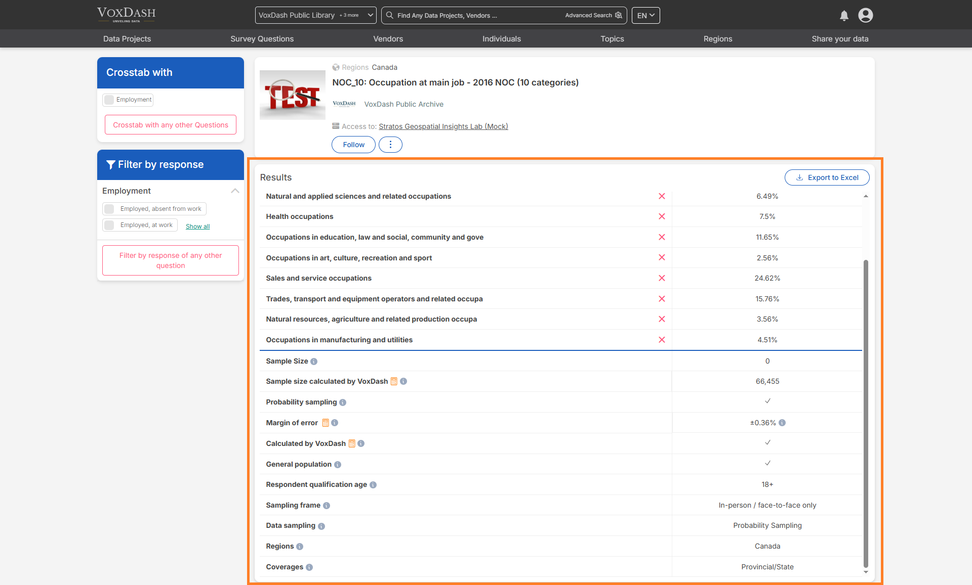
1. Detailed Response Analysis
Each question has a dedicated page displaying detailed response analysis. Users can:- View analysis results for each question individually.
- Gain a focused view of key data insights.
- Identify trends and patterns through visual aids.
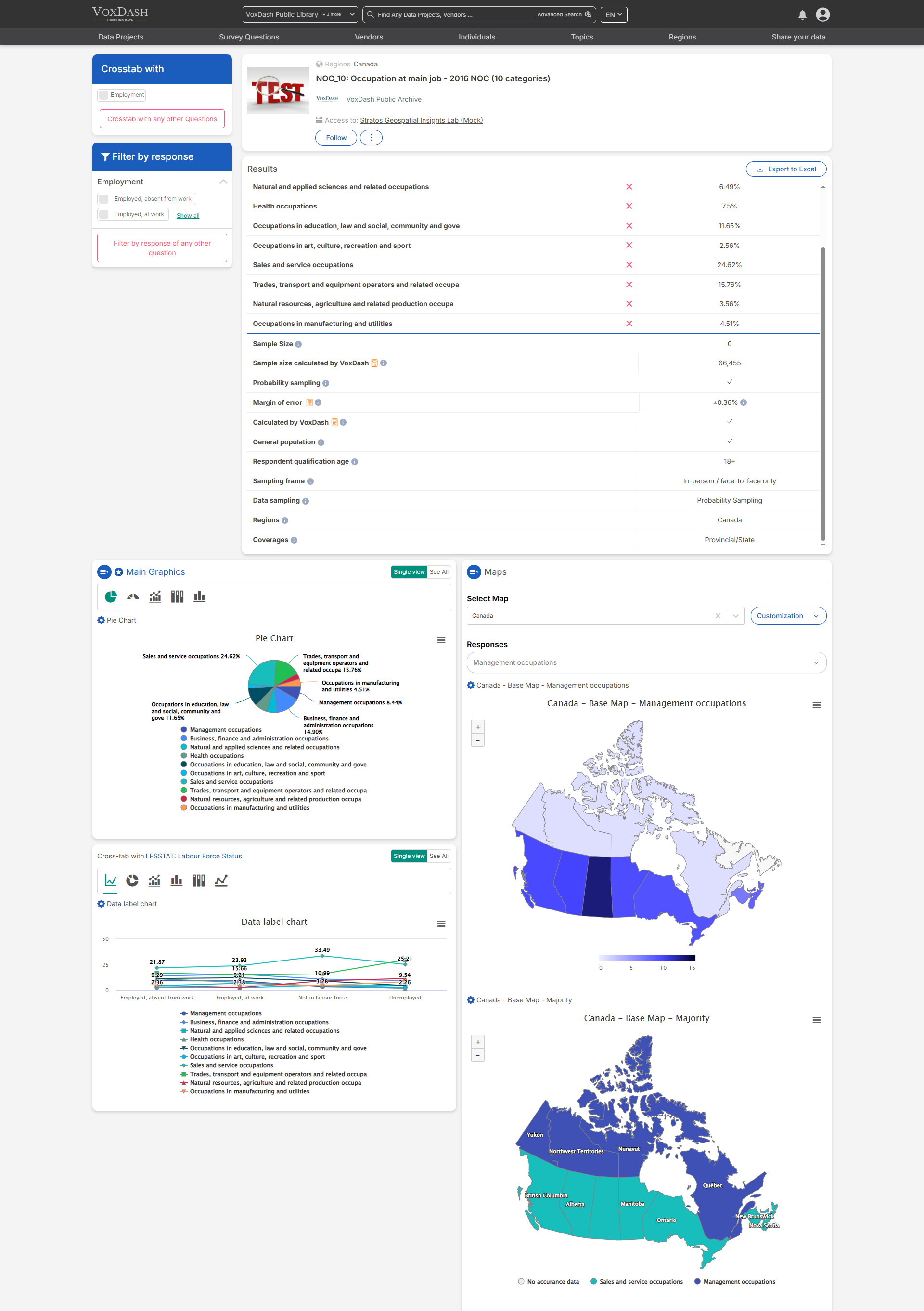
2. Survey Metrics Explained
Below are key terms to help interpret the data:- Sample Size: The number of people selected to participate in a survey or study.
- Margin of Error: Indicates how much the survey results might differ from the true population values.
- General Population: The entire group that the survey aims to represent.
- Respondent Qualification Age: The minimum or specific age required to participate in the survey.
- Data Sampling: The process of selecting a subset of people from a larger population to gather data.
- Regions: Geographic areas covered in the survey or study.
- Coverage: The extent to which the survey includes different groups within the target population.
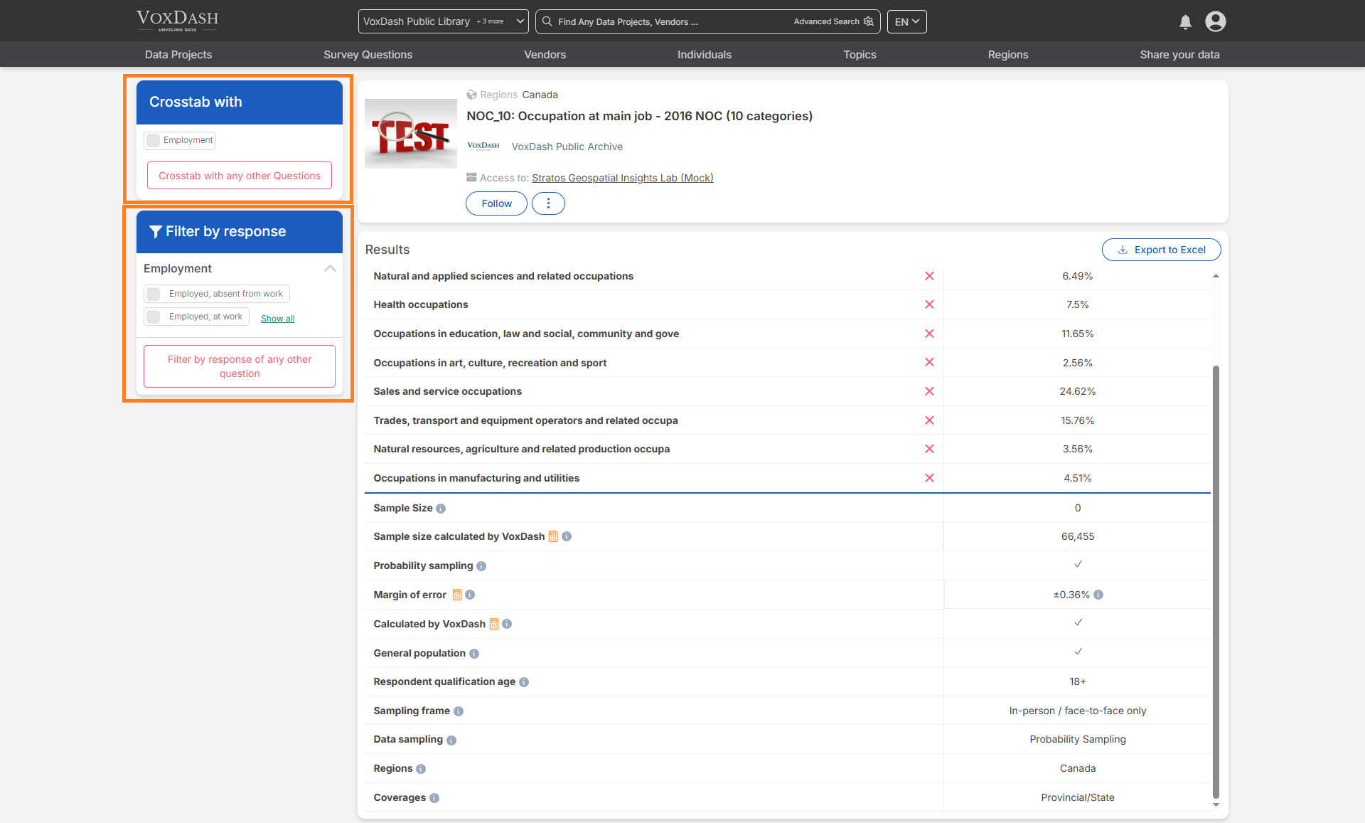
3. Filters and Shortcuts
Filters and shortcuts enhance data segmentation and analysis:- Shortcuts added during the second step of the survey data entry are displayed as filters on the left sidebar.
- These filters allow users to quickly segment responses, making it easier to derive meaningful insights.
- Users can also perform crosstab analysis by comparing responses to different questions.
4. Graphs and Maps
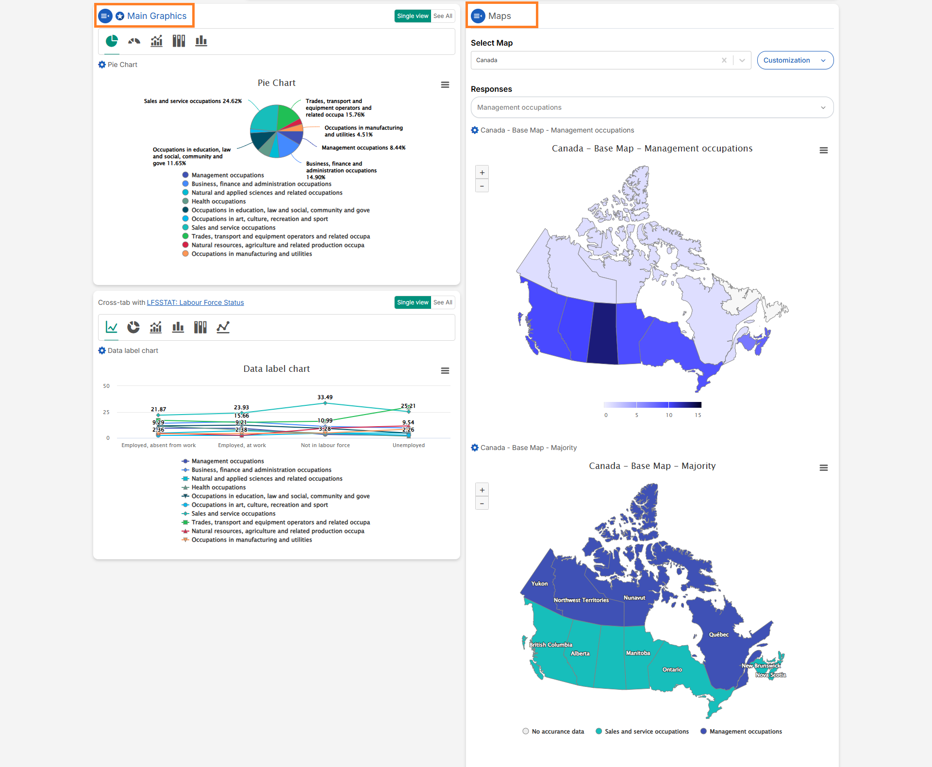
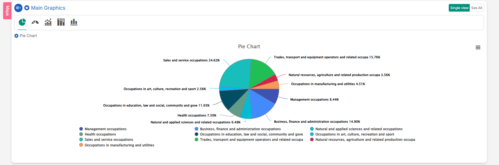
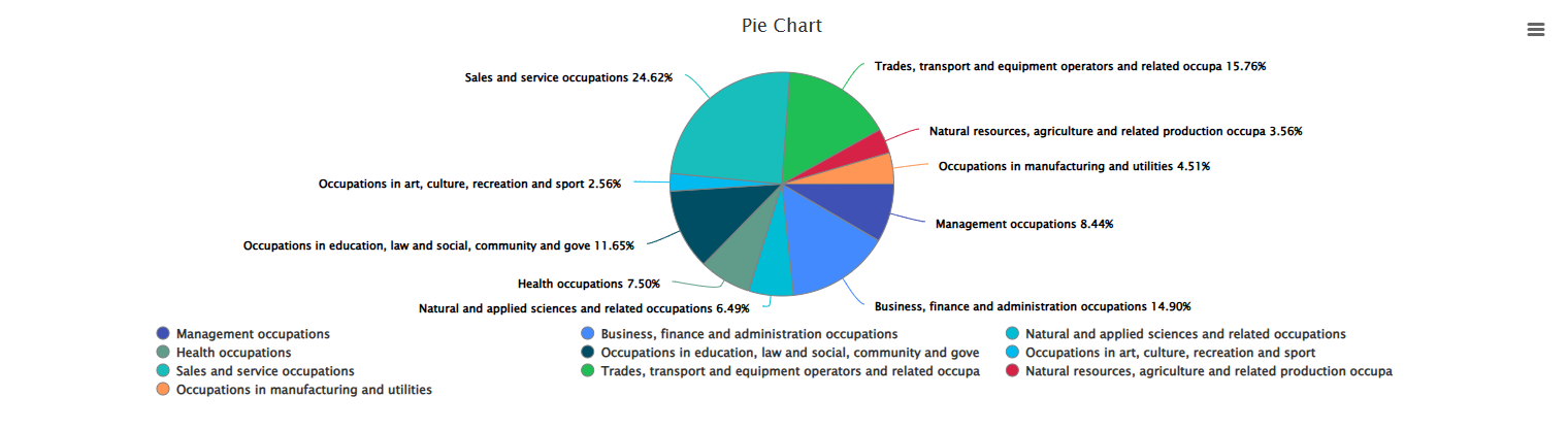
5. Available Charts
Users can scroll down to view five main chart types.- Pie Chart: Represents data as slices of a circle, with each slice proportional to the whole.
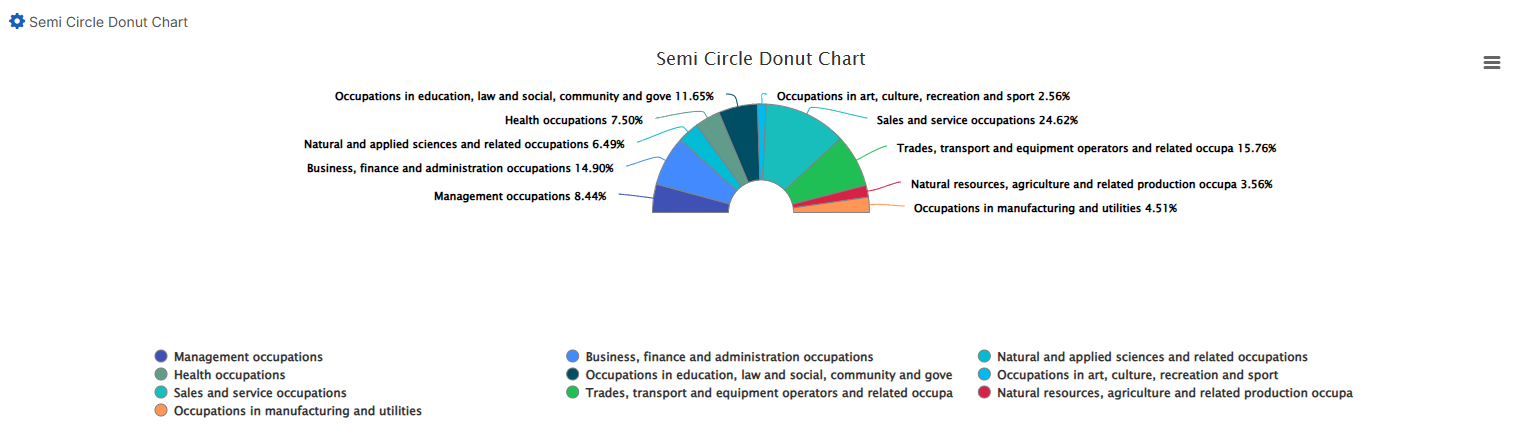
- Semi-Circle Donut Chart: A variation of the donut chart, shaped like a semi-circle, ideal for progress visualization.
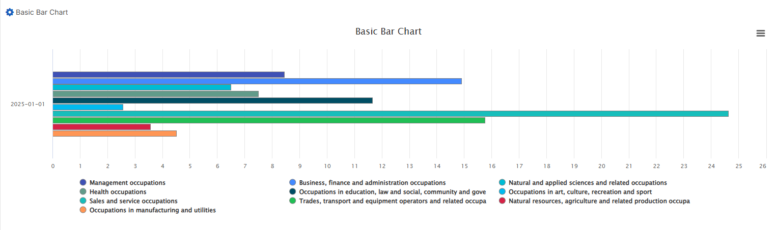
- Basic Bar Chart: Displays data using horizontal bars proportional to the values represented.
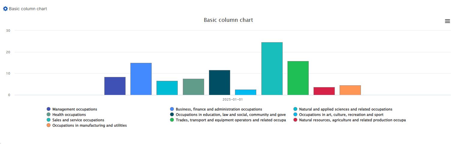
- Basic Column Chart: Similar to bar charts but with vertical columns.
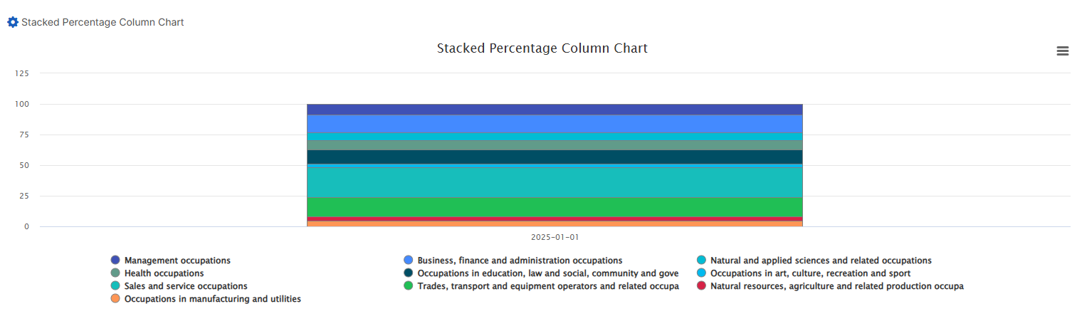
- Stacked Percentage Column Chart: Shows parts of a whole across different categories, with each column summing to 100%.
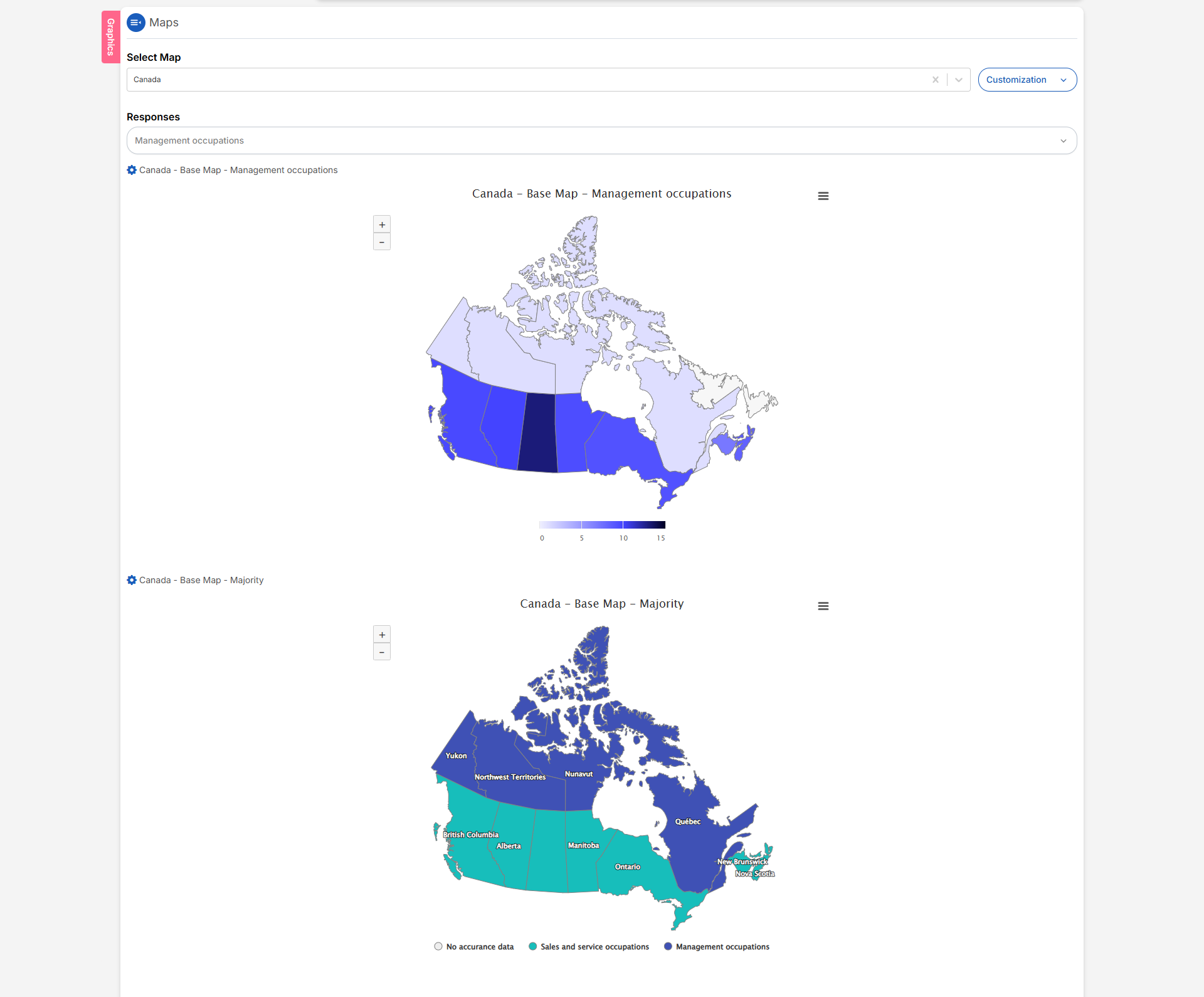
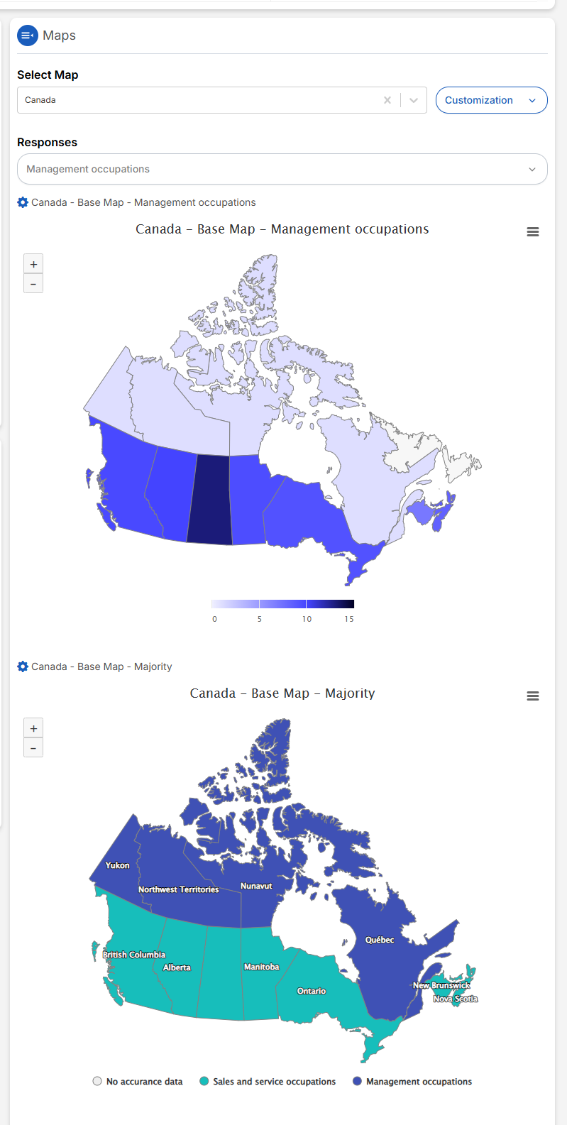
6. Map Visualization
- VoxDash includes maps to visualize responses based on respondents’ regions.
- Maps provide geographical insights, helping users identify regional trends.
7. Available Charts
VoxDash provides five main chart types for visualizing each question’s responses.Users can either have a single view of the charts or see all at once by scrolling down to view these charts: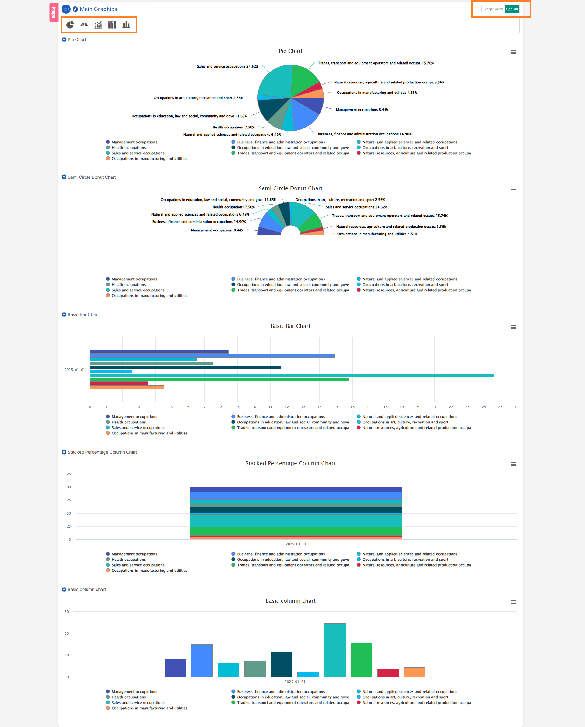
- Pie Chart: Represents data as slices of a circle, where each slice’s size corresponds to a proportion of the whole.
- Semi-Circle Donut Chart: A variation of the donut chart, shaped like a semi-circle, often used for progress visualization.
- Basic Bar Chart: Displays data using horizontal bars, with lengths proportional to the values represented.
- Basic Column Chart: Similar to a bar chart, but uses vertical columns to represent data values.
- Stacked Percentage Column Chart: Displays parts of a whole across different categories, with each column representing 100% of the total.
8. Crosstab Analysis
A crosstab (cross-tabulation) is a statistical tool used to explore the relationship between two or more categorical variables. It helps identify patterns, trends, and associations within the data.Performing Crosstab Analysis:
- Compare answer distributions across demographics or custom segments
- Validate hypotheses about differences between groups
- Produce publication-ready tables with clear bases and significance flags
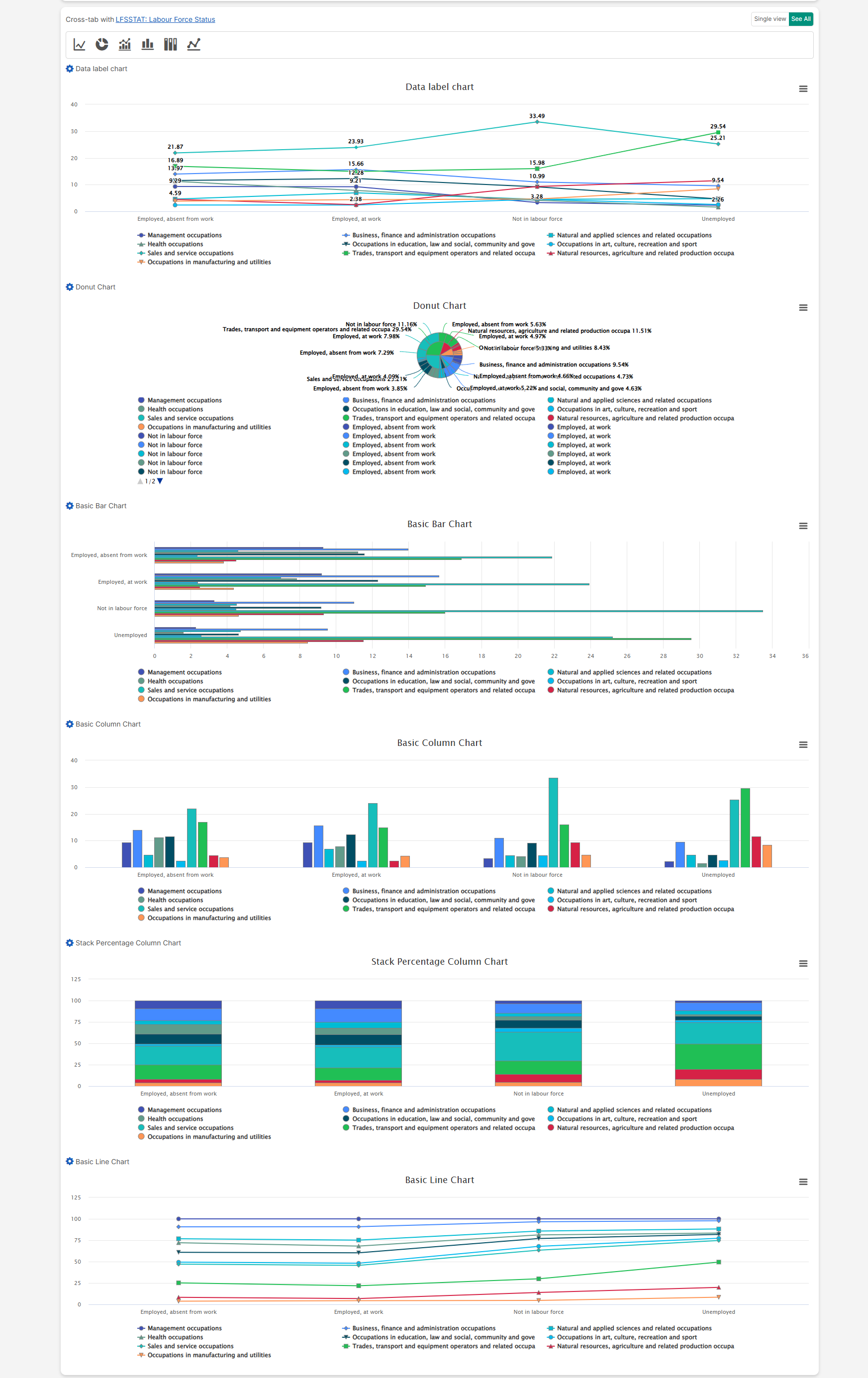
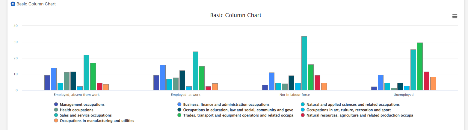
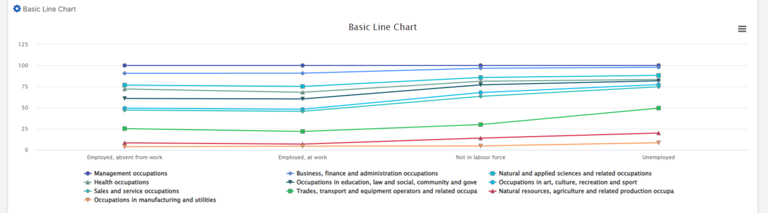
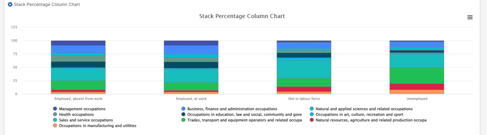
9. Crosstab Charts
When you scroll down the page, you can view different charts that visualize crosstab results. VoxDash provides seven chart types for crosstab data:- Data Label Chart: Enhances various chart types by displaying data point values directly on the chart for easier interpretation and comparison.
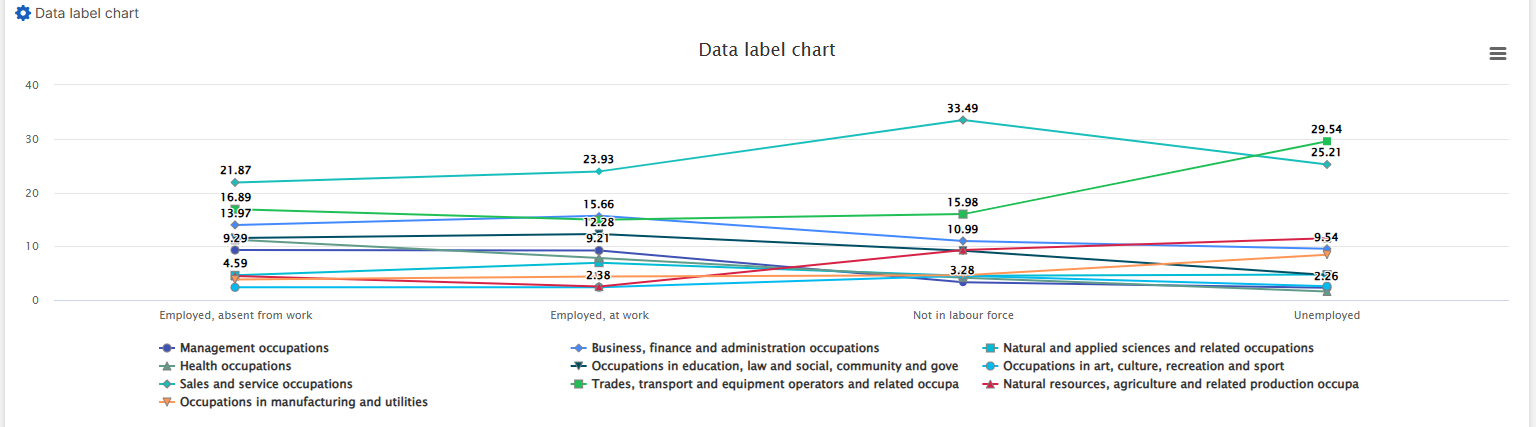
- Donut Chart: A variation of the pie chart with a blank center, offering additional space for insights or labels.
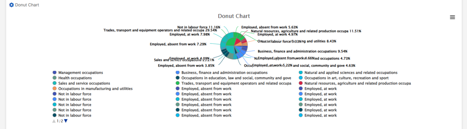
- Basic Bar Chart: Displays data using horizontal bars proportional to the values represented.
- Basic Column Chart: Uses vertical columns to represent data values.
- Basic Line Chart: Connects data points with a line to show trends over time or continuous data.
- Stacked Percentage Column Chart: Represents parts of a whole across different categories, with each column summing to 100%.
10. Advanced Map Visualization
If a map is added during the third step of survey data entry, it will be visible on the Question Page for each question. Users can choose to:- View maps for individual responses to see specific data points geographically.
- Aggregate maps for all responses to identify regional patterns and trends.
Conclusion
The Question Page in VoxDash is designed to help users analyze survey data effectively. With powerful visualization tools, advanced filters, and intuitive navigation, users can:- Uncover hidden patterns.
- Perform detailed analysis.
- Make data-driven decisions with confidence.