

Designer Tab Layout
The Designer tab is divided into four main areas:- 1.Top Toolbar – Provides quick access to questionnaire management tools, collaboration, quotas, search, preview, versions, export, and other actions.
- 2.Question Library (Left Panel) – Contains the available question types that you can add to the questionnaire.
- 3.Questionnaire Canvas (Center) – The main design area where you add, edit, arrange, and organize questionnaire pages and questions.
- 4.Properties Panel (Right Panel) – Displays settings for the questionnaire, page, or question currently selected.
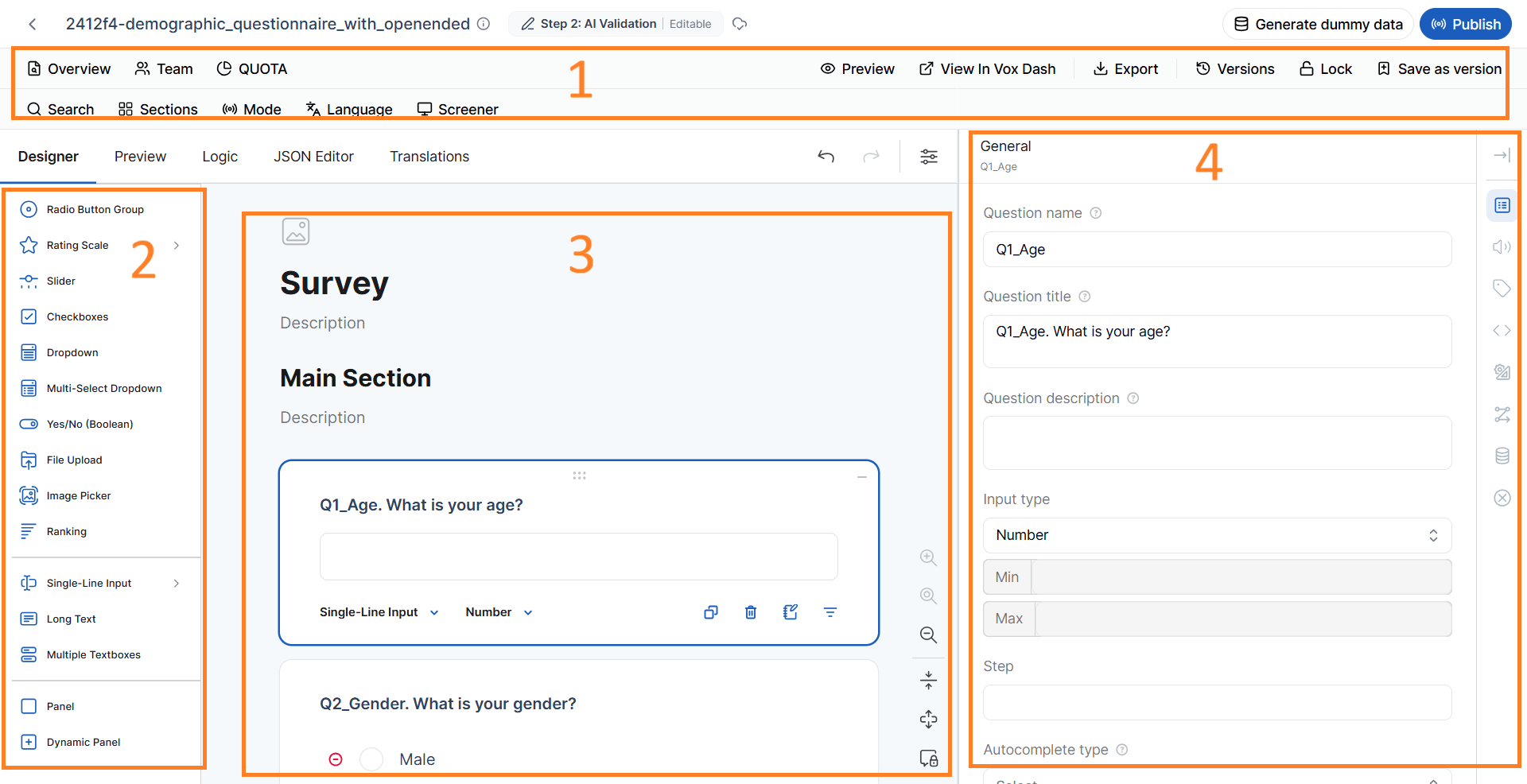
Top Toolbar
The Top Toolbar provides quick access to frequently used questionnaire management and design tools. The available tools include:- Overview
- Team
- Quota
- Preview
- View in VoxDash
- Export
- Versions
- Lock/Unlock Questionnaire
- Search and Filter
- Search
- Sections
- Mode
- Language
- Screener
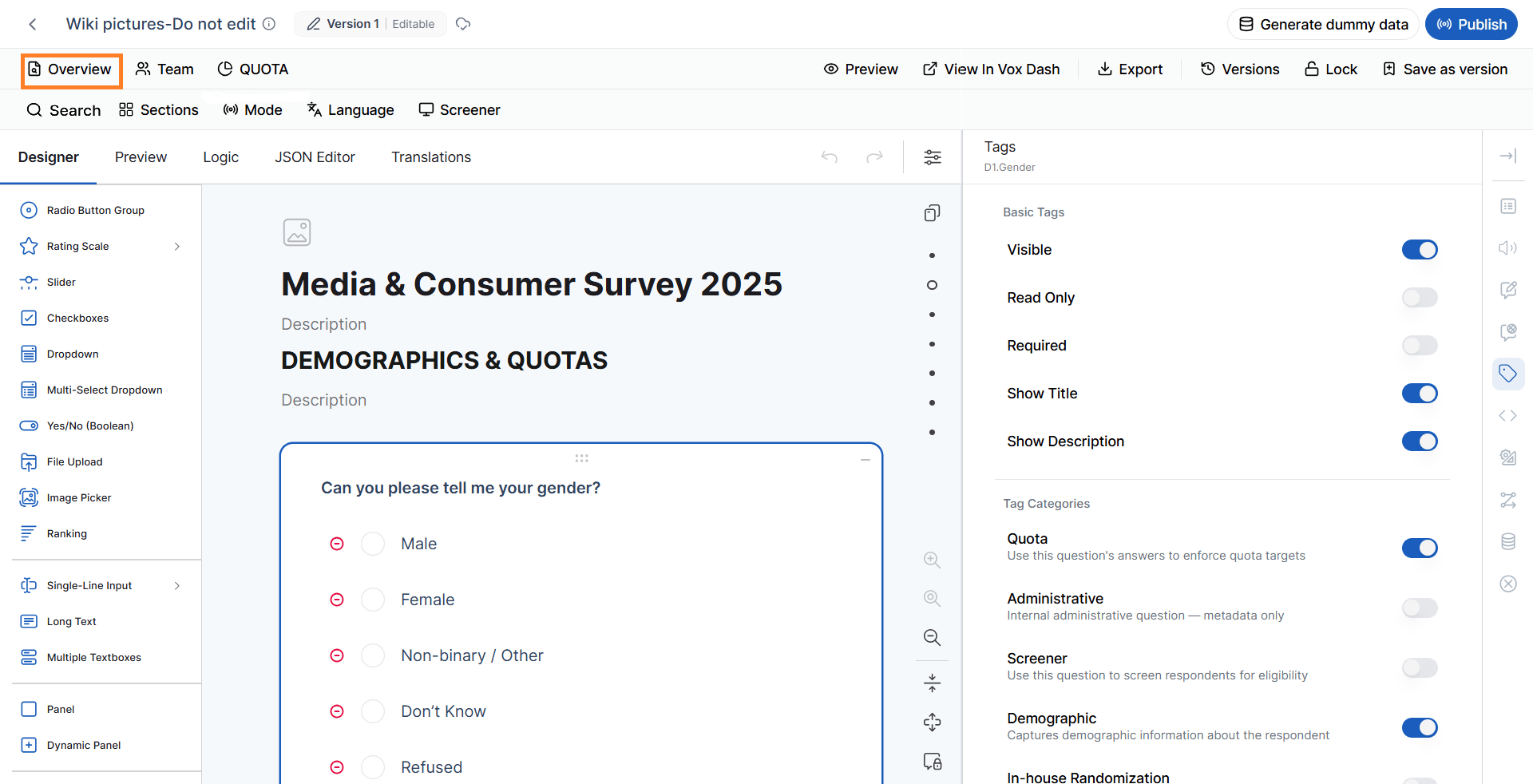
Questionnaire Overview
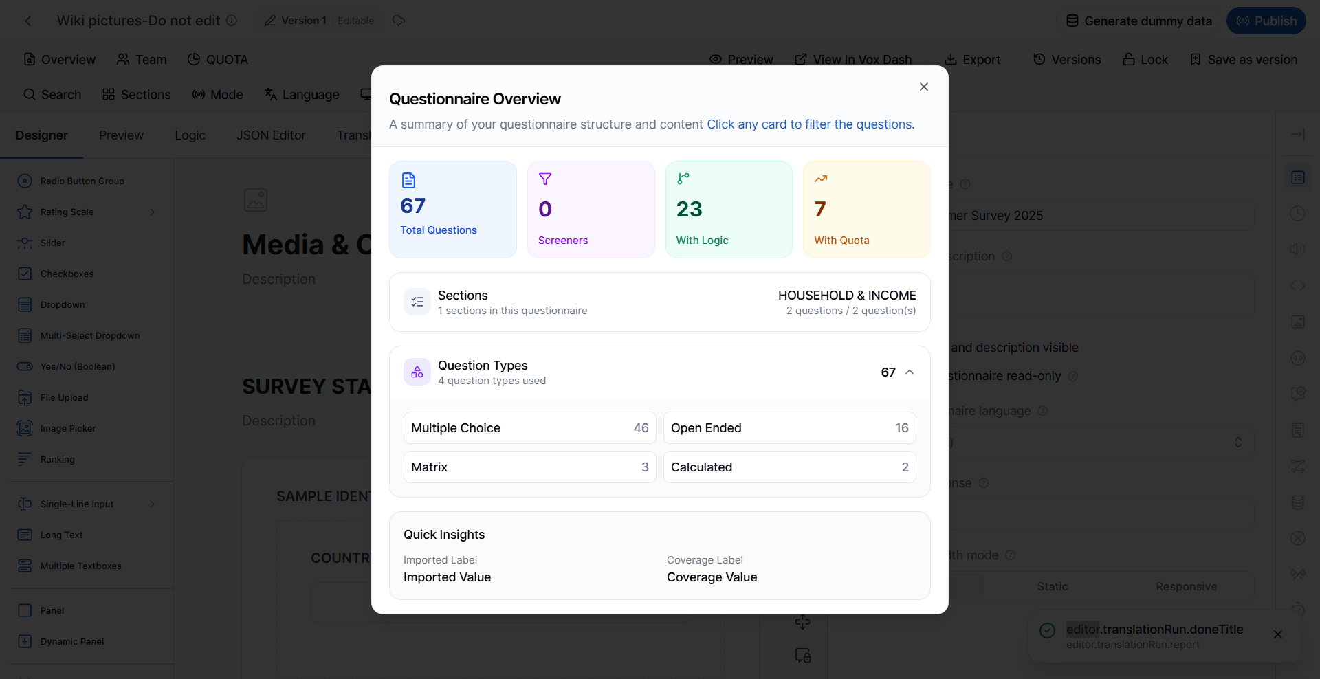
The Overview panel provides a high-level summary of the questionnaire and helps you quickly understand its structure and configuration. The panel displays key statistics such as:- Total number of questions
- Question types used
- Number of tagged questions
- Number of questions containing logic
- Other questionnaire-related metrics
- All Radio Button questions
- All Demographic questions
- Questions containing conditional logic
- Questions with validation rules
- Questions assigned specific tags
When to use Overview
The Overview panel is particularly useful when working with large questionnaires. Instead of manually searching through every page, you can use the statistics to identify specific types of questions or configurations that require review. For example, before publishing a questionnaire, you can use Overview to identify questions containing logic and review them for potential configuration issues.Team
The Team section allows you to collaborate with other users by granting them access to the questionnaire. Depending on their assigned permissions, team members may be able to:- View the questionnaire
- Edit questions and settings
- Review questionnaire content
- Participate in questionnaire development
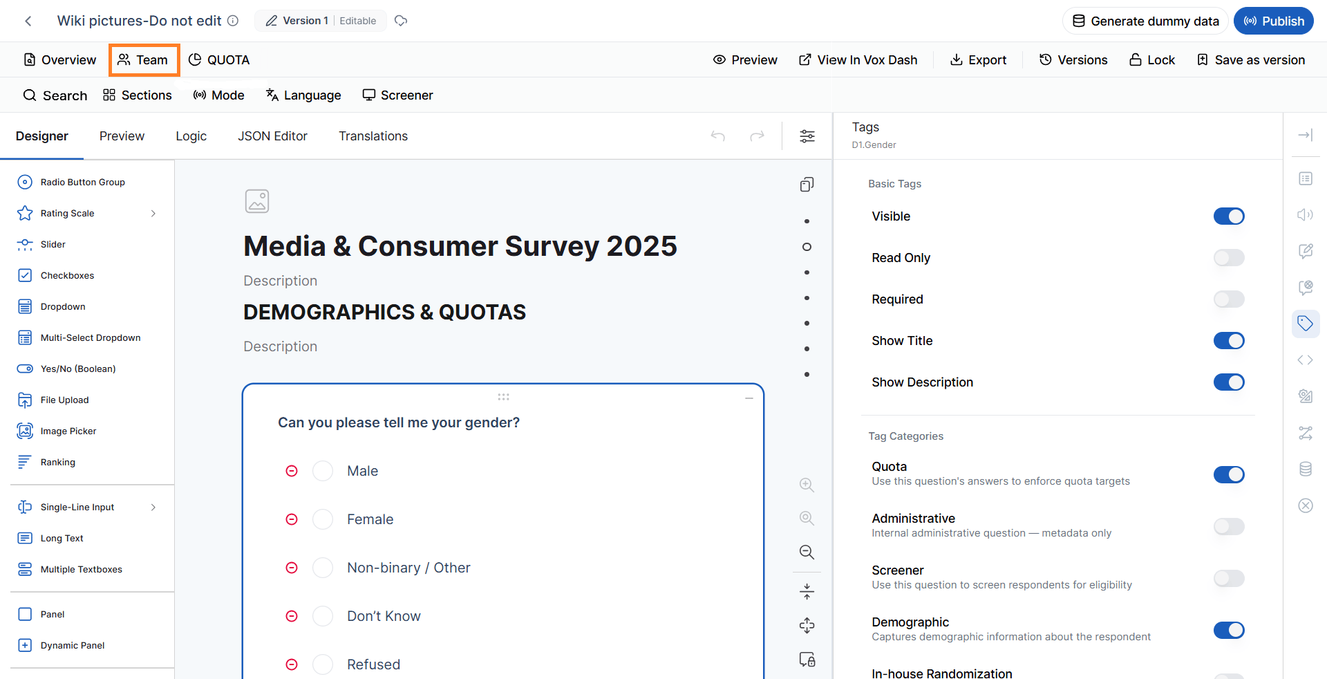
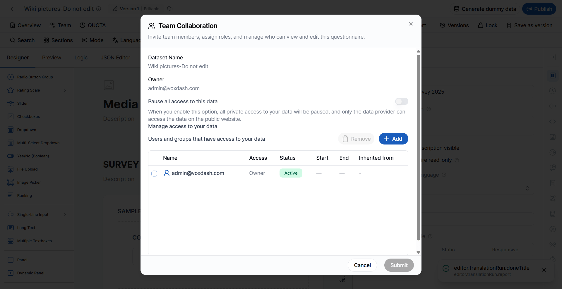
For detailed information about managing questionnaire collaborators and permissions, refer to the Team Management documentation.
Quota
The Quota button opens the Quota Management page. Quotas allow you to control the distribution of collected responses based on predefined criteria. From the Quota Management page, you can:- Create quota groups
- Edit existing quota groups
- Configure quota targets
- Validate quota configurations
- Import quotas
- Export quotas
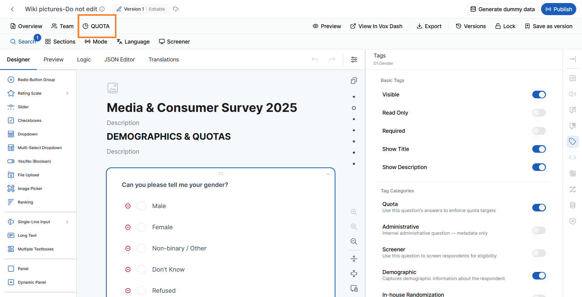
For more information, refer to the Quota Management documentation.
Preview
The Preview feature allows you to test and review the questionnaire before publishing it or using it for data collection. Preview displays the questionnaire from the respondent’s perspective, allowing you to verify:- Question appearance
- Page navigation
- Conditional logic
- Validation rules
- Required questions
- Question visibility
- Navigation buttons
- Progress indicators
- Thank You page behavior
- Other questionnaire settings
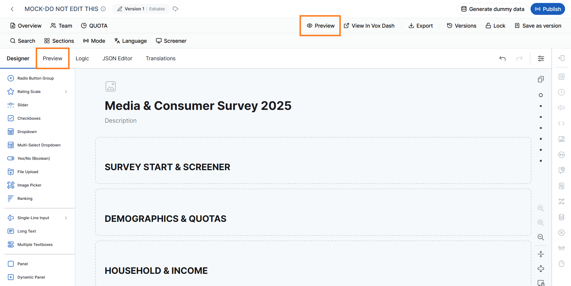
For detailed information, refer to the Preview documentation.
View in VoxDash
The View in VoxDash option allows you to open and view the Data Project assigned to the questionnaire. This provides quick access to the project associated with the questionnaire without requiring you to navigate through the Data Projects section separately. Click View in VoxDash to open the assigned Data Project and review its details, configuration, and related data. This option is particularly useful when you need to verify that the questionnaire is connected to the correct Data Project or quickly move between the questionnaire and its associated project.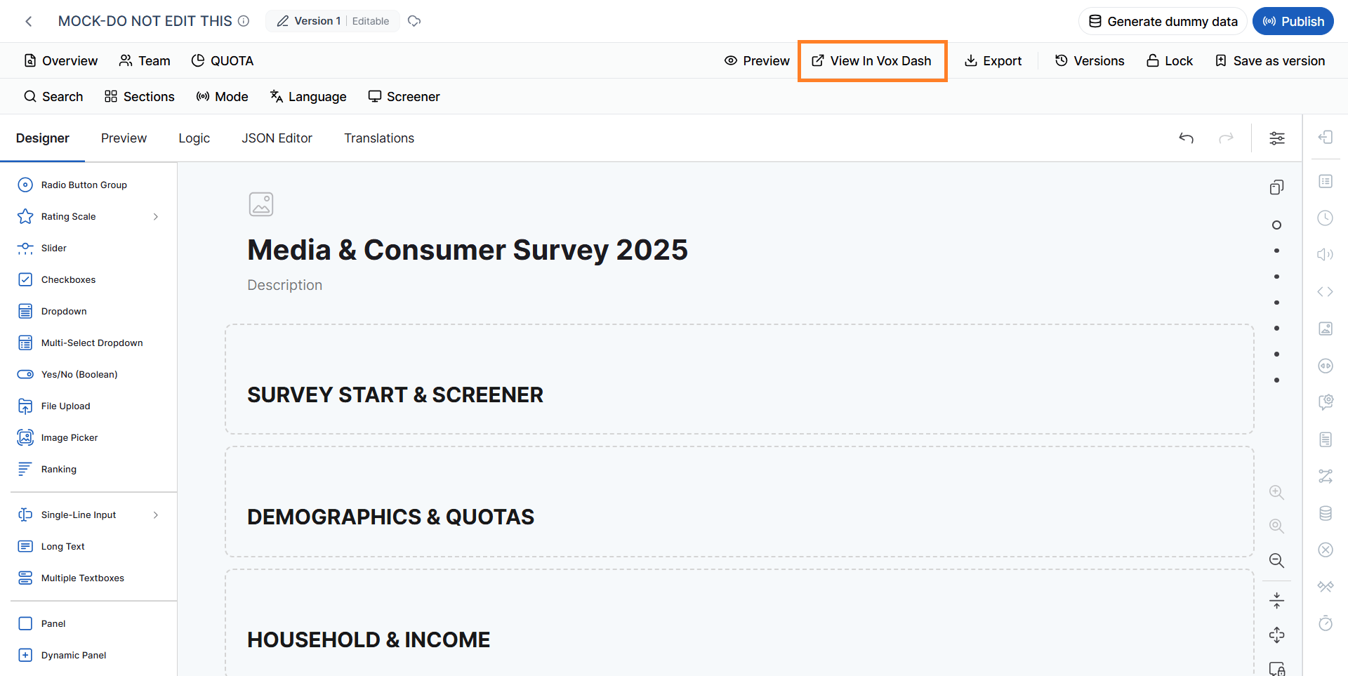
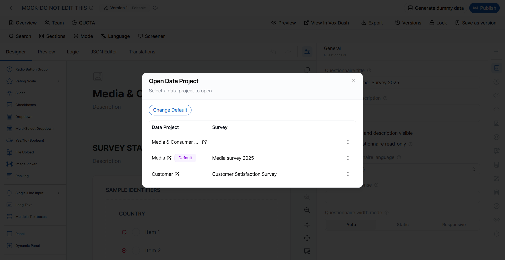
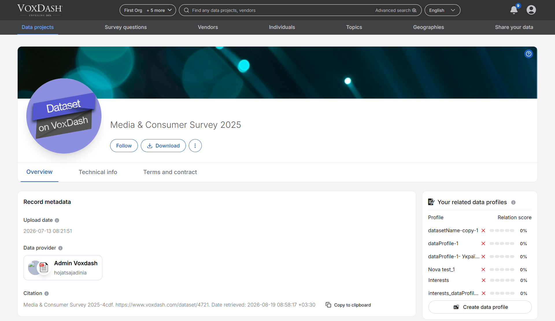
For more information, refer to the data project Overview documentation.
Export
The Export feature allows you to generate the questionnaire in different formats for review, collaboration, testing, analysis, or integration with other systems. Depending on the available export options, you can export questionnaire content for use outside the Designer. Export can be useful when you need to:- Share a questionnaire with stakeholders
- Review questionnaire content outside VoxDash
- Archive a questionnaire
- Prepare questionnaire content for another workflow
- Analyze or process questionnaire definitions
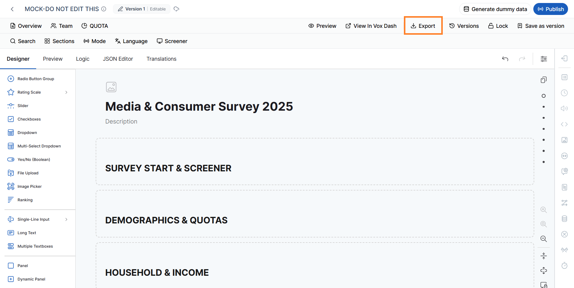
For available formats and detailed export instructions, refer to the Export documentation.
Versions
The Versions feature allows you to manage different versions of a questionnaire throughout its lifecycle. From this section, you can:- View existing questionnaire versions
- Identify editable versions
- Identify published versions
- Create a new version based on a previous version
- Save the current questionnaire as a new version
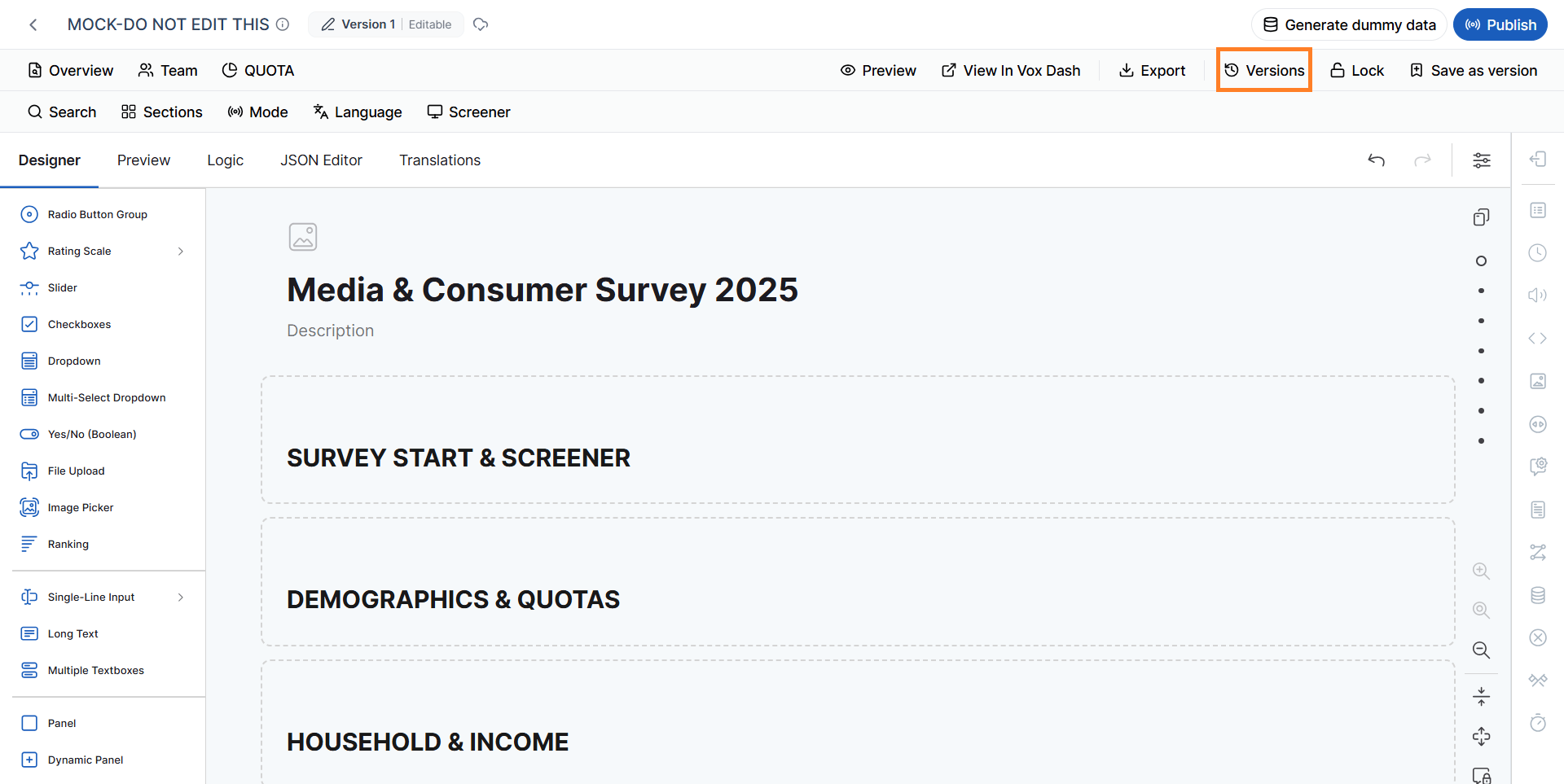
Save as Version
Save as Version creates a snapshot of the questionnaire in its current state. The saved version preserves the questionnaire configuration at that point in time, allowing you to return to or use that version later.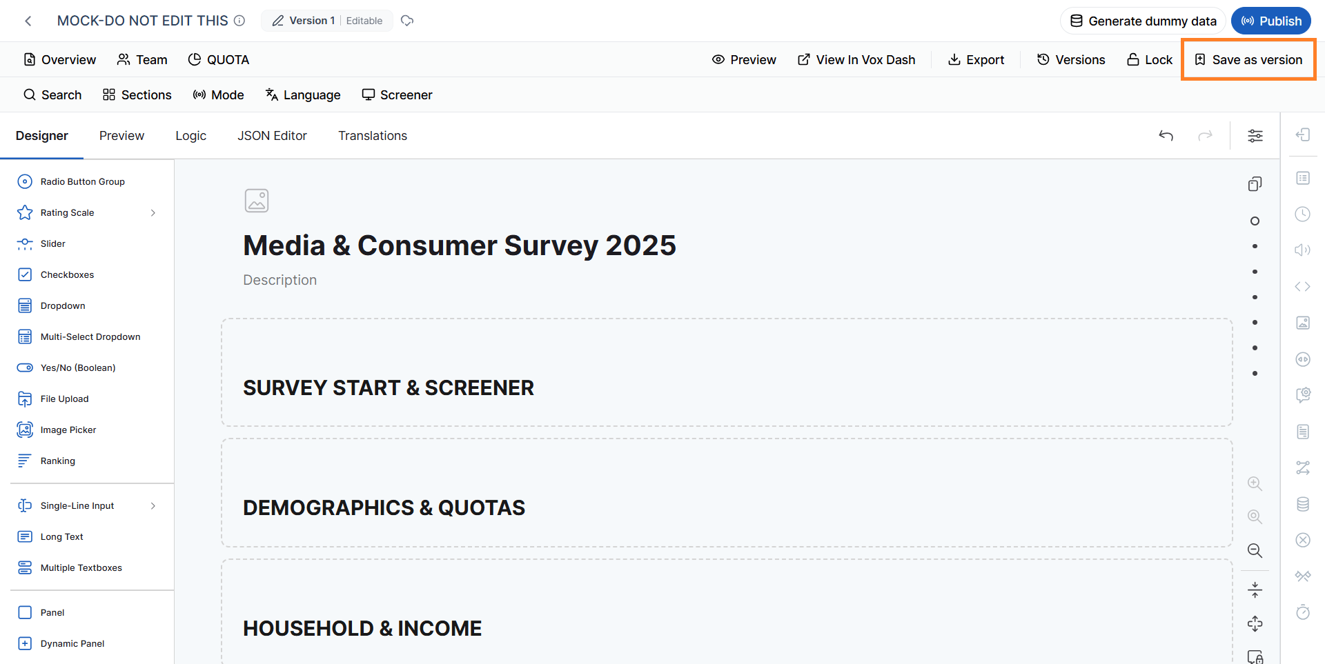
Lock/Unlock the Questionnaire
The Lock/Unlock Questionnaire feature prevents changes to the questionnaire content. When a questionnaire is locked, you and your team can still perform actions such as:- Previewing the questionnaire
- Exporting the questionnaire
- Generating dummy data
- Publishing the questionnaire
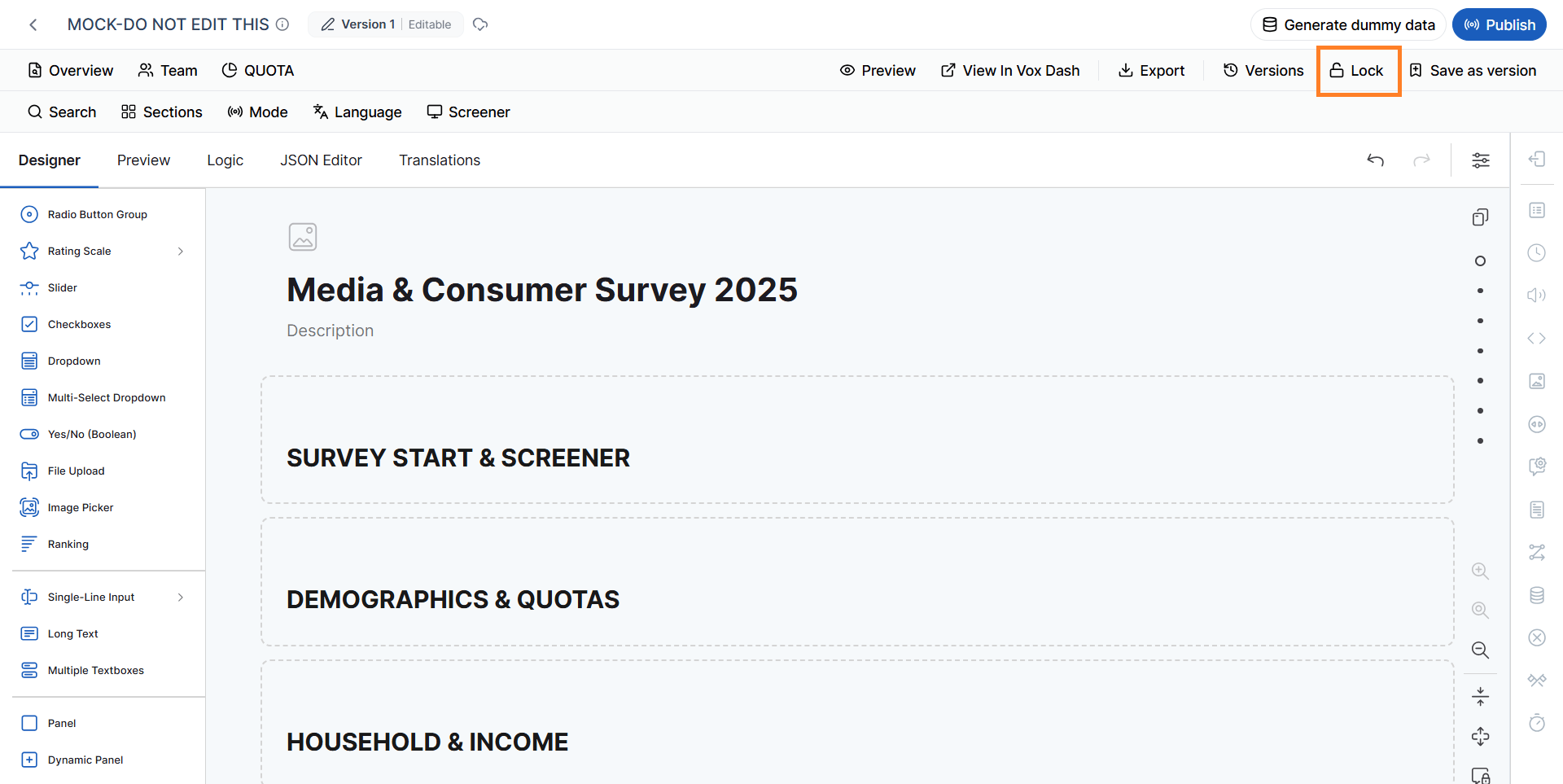
When to lock a questionnaire
Locking is particularly useful when the questionnaire has been finalized and you want to prevent accidental changes before or during data collection.Search and Filter
As questionnaires grow in size and complexity, finding a specific question can become difficult. The Search and Filter tools allow you to quickly locate questions based on their content, type, tags, language, or other questionnaire metadata. Available filtering options include:- Search
- Sections
- Mode
- Language
- Screener
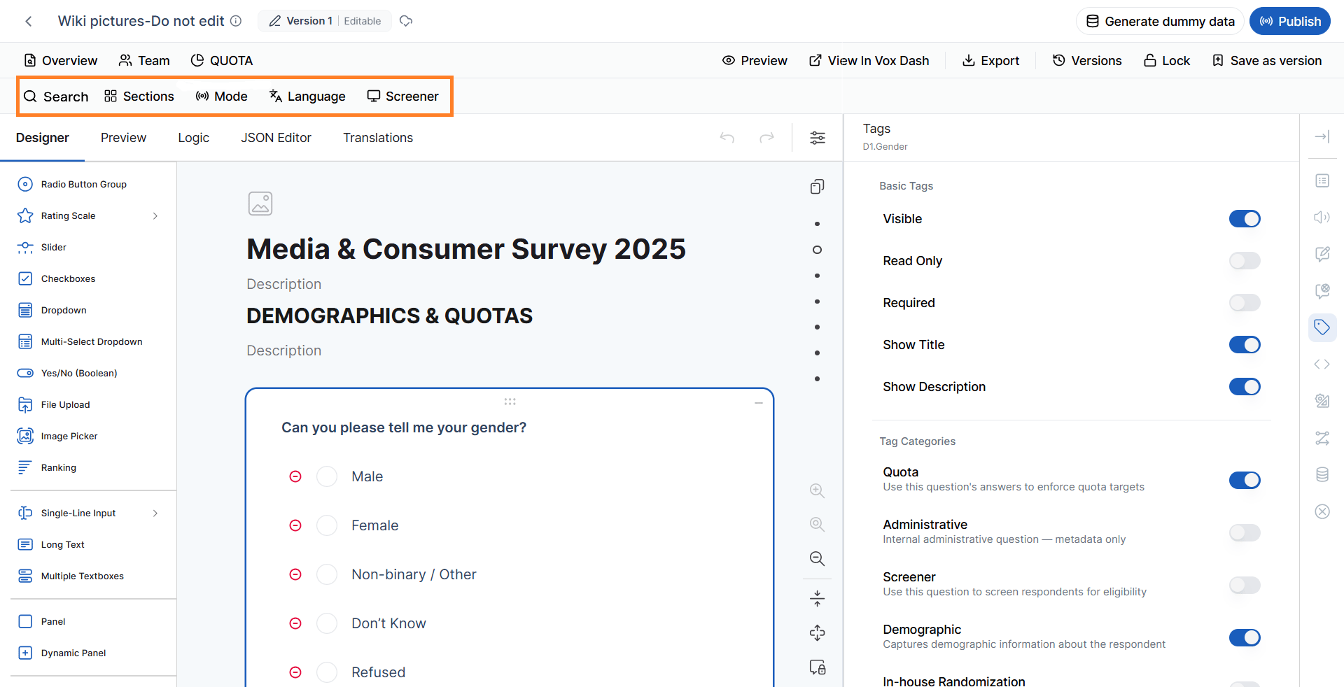
Search
Use Search to find questions based on:- Question ID
- Question title
Sections
The Sections filter displays questions assigned to a specific Section Tag. This is useful when a questionnaire contains multiple sections and you want to focus on questions belonging to a specific section.Mode
The Mode filter allows you to display questions based on their assigned Data Collection Mode. This is particularly useful when the same questionnaire supports multiple methods of data collection.Untagged questions are shared across all modes, so filtering shows questions with the selected mode plus any untagged ones.
Language
The Language filter displays questions associated with a selected language using the Multi-Language tag. This allows you to review and edit content for a specific language without having to navigate through the entire questionnaire.Untagged questions are shared across all languages, so filtering shows questions with the selected language plus any untagged ones.
Screener
The Screener filter displays only questions marked as Screener questions. Screener questions are commonly used at the beginning of a questionnaire to determine whether respondents meet specific eligibility criteria.For detailed information, refer to the Search and Filter documentation.
Question Library
The Question Library is located on the left side of the Designer tab. It contains the available question types that you can add to your questionnaire. Depending on your questionnaire requirements, you can add question types such as:- Radio Button
- Checkboxes
- Dropdown
- Rating Scale
- Matrix
- Dynamic Panel
- HTML
- Image
- Signature
- File Upload

For a complete description of available question types, refer to the Available Question Types documentation.
Questionnaire Canvas
The Questionnaire Canvas is the central workspace of the Designer tab. This is where you build the questionnaire structure and organize its content. From the canvas, you can:- Add questions
- Edit questions
- Reorder questions
- Create and manage pages
- Select individual questions
- Select pages
- Review the questionnaire structure
- Apply page-level or question-level settings
Properties Panel
The Properties Panel is located on the right side of the Designer tab. The content of this panel changes based on the item currently selected.- If no question is selected, the panel displays Questionnaire Settings.
- If a page is selected, the panel displays Page Settings.
- If a question is selected, the panel displays the settings for that specific question.
Questionnaire Settings
When no question is selected, the Properties Panel displays the Questionnaire Settings. These settings control the overall behavior, appearance, navigation, data handling, and respondent experience of the questionnaire.General Settings
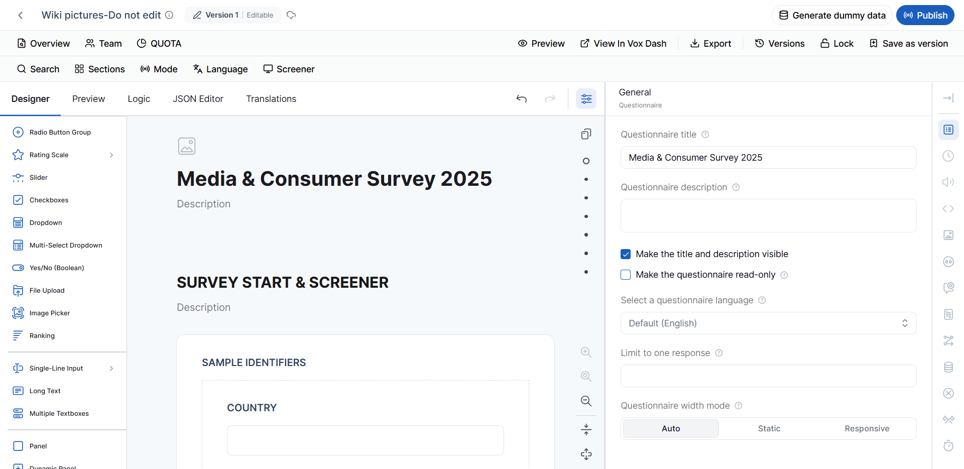
The General Settings section contains basic questionnaire properties. Questionnaire Title The Questionnaire Title is the main title associated with the questionnaire. It can be displayed to respondents when the Show Title and Description option is enabled. Questionnaire Description The Questionnaire Description provides additional information about the questionnaire. You can use it to:- Introduce the survey
- Explain its purpose
- Provide instructions
- Give respondents additional context
- Auto – Automatically determines the appropriate width.
- Static – Uses a fixed questionnaire width.
- Responsive – Adjusts the questionnaire layout according to the available screen size.
Length of Interview (LOI)
The Length of Interview (LOI) feature estimates the expected time required for a respondent to complete the questionnaire. LOI estimation can help with:- Project planning
- Respondent experience planning
- Budget estimation
- Incentive planning
- Data collection planning
- Service tier selection
- Question types
- Data collection method
- Configured timing multipliers
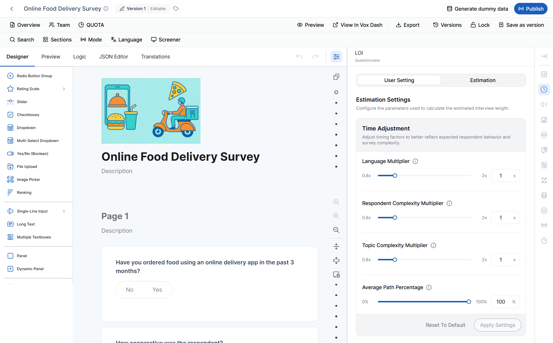
For detailed information about LOI calculation and configuration, refer to the LOI documentation.
Text-to-Speech (TTS)
The Text-to-Speech (TTS) feature converts questionnaire text into natural-sounding audio. Depending on the available configuration, you can generate audio for:- The entire questionnaire
- Individual questions
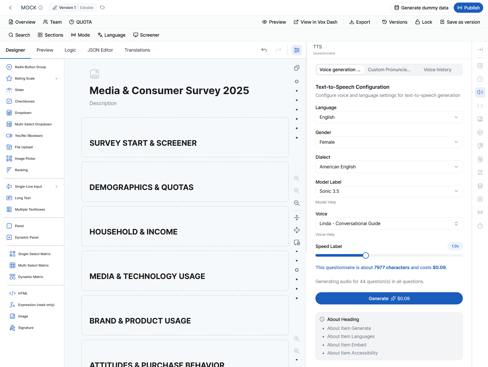
For detailed information, refer to the Text-to-Speech documentation.
Questionnaire Metadata
The Questionnaire Metadata section allows you to review and manage metadata associated with the questionnaire. One important use of this section is managing Missing Values. From Questionnaire Metadata, you can:- View missing values currently defined for the questionnaire
- Add new missing values
- Edit existing missing values
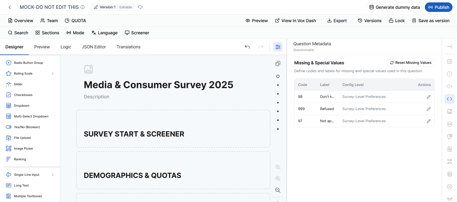
Note: The exact meaning and coding of missing values should be consistent with the questionnaire and dataset requirements.
Questionnaire Appearance & Navigation
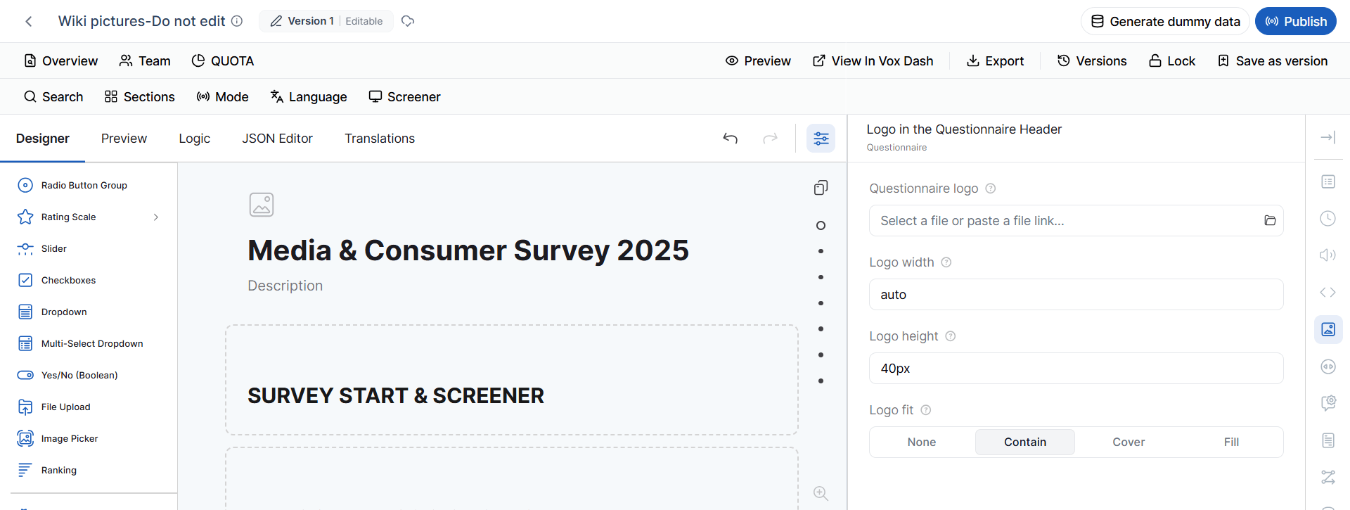
The Questionnaire Appearance & Navigation settings control how the questionnaire looks and how respondents move through it. Questionnaire Logo Upload a logo to display in the questionnaire header. You can configure:- Logo Width
- Logo Height
- Logo Fit
- Contain – Keeps the entire logo visible within the available space.
- Cover – Fills the available area while maintaining the image proportions.
- Fill – Stretches the image to fill the available area.
- Original Layout
- Original Structure
- Show All Questions on One Page
- Show One Question Per Page
- Show One Input Field Per Page
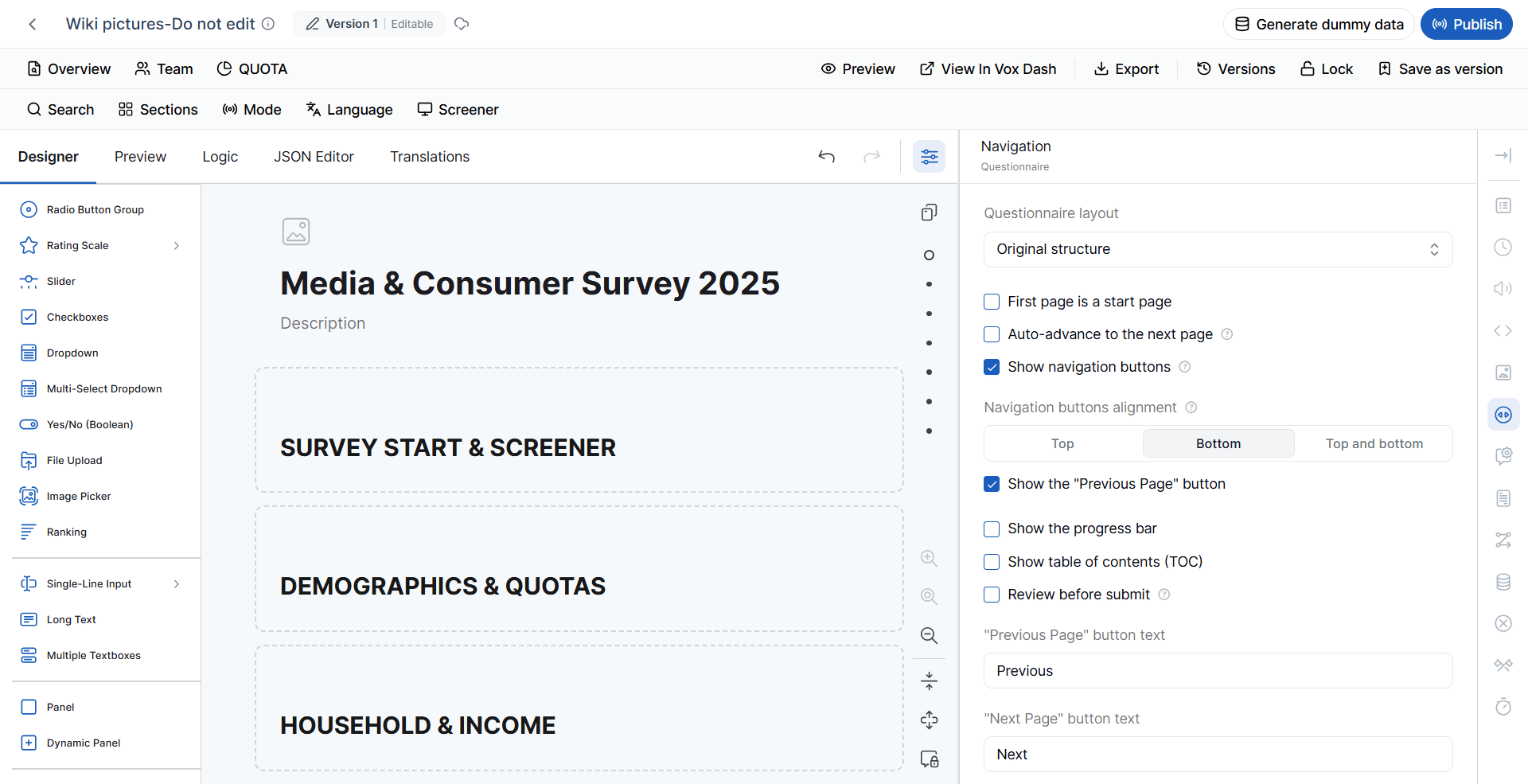
- Show or hide navigation buttons
- Configure button alignment
- Show or hide the Previous Page button
- Top
- Bottom
- Top and Bottom
- Progress Bar
- Table of Contents (TOC)
- Previous Page
- Next Page
- Complete Questionnaire
Default Question Settings
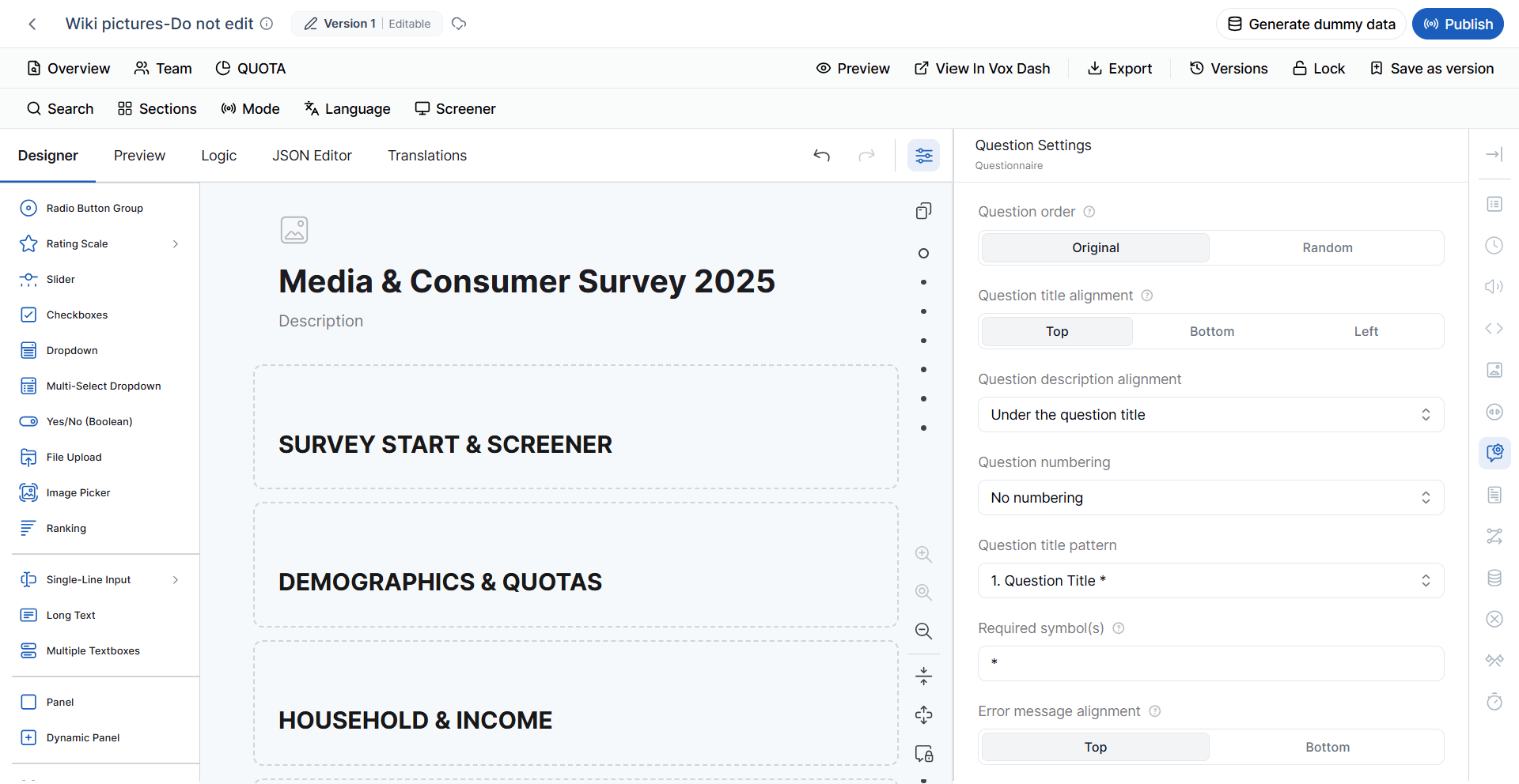
Default Question Settings define the initial behavior and appearance of questions throughout the questionnaire. These settings provide a consistent starting point for newly added questions. Question Order Specify how questions are ordered. Available options:- Original – Questions appear in their defined order.
- Random – Questions are displayed in a randomized order.
- Top
- Bottom
- Left
- Under the Question Title
- Under the Input Field
- Auto Numbering
- Reset on Each Page
- Recursive Numbering
- No Numbering
- 1. Question Title*
- 1. Question Title*
- 1. Question Title
- Top
- Bottom
- Focus first question on a new page – Automatically places focus on the first question when a new page is opened.
- Restrict answer length – Limits the length of respondent answers.
- Restrict comment length – Limits the length of comments.
- Comment area height – Controls the height of comment fields.
- Automatically expand text areas – Allows text areas to expand as more content is entered.
- Allow respondents to resize text areas – Allows respondents to manually adjust the size of text areas.
Pages
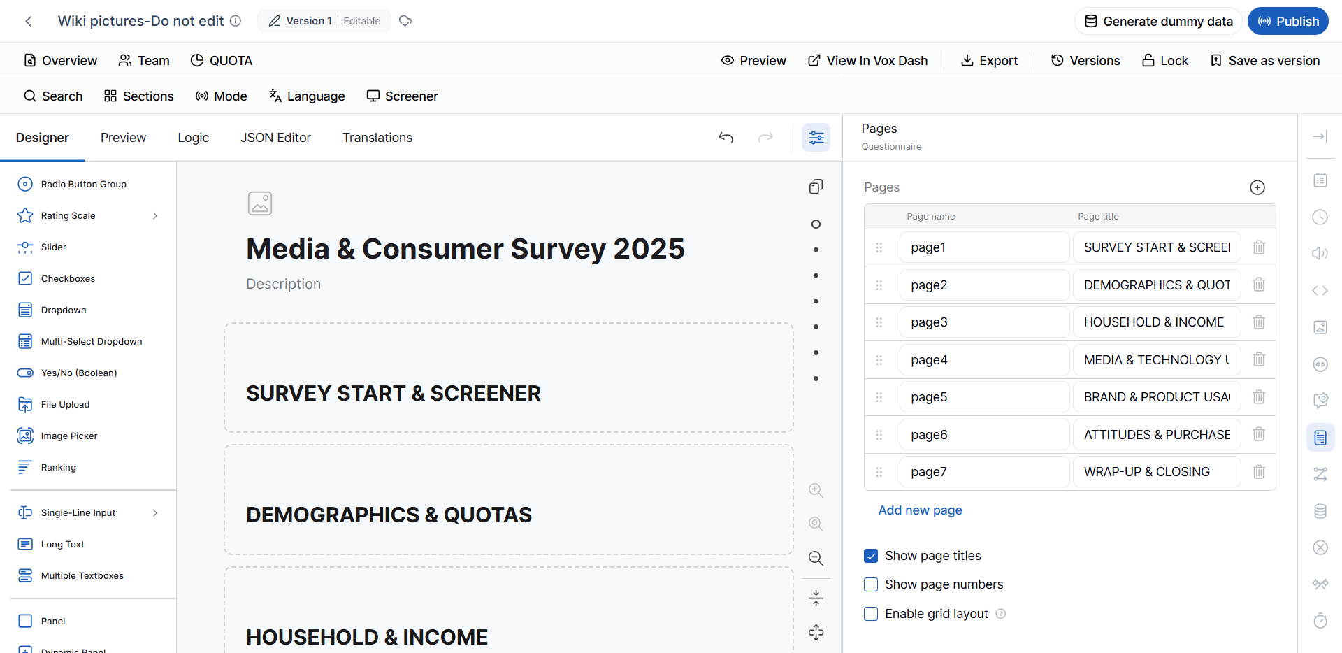
The Pages section allows you to organize questions into separate questionnaire pages. You can configure:- Page Name
- Page Title
- Add New Page
- Show Page Titles
- Show Page Numbers
- Enable Grid Layout
- Respondent Information
- Product Usage
- Customer Satisfaction
- Purchase Behavior
- Final Comments
Conditions
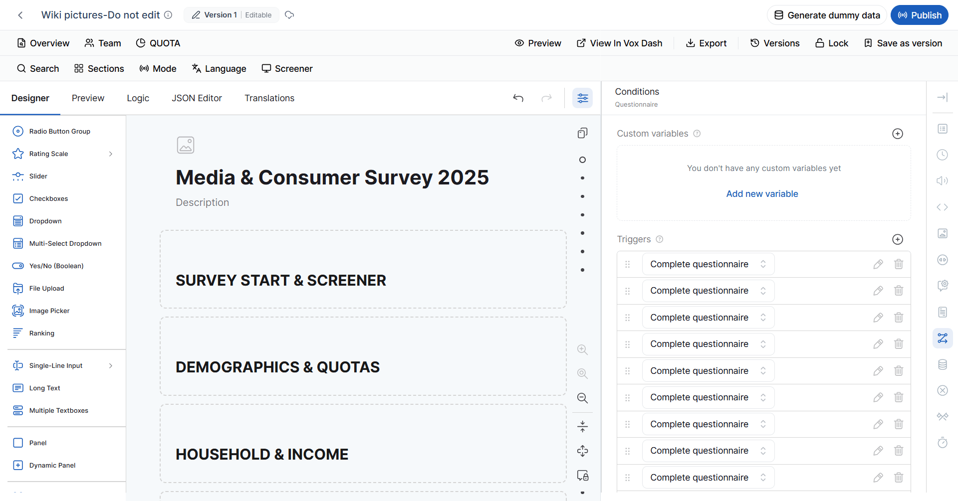
The Conditions section allows you to define questionnaire logic and dynamic behavior. Conditions can control how the questionnaire responds to a respondent’s answers. Available tools include: Custom Variables Create reusable variables that can be referenced in calculations and conditional logic. Custom variables are useful when you need to store intermediate values or perform calculations based on respondent answers. Triggers Triggers automatically perform an action when a specified condition is met. Triggers can be used to:- Set values
- Skip questions
- Complete the questionnaire
- Display messages
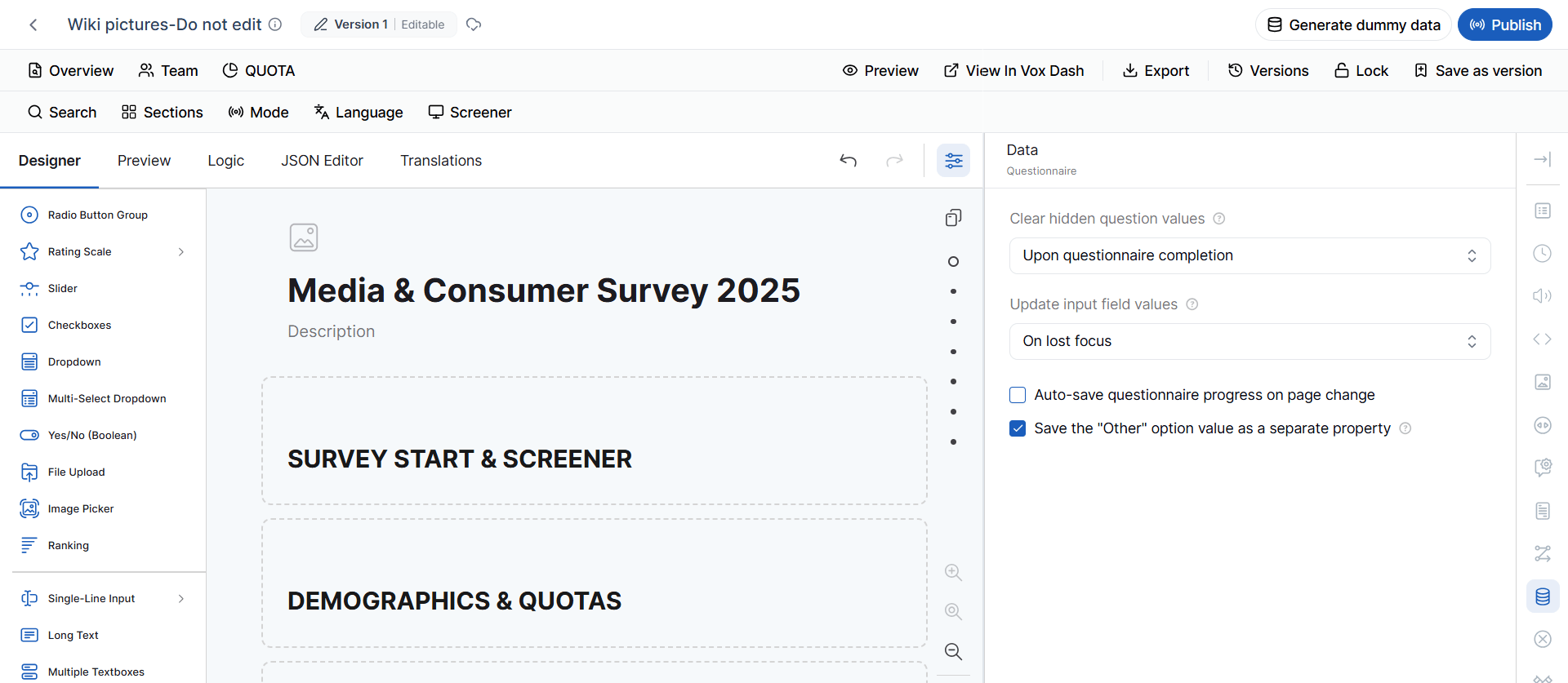
Data
The Data settings control how questionnaire responses are stored and updated. Clear Hidden Question Values Specify when values entered into hidden questions should be removed. Available options include:- Never
- Upon Questionnaire Completion
- When the Question Becomes Hidden
- When the Question or Its Panel/Page Becomes Hidden
- On Lost Focus – Updates the value when the respondent leaves the input field.
- While Typing – Updates the value as the respondent enters information.
Validation
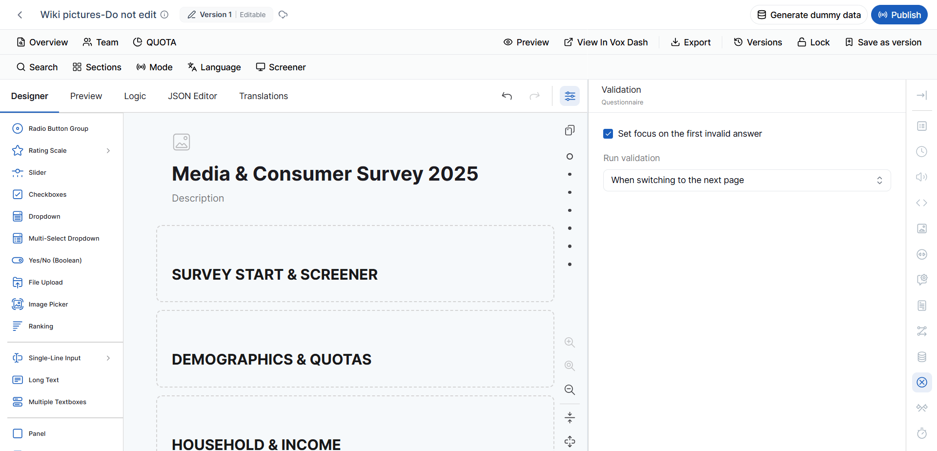
The Validation settings control when questionnaire validation is performed and how validation errors are handled. Focus First Invalid Question Automatically moves the respondent to the first question containing a validation error. This helps respondents quickly identify and correct invalid responses. Run Validation Choose when validation should be performed. Available options include:- When switching to the next page
- After an answer changes
- Upon questionnaire completion
Thank You Page
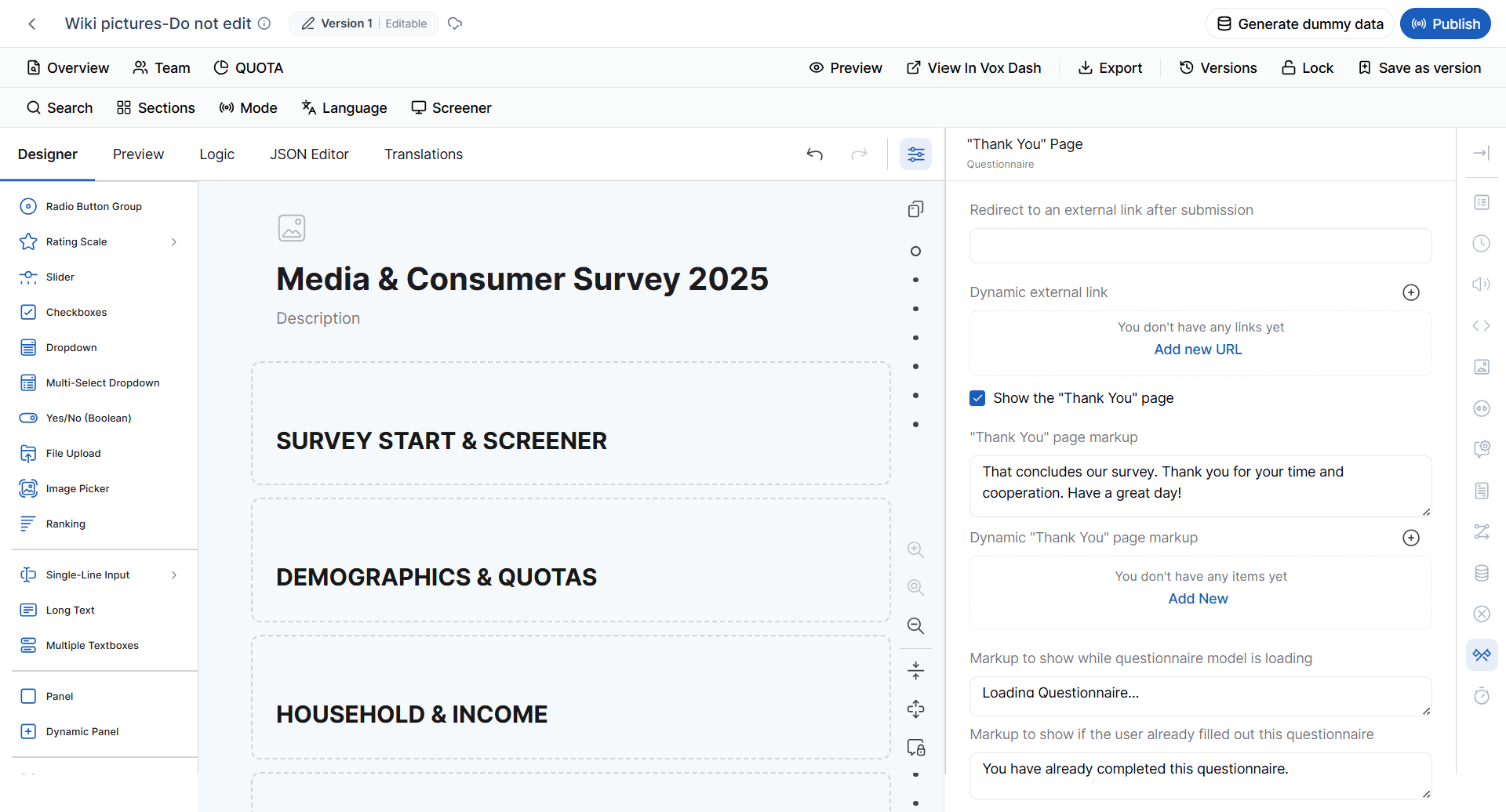
The Thank You Page is displayed after the respondent completes the questionnaire. You can configure options such as:- Redirect to an external URL
- Use a dynamic redirect URL
- Show or hide the Thank You page
- Customize Thank You page content
- Display dynamic Thank You messages
- Configure the loading message displayed while the questionnaire initializes
- Configure the message displayed when a respondent has already completed the questionnaire
Quiz Mode
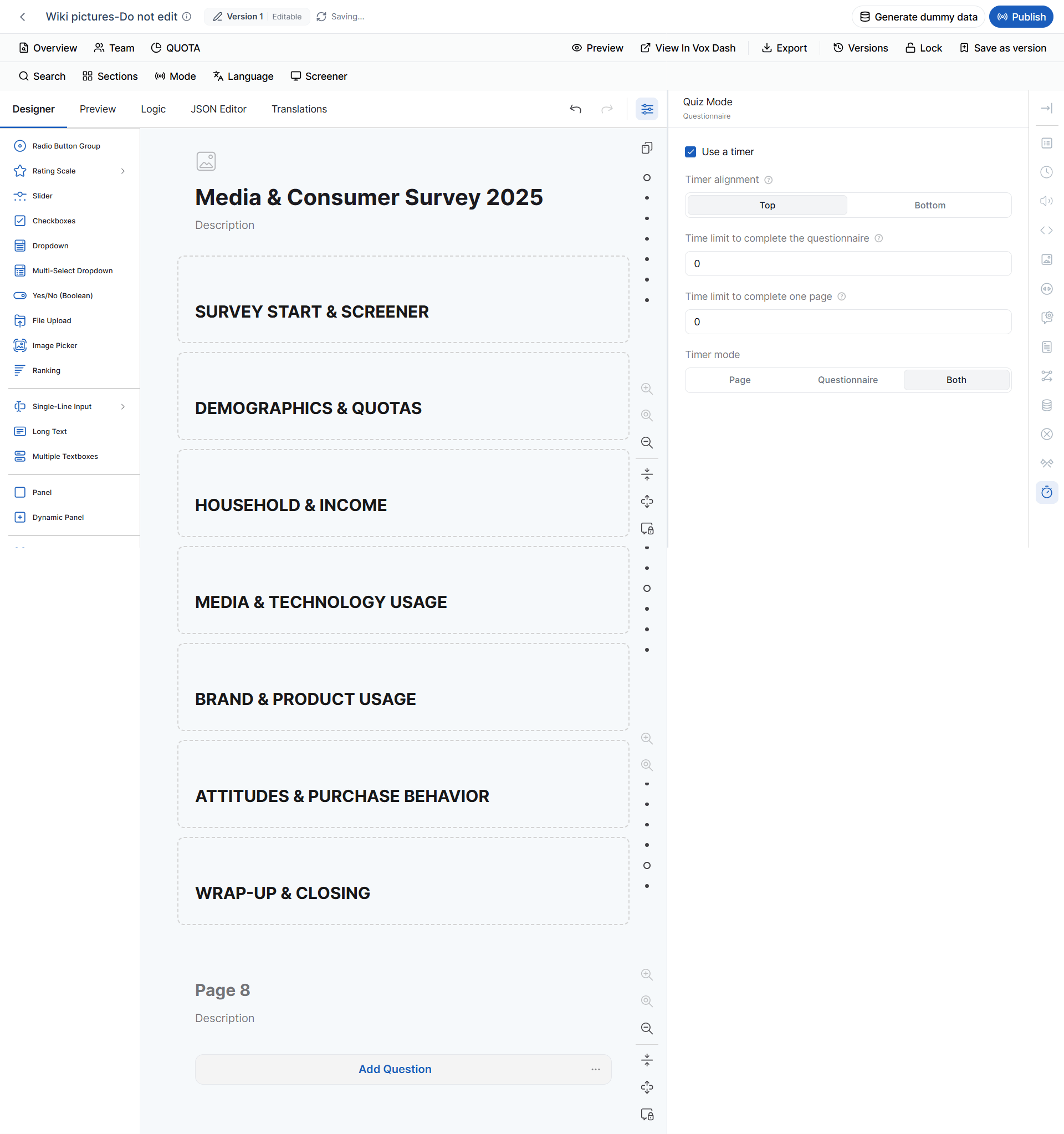
Quiz Mode enables questionnaire functionality designed for assessments, exams, knowledge tests, and other timed evaluations. Quiz Mode includes settings for timers and time limits. Timer Enable a countdown timer for:- The entire questionnaire
- Individual pages
- Both the questionnaire and individual pages
- Top
- Bottom
- Total questionnaire time limit
- Time limit per page
- Page
- Questionnaire
- Both
- Certification exams
- Employee assessments
- Training programs
- Knowledge tests
- Timed evaluations
Page Settings
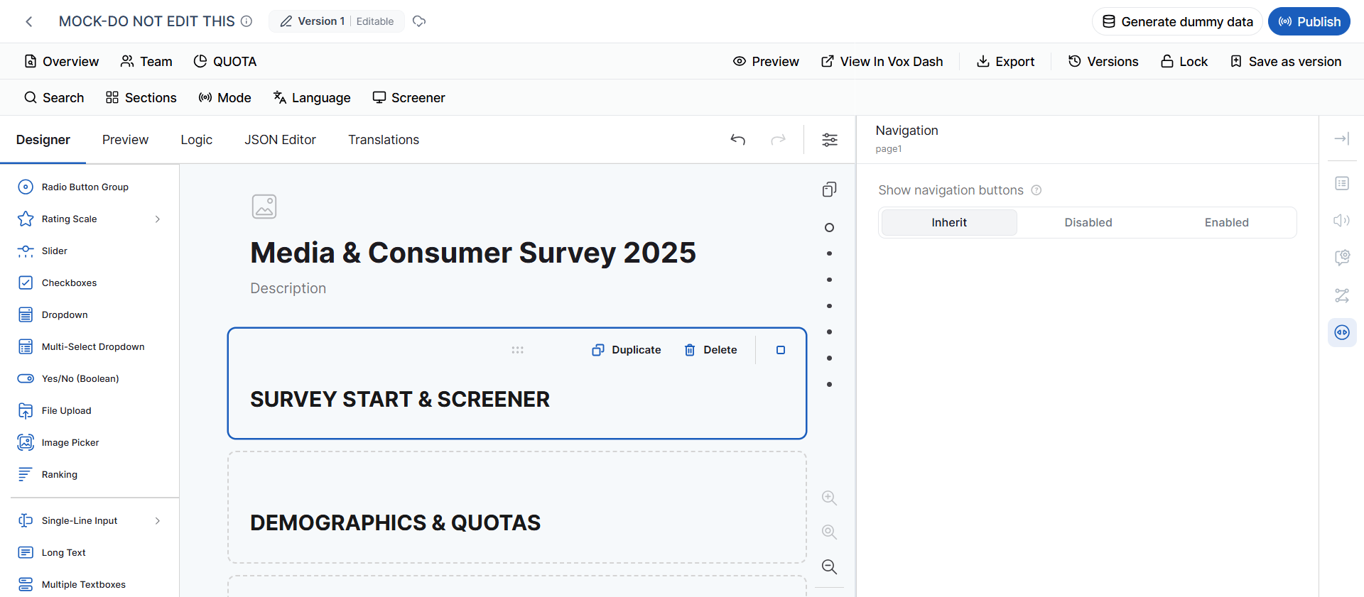
When you select a page in the Questionnaire Canvas, the Properties Panel displays Page Settings. Page settings allow you to control the appearance, behavior, navigation, and conditions of an individual page without changing the settings for the entire questionnaire.General Settings
The General Settings section includes: Page Name The internal name used to identify the page within the questionnaire. Page ID The unique identifier associated with the page. Page Title The title displayed for the page. Page Description Additional information or instructions displayed for the page. Visible Controls whether the page is visible to respondents. Read-Only Controls whether the content of the page can be edited by respondents. Navigation Title Defines the title used to identify the page in questionnaire navigation.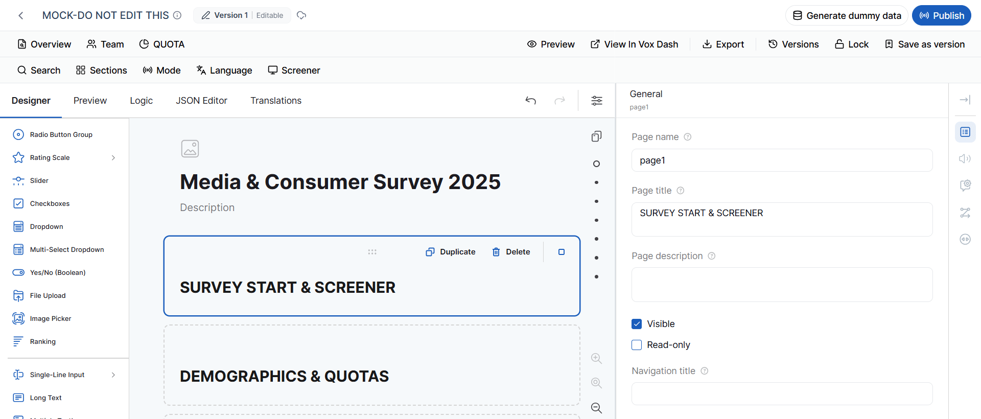
Page TTS
Page TTS allows you to review the Text-to-Speech content associated with a specific page. Use this option to review the text that will be converted into audio before generating or using the TTS output. This is particularly useful for verifying that the page content is suitable for audio-assisted interviewing.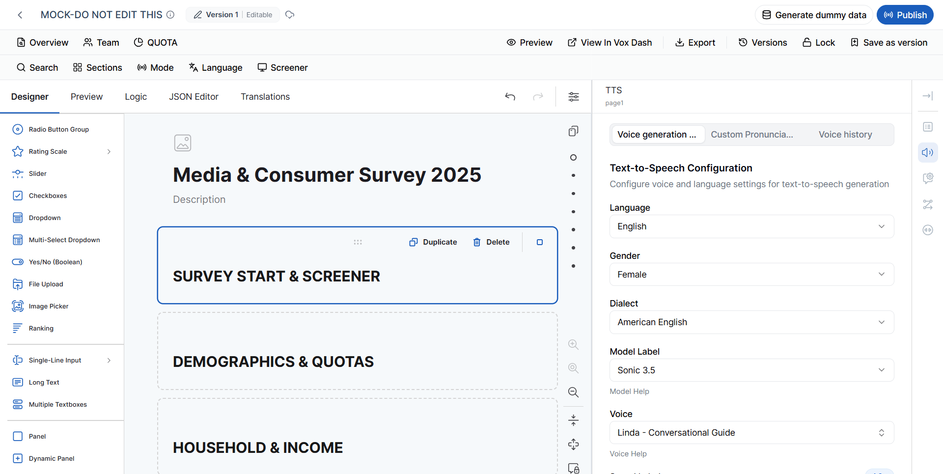
Question Settings
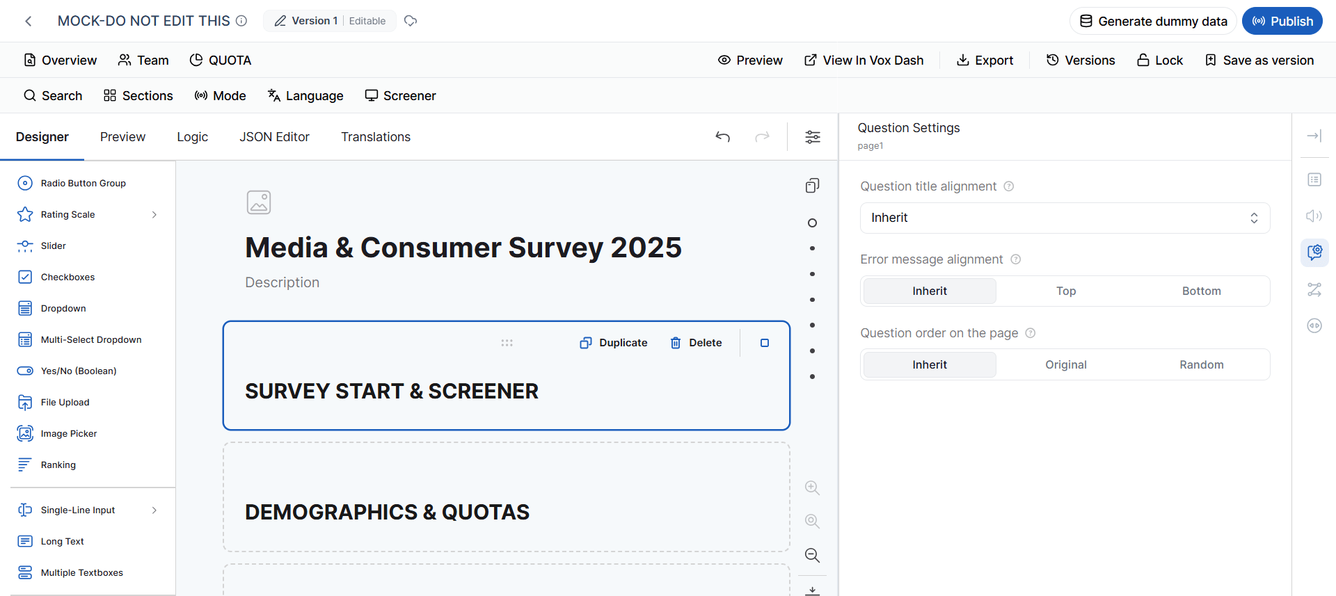
Page-level Question Settings allow you to define default behavior for questions on the selected page. Available settings include: Question Title Alignment Choose the alignment of question titles on the page. Available options:- Inherit
- Top
- Bottom
- Left
- Inherit
- Top
- Bottom
- Inherit
- Original
- Random
Page Conditions
Page-level conditions allow you to dynamically control the behavior of an individual page. Available conditions include: Make the Page Visible If Defines a condition that determines when the page should be displayed. Disable the Read-Only Mode If Defines a condition that determines when the page should become editable. Make the Page Required If Defines a condition that determines when the page should be considered required. Conditions are useful when different respondents should see different pages or when page behavior depends on previous answers.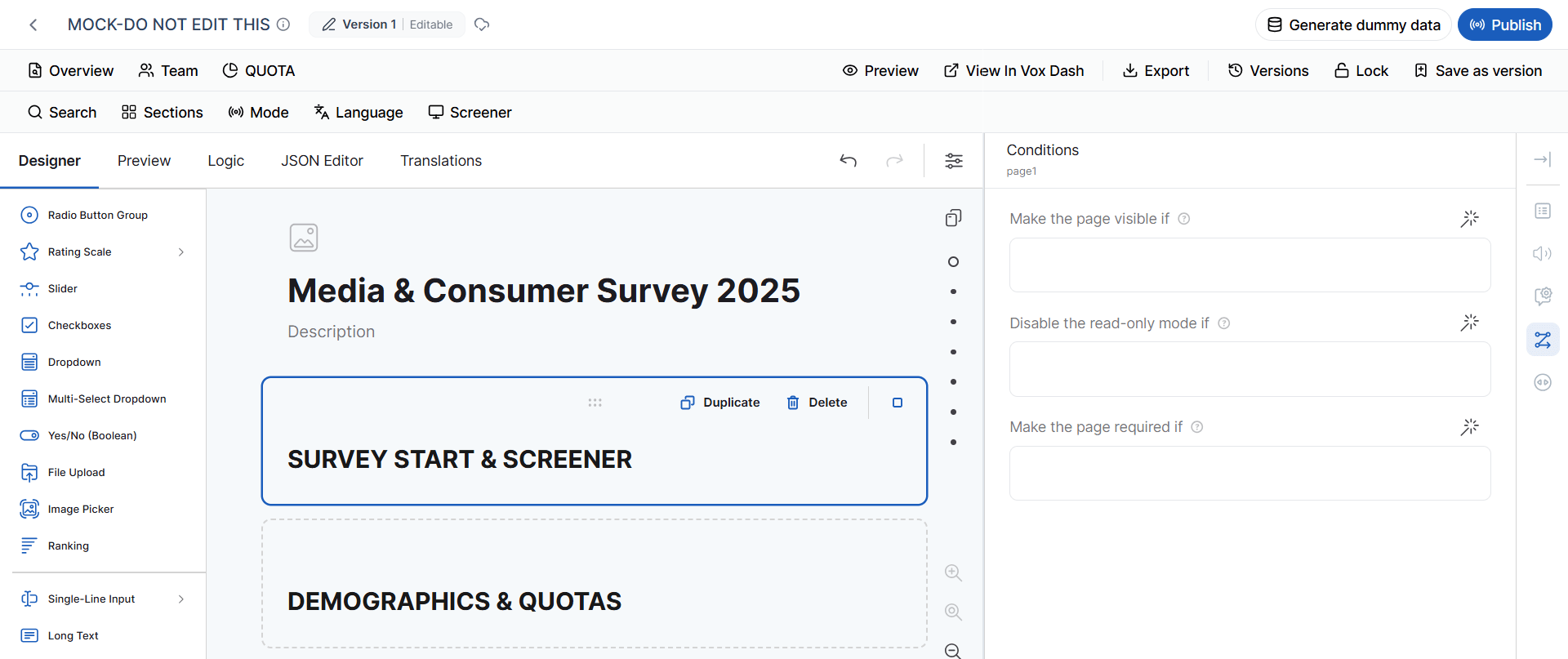
Page Navigation
The Navigation settings control navigation behavior for the selected page. Show Navigation Buttons Controls whether navigation buttons are displayed on the page. Available options:- Inherit
- Disabled
- Enabled
Question Settings
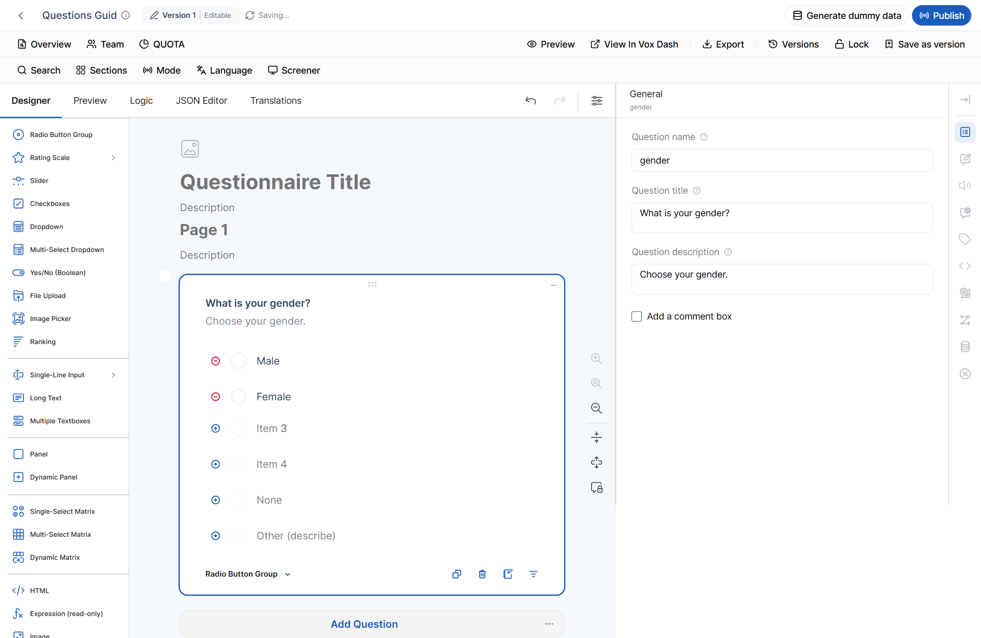
When you select an individual question in the Questionnaire Canvas, the Properties Panel changes to display the settings available for that question. The available settings depend on the selected question type. For example, a Radio Button question may contain answer choices and selection-related settings, while a Text question may contain settings for input format, character limits, placeholders, and validation. Question-level settings can also include:- General properties
- Input settings
- Display settings
- Validation
- Conditions
- Default values
- Required behavior
- Read-only behavior
- Visibility
- Tags
- Data-related settings
For detailed information about configuring individual question types, refer to the Available Question Types documentation.
Recommended Questionnaire Design Workflow
A typical workflow in the Designer tab is:- Add questions from the Question Library.
- Organize questions into pages and sections.
- Configure question settings from the Properties Panel.
- Add tags for features such as sections, languages, screeners, quotas, and data collection modes.
- Configure conditions and questionnaire logic.
- Configure questionnaire appearance and navigation.
- Set validation and data-handling rules.
- Configure LOI to estimate the expected interview duration.
- Configure TTS if audio is required.
- Configure quotas if response distribution needs to be controlled.
- Preview the questionnaire and test the respondent experience.
- Review and save a version before making major changes.
- Lock the questionnaire when editing should no longer be allowed.
- Publish or use the questionnaire for data collection.
Summary
The Designer tab is the central workspace for creating, configuring, testing, and managing questionnaires in VoxDash. From the Designer tab, you can:- Build questionnaires using a wide range of question types.
- Organize questions into pages and sections.
- Search and filter questions using content, tags, language, mode, and other criteria.
- Configure questionnaire-wide settings for appearance, navigation, validation, and data handling.
- Configure page-level and question-level behavior.
- Create conditional logic using conditions, custom variables, and triggers.
- Manage multilingual questionnaires.
- Estimate the Length of Interview (LOI).
- Generate Text-to-Speech (TTS) audio.
- Create and manage Quota Groups.
- Preview questionnaires before data collection.
- View questionnaires in VoxDash.
- Export questionnaire definitions.
- Create and manage questionnaire versions.
- Lock finalized questionnaires to prevent accidental changes.
- Configure respondent navigation, progress indicators, timers, and Thank You pages.
Best practice: Before publishing or using a questionnaire for data collection, always preview it and test its questions, conditions, validation rules, navigation, quotas, LOI, and other relevant settings. This helps ensure that the questionnaire behaves as intended and provides a clear and consistent experience for respondents.